How to Create Boxplot from Pandas DataFrame?
Last Updated :
19 Dec, 2021
Box plot is also called a Whisker plot which provides a summary of a set of data that includes minimum, first-quartile, median, third quartile, and maximum value. This Box plot is present in the matplotlib library. In the Box plot graph, the x-axis represents the data we are going to plot and the y-axis represents frequency.
Method 1: Using DataFrame_Name[‘column_name’].plot() function
We can create a box plot on each column of a Pandas DataFrame by following the below syntax-
DataFrame_Name[‘column_name’].plot(kind=’box’, title=’title_of_plot’)
Note: We can find first quartile values, median, third quartile values using quantile method.
Syntax to find quartiles
data.quantile([0.25,0.5,0.75])
- 0.25 indicates the first quartile.
- 0.5 indicates the median value.
- 0.75 indicates the third quartile.
Example to find quartiles of a data
Python3
import pandas as pd
data = pd.Series([1, 2, 3, 4, 5, 6])
print(data.quantile([0.25, 0.5, 0.75]))
|
Output
0.25    2.25
0.50    3.50
0.75    4.75
dtype: float64
Consider the below data to create a DataFrame and to plot a box plot on it.
|
Name
|
Marks
|
Credits
|
|
Akhil
|
77
|
8
|
|
Nikhil
|
95
|
10
|
|
Satyam
|
89
|
9
|
|
Sravan
|
78
|
8
|
|
Pavan
|
64
|
7
|
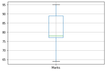
Example:
Create a DataFrame using the above data and plot the Boxplot on Marks of a student. The bottom line indicates the minimum marks of a student and the top line indicates the maximum marks of a student. Between the bottom and top, the middle 3 lines indicate 1st quartile, median, and 3rd quartile respectively.
Python3
import pandas as pd
import matplotlib.pyplot as plt
data = pd.DataFrame({'Name': ['Akhil', 'Nikhil', 'Satyam', 'Sravan', 'Pavan'],
'Marks': [77, 95, 89, 78, 64],
'Credits': [8, 10, 9, 8, 7]})
data['Marks'].plot(kind='box', title='Marks of students')
plt.show()
|
Output:

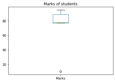
Example:
In this example, the minimum mark of the student is 10 which is very small and far from other marks (data points). So it is indicated as o at the bottom which represents an outlier. If any of the data points in the data is much larger or smaller compared to other values then the following plot will be generated.
Python3
import pandas as pd
import matplotlib.pyplot as plt
data = pd.DataFrame({'Name': ['Akhil', 'Nikhil', 'Satyam', 'Sravan', 'Pavan'],
'Marks': [77, 95, 89, 78, 10],
'Credits': [8, 10, 9, 8, 0]})
data['Marks'].plot(kind='box', title='Marks of students')
plt.show()
|
Output:
Method 2: Using pandas.DataFrame.boxplot() function
We can also use pandas.DataFrame.boxplot to draw the box plot for respective columns in a DataFrame.
Syntax
DataFrameName.boxplot(column=’column_name’,grid=True/False)
grid indicates grid lines in a graph. It is an optional parameter, if not specified it will be considered as true.
Example:
Here we plotted the boxplot using the boxplot method instead of using the plot method and specifying its kind. As we did not specify the grid argument as a parameter in the boxplot method, it will consider the default value i.e. True.
Python3
import pandas as pd
data = pd.DataFrame({'Name': ['Akhil', 'Nikhil', 'Satyam', 'Sravan', 'Pavan'],
'Marks': [77, 95, 89, 78, 64],
'Credits': [8, 10, 9, 8, 7]})
data.boxplot(column='Marks')
|
Output:
Like Article
Suggest improvement
Share your thoughts in the comments
Please Login to comment...