How to Create a Transparent button using HTML and CSS ?
Last Updated :
17 Jan, 2024
To create a transparent button using HTML and CSS, you can set the background-color property to have an rgba value with an alpha channel less than 1 (e.g., rgba(0, 0, 0, 0.5) for a semi-transparent black). This allows the underlying content to show through the button, creating a transparent effect.
This article uses the background-color: transparent; property to design the transparent background button, and we will also design a semi-transparent button with small changes in the code
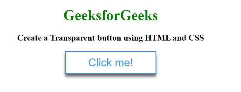
Example: This example shows the implementation of a fully transparent button with an example.
HTML
<!DOCTYPE html>
<html lang="en">
<head>
<meta charset="utf-8">
<title>Fully transparent button</title>
<style>
body {
margin: 0;
padding: 0;
text-align: center;
}
h1 {
color: green;
}
.btn {
cursor: pointer;
border: 1px solid #3498db;
background-color: transparent;
height: 50px;
width: 200px;
color: #3498db;
font-size: 1.5em;
box-shadow: 0 6px 6px rgba(0, 0, 0, 0.6);
}
</style>
</head>
<body>
<h1>GeeksforGeeks</h1>
<h3>
Create a Transparent button
using HTML and CSS
</h3>
<button class="btn">Click me!</button>
</body>
</html>
|
Output:
Example 2: This example shows the design of semi transparent button with an example.
HTML
<!DOCTYPE html>
<html lang="en">
<head>
<meta charset="utf-8">
<title>Semi transparent button</title>
<style>
body {
margin: 0;
padding: 0;
text-align: center;
}
h1 {
color: green;
}
.btn {
cursor: pointer;
border: 1px solid #3498db;
background-color: rgba(24, 100, 171, 0.1);
height: 50px;
width: 200px;
color: #3498db;
font-size: 1.5em;
box-shadow: 0 6px 6px rgba(0, 0, 0, 0.6);
}
</style>
</head>
<body>
<h1>GeeksforGeeks</h1>
<h3>
Create a Transparent button
using HTML and CSS
</h3>
<button class="btn">Click me!</button>
</body>
</html>
|
Output:

Output
Share your thoughts in the comments
Please Login to comment...