How to Create a Tolerance Chart in Excel?
Last Updated :
01 May, 2021
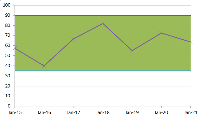
A tolerance chart shows how a particular data item compares to the maximum and minimum permissible values. In this article, we’ll analyze the average results of the students of a class using a tolerance chart.
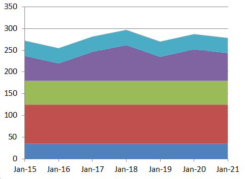
Tolerance Chart
Steps for creating a Tolerance Chart
Follow the below steps to create a Tolerance chart in Excel:
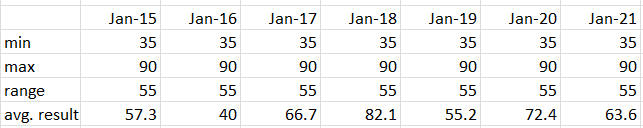
Step 1: The first step is to make your data table. This table must have three main attributes, Minimum, Maximum, and Range. Here, the range is the difference between the Maximum and the Minimum values. You can use this formula and apply it to all corresponding cells. Take a look at the following image for better clarity.
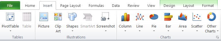
Step 2: Next, select the entire table and click on Insert.
Note: The menus may look different for different versions of Excel, but the basic principles remain the same.
Step 3: Find Stacked Area Chart under the Charts sub-section, and click on it. You may delete the legend on the right-hand side if you want.
Stacked Area Chart
Step 4: Now, from the table, select all the values from the ‘min’ row. Then click Ctrl + C, to copy. Now, click on the chart and hit Ctrl + V, to paste. This will result in an additional layer being added to the stacked chart as shown below:
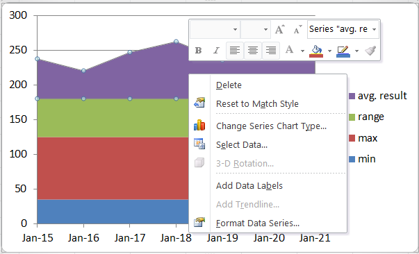
Step 5: Now, select the colored charts that correspond to Min (the top-most layer), Max, and Result and make the following conversions. Note – All others remain the same.
Max --> Line Chart
Min --> Line Chart
Result --> Line Chart with Markers
Right-click on the Layer you want to change and click on ‘Change Series Chart Type‘
The following screen will appear where you can select from the available Line Charts on the left.
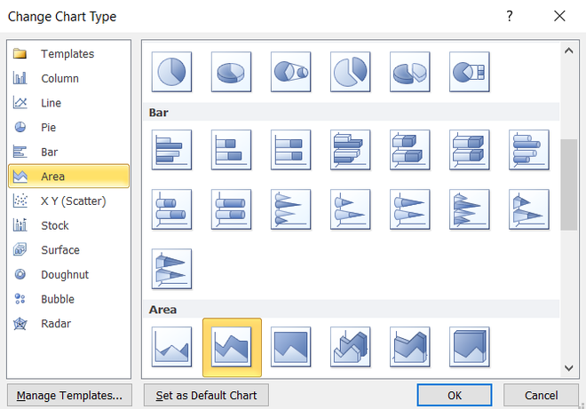
Select Line from the left pane and choose the corresponding Line Chart mentioned above.
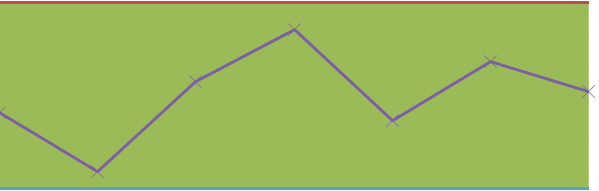
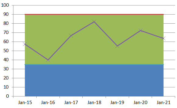
Do, this for all items and the final result would look something like this.
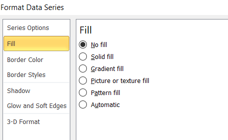
Step 6: Now, select the bottom-most layer, i.e., the min layer, and double-click on it. Then, select No Fill from the Fill section on the left.
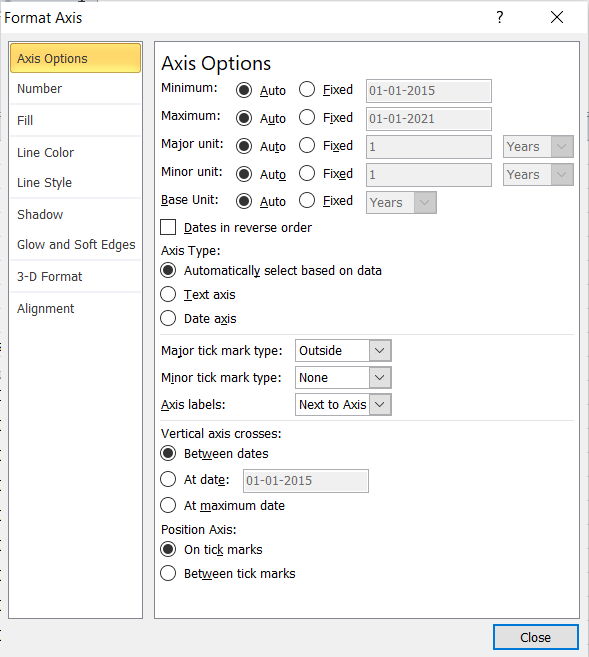
Step 7: Next, right-click on the bottom axis and select Format Axis. Navigate to the bottom and select “On tick Marks”.
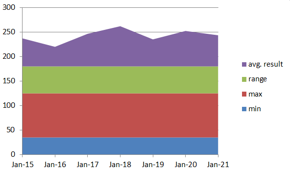
Your Tolerance Chart is ready!
Like Article
Suggest improvement
Share your thoughts in the comments
Please Login to comment...