How to Create a Timeline or Milestone Chart in Excel?
Last Updated :
31 May, 2021
A timeline is a type of chart that visually shows a series of events in chronological order over a linear timescale. The power of a timeline is that it is graphical, which makes it easy to understand critical milestones, such as the progress of a project schedule.
Benefits of using Timeline / Milestone Chart:
- It’s easy to check the progress of the project with a milestone chart.
- Easy for the user to understand the project schedule.
- You have all the important information in a single chart.
Steps to Create a Timeline / Milestone Chart
Follow the below steps to create a Timeline or Milestone chart:
Step 1: Prepare your Data.
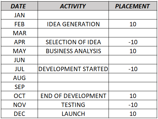
Data
In the above table:
- The first column is for completion dates of the project stages.
- The second column is for the activity name.
- The third column is just for the placement of the activities into the timeline (up and down).
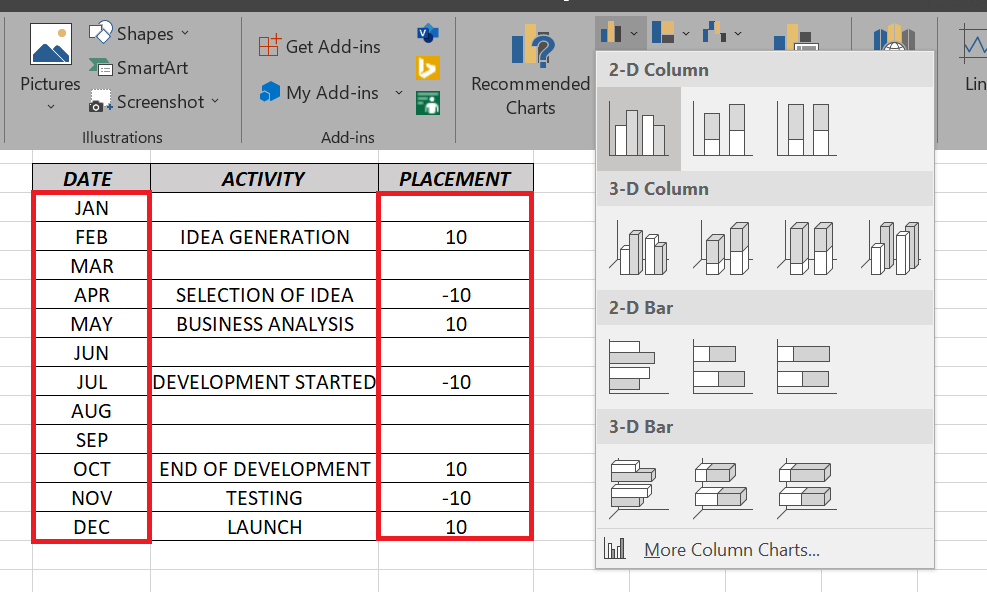
Step 2: Select “Date” and “Placement” column and then from:
insert-> chart-> select 2d chart
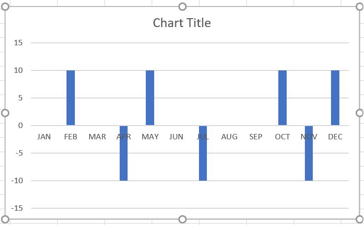
The following chart will appear:
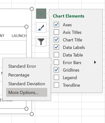
Step 3: From the chart element select data labels then select more options.
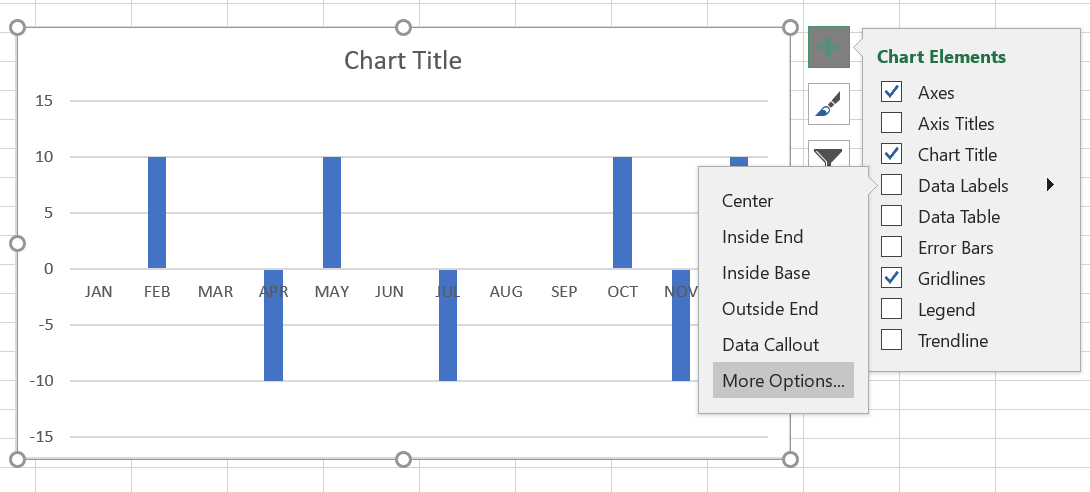
chart elements->data labels->more options
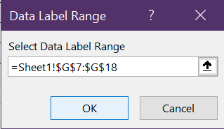
Step 4: Now in Format data labels deselect the “value” option and select the “value from cells” option.
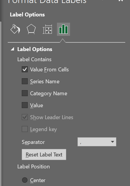
Step 5: Then select the “activity” column and then click on ok.
Step 6: Now select bars and on the format tab on the chart tools select no fill-in shape fills.
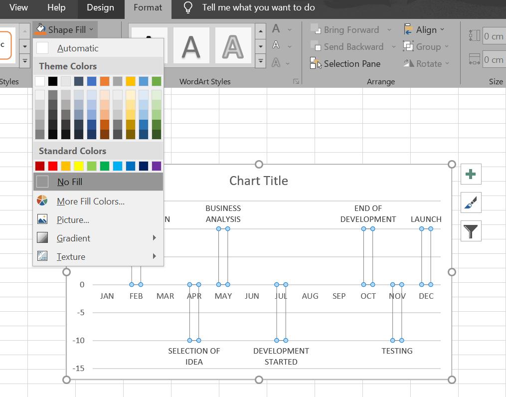
No fill bars
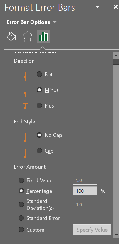
Step 7: Now for the Error bars, from the chart element select error bars then select more options.
Step 8: Now in “Format Error Bars” change everything as per the image shown below:
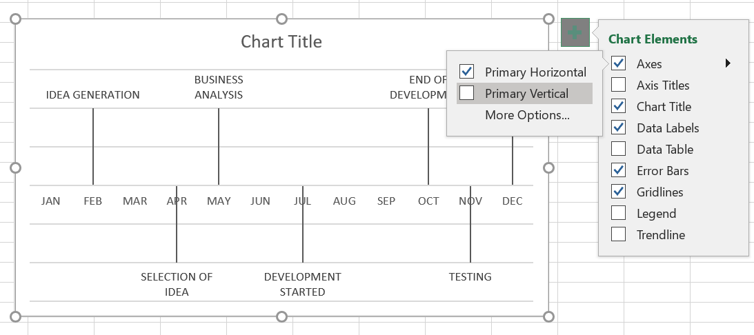
Step 9: Now remove the vertical axis by unchecking the primary vertical option from
chart element->axes
And also deselect gridlines option.
Vertical axis Removed
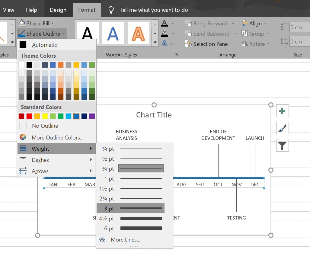
Step 10: To customize the bars, select Horizontal axis and then in format select shape outline color weight and arrow design.
Step 11: Now select the arrow bars and change their color too.
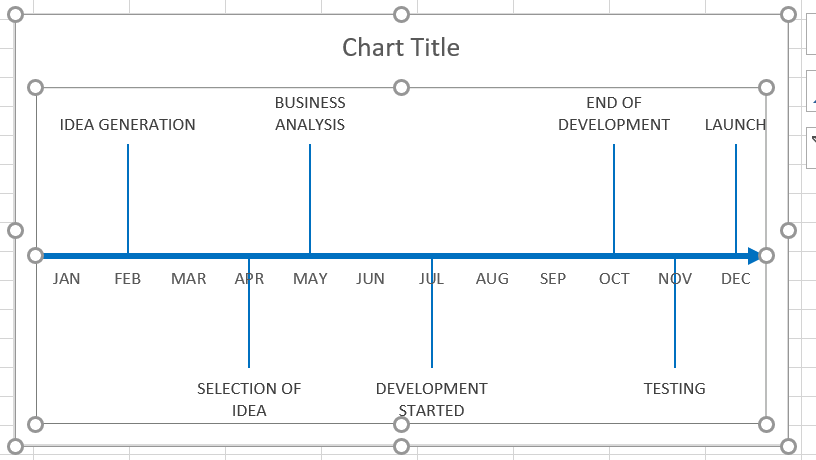
Both Horizontal axis and arrow bars in the same color
Step 12: The final step is to change the Chat Title. The following would be the result:
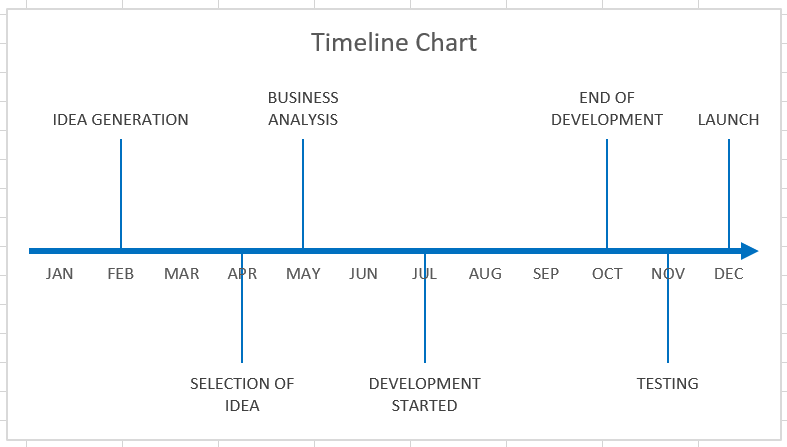
Final Chart
Like Article
Suggest improvement
Share your thoughts in the comments
Please Login to comment...