How to Create a Sales Funnel Chart In Excel?
Last Updated :
24 Jun, 2022
A Funnel Chart is a type of chart which is used to represent how the data moves through a process. Usually, it is used to represent the different stages in the sales process and shows the amount of potential revenue for each stage. Funnel charts are widely used to represent the sales funnels, recruitment, and order fulfillment process. The funnel chart in sales (for example, In e-Commerce websites) gives the reader a better picture of how many customers start the search for a product and at the end put a purchase order. Given below is a random sales funnel chart for an e-commerce website.
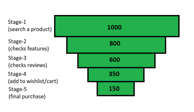
Fig 1 – A demo funnel chart for an e-commerce website
The funnel chart is created with the help of a stacked bar chart. Below is the step-by-step implementation of funnel char for the random sales data.
Step By Step Implementation For A Funnel Chart
Step 1: Create Dataset
In this step, we will create our dataset for preparing a random sales funnel chart. For this, we will be adding the following columns Sales Stage, Spacer, and Number Of Customer. The spacer will center each of the horizontal bars of the chart depending on the largest data value.
Note: Spacer will simply align the data bars in centre alignment. For this we need to find the maximum data value in the dataset and we will subtract the current data value then we will divide it by 2.
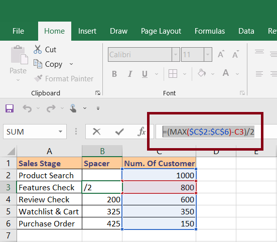
Fig 2 – Dataset and Spacer formula
Above, we can see the spacer formula. (You will need to change the column and rows according to your own data). After that, we need to put the same formula for all the rows for which we will hold and drag it below to all rows.
Step 2: Create Stacked Bar Chart
In this step, we will select our data and insert a stacked bar chart. For this , Select Data > Insert > Charts > Stacked Bar Chart.
Once we insert the stacked bar it will look something like this.
Step 3: Reverse the Chart Categories
Once we will insert our chart, it shows the categories in reverse order from the one which is present in our dataset. So, we will reverse the order once. In order to reverse the chart categories, we need to select the vertical axis (the one with category names).
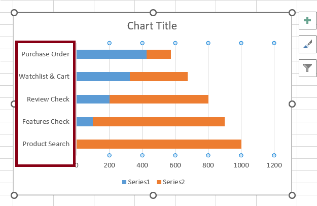
Fig 5 – Vertical axis
After we click on the vertical axis we need to do a right-click and choose Format Axis.
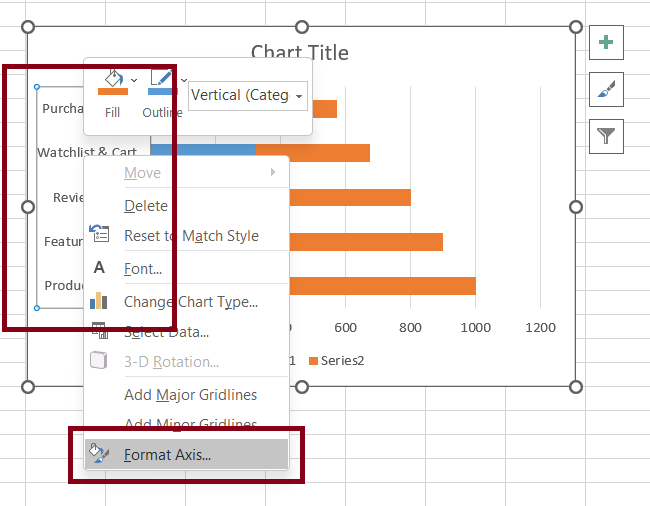
Fig 6 – Format axis
Once we click on the Format axis option, it will open a right-side pane for axis formatting. We need to click on the checkbox for “Categories in reverse order”.
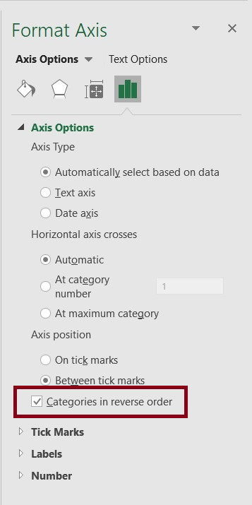
Fig 7 – Reverse categories
This will reverse the stacked bar graph depending on categories order and it will match to same as the one present in dataset.
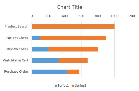
Fig 8 – Reverse chart
Step 3: Reduce Bars Gap Width To Zero
In this step, we will reduce the gap between each bar to zero. For this, we need to select any bar and do a right-click and choose Format Data Series.
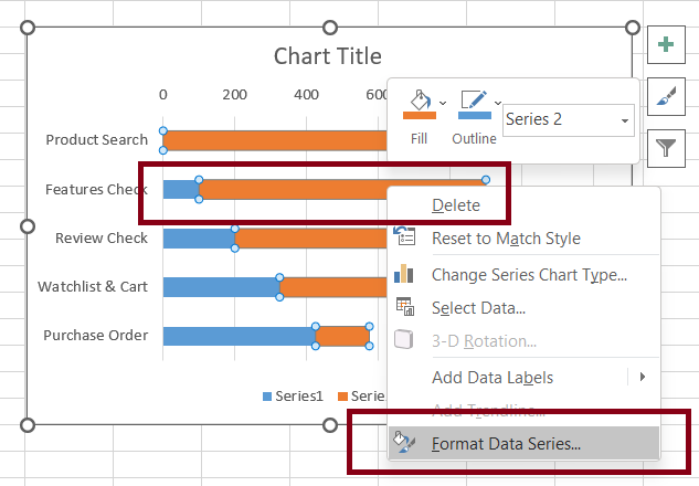
Fig 9 – Format Data Series
Once we click on Format Data Series, the excel will open a side pane where we need to reduce the Gap Width to 0%.
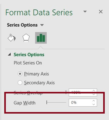
Fig 10 – Gap Width
The above option will reduce the gap between each bar to 0 and our graph will look something like this.
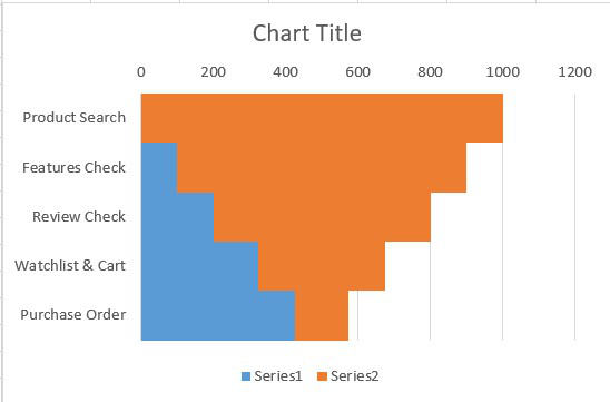
Fig 11 – Zero width between bars
Step 4: Change The Spacer Bar Color
In this step, we will change the spacer(blue) color to the chart background color. For this, Select Region (blue color region) > Right-Click > Format Data Series.
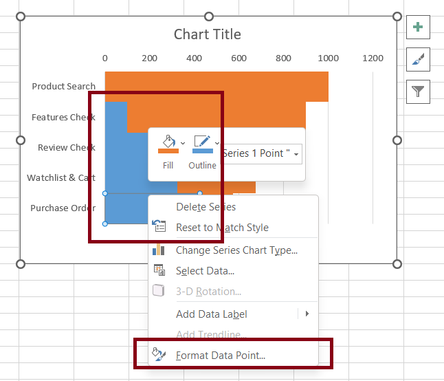
Fig 12 – No Fill to Spacer region
It will open a side pane where we are required to choose No Fill. It will remove the background color.
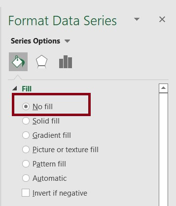
Fig 13 – No Fill option
After all the above steps, our chart now looks something like this.
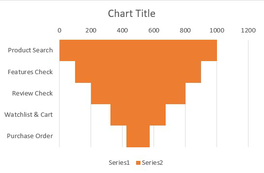
Fig 14 – Funnel Chart
Step 5: Formatting Chart
In this step, we will format the chart to enhance its representational view. For this, we will do the following operations (You can update your chart depending upon your own needs).
- Add title to the chart.
- Remove the vertical grid lines from the chart area.
- Remove the legends.
- Add data labels to the funnel bars and center them.
- Remove the horizontal value axis. (Select the horizontal value axis and deleted)
Now, we are required to remove the data labels for the spacer region and remove the data labels by clicking plus icon beside the chart.
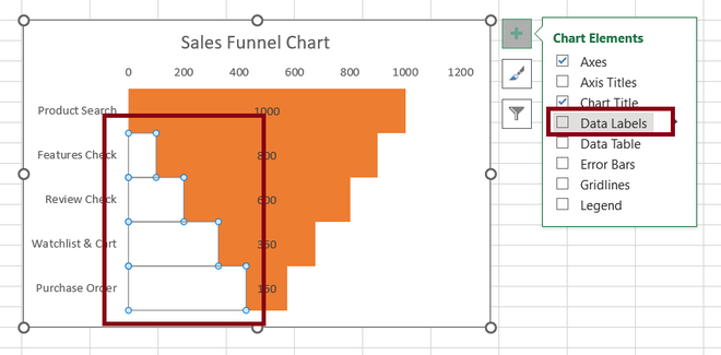
Fig 18 – Remove data labels from the spacer region
Once we are done with all the above steps, we will finally Select Chart Region > Right-Click > Format Data Series and add borders, and change color accordingly.
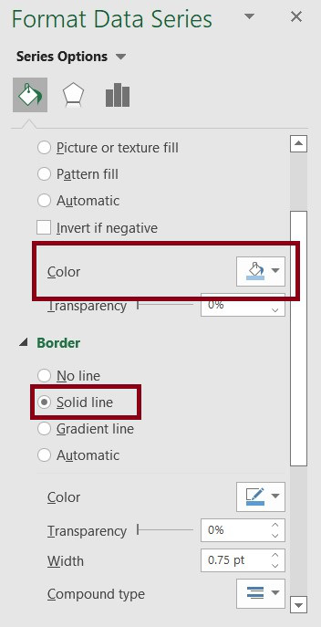
Fig 19 – Adding border and color
Output
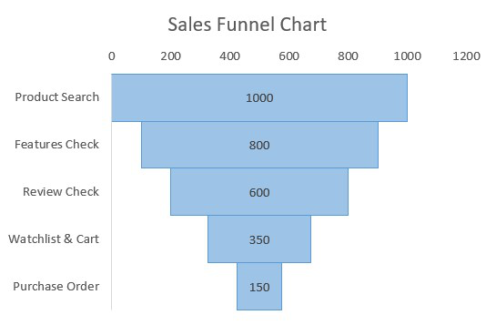
Fig 20 – Output
Share your thoughts in the comments
Please Login to comment...