How to create a pie chart with percentage labels using ggplot2 in R ?
Last Updated :
24 Oct, 2021
In this article, we are going to see how to create a pie chart with percentage labels using ggplot2 in R Programming Language.
Packages Used
The dplyr package in R programming can be used to perform data manipulations and statistics. The package can be downloaded and installed using the following command in R.
install.packages("dplyr")
The ggplot2 package in R programming is used to plots graphs to visualize data and depict it using various kinds of charts. The package is used as a library after running the following command.
install.packages("ggplot2")
The ggplot method in R programming is used to do graph visualizations using the specified data frame. It is used to instantiate a ggplot object. Aesthetic mappings can be created to the plot object to determine the relationship between the x and y-axis respectively. Additional components can be added to the created ggplot object.
Syntax: ggplot(data = NULL, mapping = aes(), fill = )
Arguments :
- data – Default dataset to use for plot.
- mapping – List of aesthetic mappings to use for plot.
Geoms can be added to the plot using various methods. The geom_line() method in R programming can be used to add graphical lines in the plots made. It is added as a component to the existing plot. Aesthetic mappings can also contain color attributes which is assigned differently based on different data frames.
The geom_bar() method is used to construct the height of the bar proportional to the number of cases in each group.
Syntax: geom_bar ( width, stat)
Arguments :
width – Bar width
The coord_polar() component is then added in addition to the geoms so that we ensure that we are constructing a stacked bar chart in polar coordinates.
Syntax: coord_polar(theta = “x”, start = 0)
Arguments :
theta – variable to map angle to (x or y)
start – Offset of starting point from 12 o’clock in radians.
This is followed by the application of geom_text() method which is used to do textual annotations.
geom_text(aes() , label, size)
Below is the implementation:
R
library(dplyr)
library(ggplot2)
library(ggrepel)
library(forcats)
library(scales)
data_frame <- data.frame(col1 = letters[1:3],
col2 = c(46,24,12))
print("Original DataFrame")
print(data_frame)
sum_of_obsrv <- 82
pie_chart <- ggplot(data_frame, aes(x="", y=col2, fill=col1)) +
geom_bar(width = 1, stat = "identity") +
coord_polar("y", start=0) +
geom_text(aes(y = col2/2 + c(0, cumsum(col2)[-length(col2)]),
label = percent(col2/sum_of_obsrv )), size=5)
print(pie_chart)
|
Output
[1] "Original DataFrame"
col1 col2
1    a   46
2    b   24
3    c   12

In order to accommodate the index inside the par chart along with levels, we can perform mutations on the data frame itself to avoid carrying out the calculations of the cumulative frequency and its corresponding midpoints during the graph plotting. This method is less cumbersome than the previous method. In this approach, the three required data properties are appended in the form of columns to the data frame, which are :
- cumulative frequency, calculated by the cumsum() method taking as argument the column name.
- mid point which is computed as the half of difference of cumulative frequency with column value.
- label which is used to compute labeling in the form of textual annotations.
This is followed by the application of the method theme_nothing which simply strips all thematic elements in ggplot2.
R
library(dplyr)
library(ggplot2)
library(ggmap)
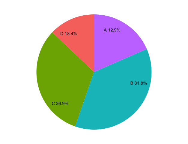
data_frame <- data.frame(col1 = c(28,69,80,40),
col2 = LETTERS[1:4]) %>%
mutate(col2 = factor(col2, levels = LETTERS[1:4]),
cf = cumsum(col1),
mid = cf - col1 / 2,
label = paste0(col2, " ", round(col1 / sum(col1) * 100, 1), "%"))
print("Original DataFrame")
print(data_frame)
ggplot(data_frame, aes(x = 1, weight = col1, fill =col2)) +
geom_bar(width = 1) +
coord_polar(theta = "y") +
geom_text(aes(x = 1.3, y = mid, label = label)) +
theme_nothing()
|
Output
[1] "Original DataFrame"
col1 col2  cf   mid   label
1   28    A  28  14.0 A 12.9%
2   69    B  97  62.5 B 31.8%
3   80    C 177 137.0 C 36.9%
4   40    D 217 197.0 D 18.4%
Like Article
Suggest improvement
Share your thoughts in the comments
Please Login to comment...