How to Create a Pie Chart in Seaborn?
Last Updated :
28 Feb, 2022
In this article, we will learn how to plot pie charts using seaborn and matplotlib.
Seaborn is a Python data visualization library based on matplotlib. It provides a high-level interface for drawing attractive and informative statistical graphics. Matplotlib is a comprehensive library for creating static, animated, and interactive visualizations in Python. Matplotlib is a multi-platform data visualization library built on NumPy arrays and designed to work with the broader SciPy stack.
Syntax to install seaborn and matplotlib libraries:
pip install seaborn
pip install matplotlib
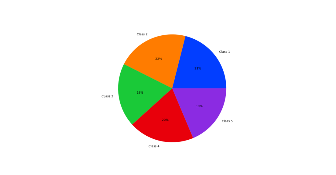
Example 1:
Let’s take an example of 5 classes with some students in it and plot a pie chart on the basic number of students in each class.
Python3
import matplotlib.pyplot as plt
import seaborn
data = [44, 45, 40, 41, 39]
keys = ['Class 1', 'Class 2', 'CLass 3', 'Class 4', 'Class 5']
palette_color = seaborn.color_palette('bright')
plt.pie(data, labels=keys, colors=palette_color, autopct='%.0f%%')
plt.show()
|
Output:
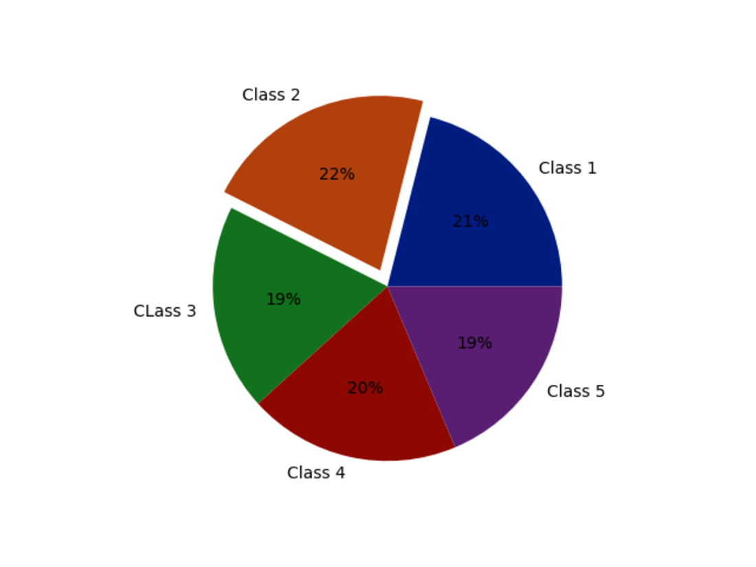
Example 2:
Now let’s plot a pie chart with a different palette and explode.
Python3
import matplotlib.pyplot as plt
import seaborn
data = [44, 45, 40, 41, 39]
keys = ['Class 1', 'Class 2', 'CLass 3', 'Class 4', 'Class 5']
explode = [0, 0.1, 0, 0, 0]
palette_color = seaborn.color_palette('dark')
plt.pie(data, labels=keys, colors=palette_color,
explode=explode, autopct='%.0f%%')
plt.show()
|
Output:
Like Article
Suggest improvement
Share your thoughts in the comments
Please Login to comment...