How to Create a Histogram of Two Variables in R?
Last Updated :
19 Dec, 2021
In this article, we will discuss how to create a histogram of two variables in the R programming language.
Method 1: Creating a histogram of two variables with base R
In this approach to create a histogram pf two variables, the user needs to call the hist() function twice as there is two number of variables, and with the second hist() function the user needs to use the special argument of this function ‘add’ with which both the histogram with different variables will be plotted on the single plot.
Syntax:
hist(x, col = NULL, add=true)
Parameters:
- x: a vector of values for which the histogram is desired.
- col: a colour to be used to fill the bars
- add: to merge the histogram
Example:
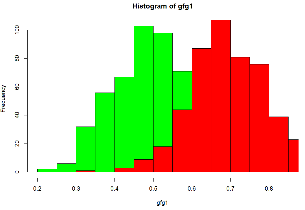
In this example, we will be creating the histogram using the hist() function with variables with random data points of 500 entries into the same plot.
R
gfg1<-rnorm(500,mean=0.5,sd=0.1)
gfg2<-rnorm(500,mean=0.7,sd=0.1)
hist(gfg1,col='green')
hist(gfg2,col='red',add=TRUE)
|
Output:
Method 2: Creating a histogram of two variables with ggplot2 package
In this method, to create a histogram of two variables, the user has to first install and import the ggplot2 package, and then call the geom_histrogram with the specified parameters as per the requirements and needs to create the dataframe with the variable to which we need the histogram in the R programming language.
To install & import the ggplot2 package, the user needs to use the below syntax:
Install - install.package('ggplot2')
Import - library(ggplot2)
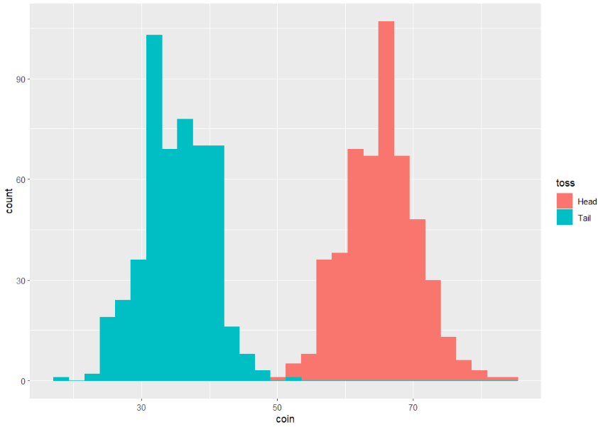
Example:
R
library(ggplot2)
gfg < - data.frame(toss=factor(rep(c("Head", "Tail"), each=500)),
coin=round(c(rnorm(500, mean=65, sd=5),
rnorm(500, mean=35, sd=5))))
ggplot(gfg, aes(x=coin, fill=toss, color=toss)) +
geom_histogram(position="identity")
|
Output:
Like Article
Suggest improvement
Share your thoughts in the comments
Please Login to comment...