How to Create a Histogram from Pandas DataFrame?
Last Updated :
19 Dec, 2021
A histogram is a graph that displays the frequency of values in a metric variable’s intervals. These intervals are referred to as “bins,” and they are all the same width.
We can create a histogram from the panda’s data frame using the df.hist() function.
Syntax:
DataFrame.hist(column=None, by=None, grid=True, xlabelsize=None, xrot=None, ylabelsize=None, yrot=None, ax=None, sharex=False, sharey=False, figsize=None, layout=None, bins=10, backend=None, legend=False, **kwargs)
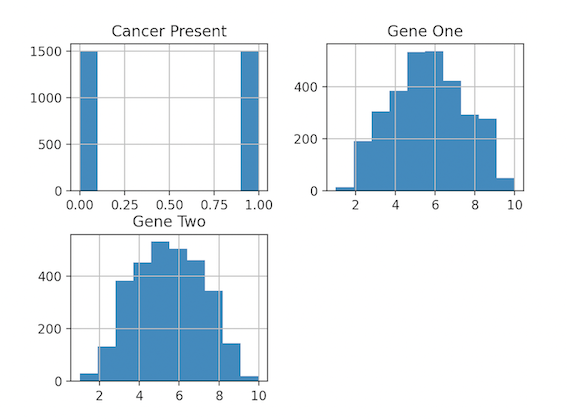
Example 1: Creating a basic histogram( histogram for individual columns)
We use df.hist() and plot.show() to display the Histogram.
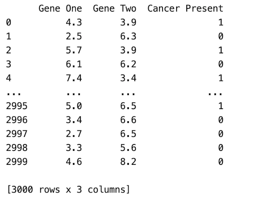
CSV file used: gene_expression.csv
Python3
import numpy as np
import pandas as pd
import matplotlib.pyplot as plt
import seaborn as sns
df = pd.read_csv('gene_expression.csv')
print(df)
df.hist()
plt.show()
|
Output:
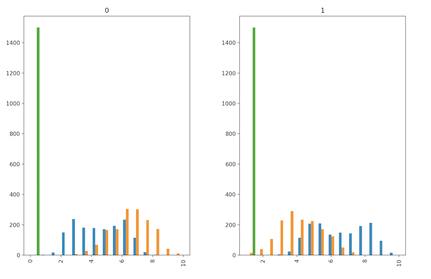
Example 2: Creating a modified histogram(plotting histogram by the group)
In this example, we add extra parameters to the hist method. We have changed the fig size, no of bins is specified as 15, and by parameter is given which ensures histograms for each cancer group are created.
Python3
import numpy as np
import pandas as pd
import matplotlib.pyplot as plt
import seaborn as sns
df = pd.read_csv('gene_expression.csv')
print(df)
df.hist(by='Cancer Present', figsize=[12, 8], bins=15)
plt.show()
|
Output:
Like Article
Suggest improvement
Share your thoughts in the comments
Please Login to comment...