How to Create a Gauge Chart in Excel?
Last Updated :
25 Feb, 2022
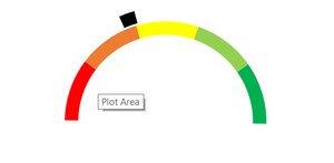
Gauge chart is also known as a speedometer or dial chart, which use a pointer to show the readings on a dial. It is just like a speedometer with a needle, where the needle tells you a number by pointing it out on the gauge chart with different ranges.
It is a Single point chart that tracks a single data point against its target.
Steps to Create a Gauge Chart
Follow the below steps to create a Gauge chart:
Step 1: First enter the data points and values.
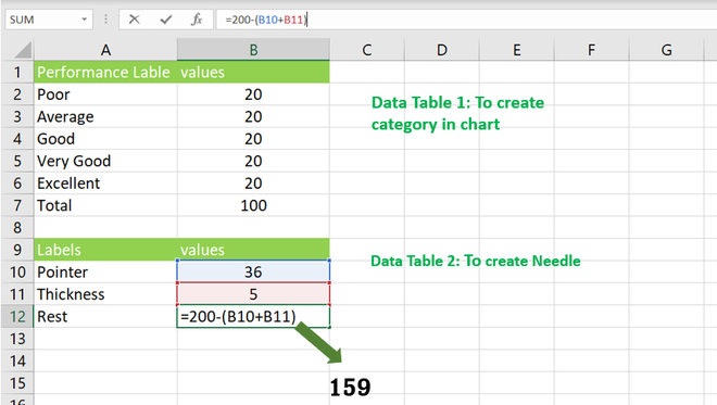
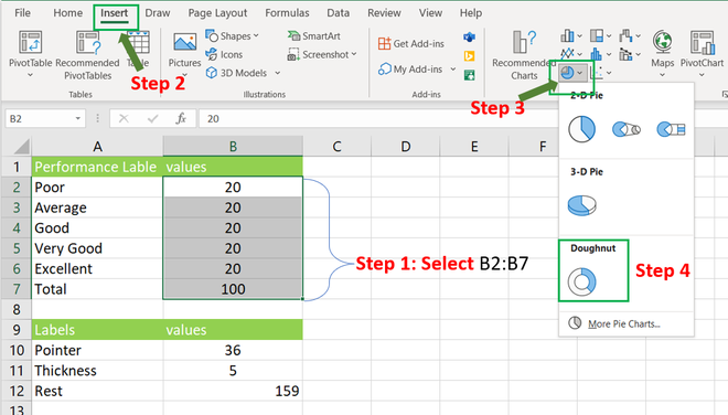
Step 2: Doughnut chart(with First table values).
- Select the range B2:B7
- Then press shortcut keys [Alt + N + Q and select the Doughnut] or Go to Insert -> Charts -> Doughnut (With these steps you will get a blank chart).
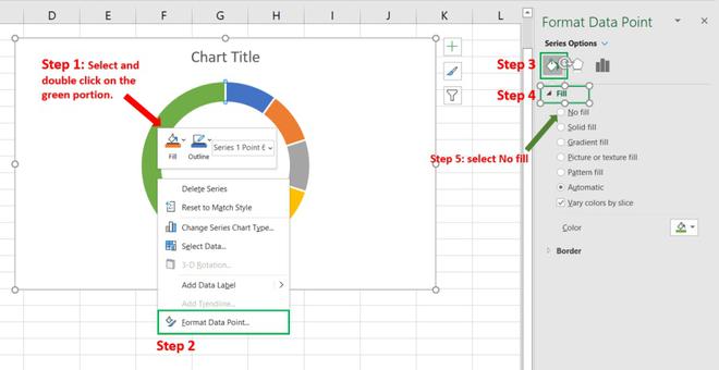
Step 3: Delete or hide the left portion of the Doughnut chart.
- Select the chart (left click on the chart) & double click on the left portion.
- Then right click -> format Data point… -> paint -> fill -> select “No fill”.
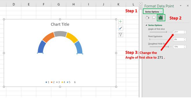
Step 4: Change the Angle
- Select the legend Icon & Change the angle to 271.
- Then you can change the doughnut hole size.
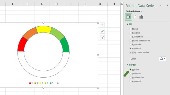
Step 5: Set the Border & color
- Go to fill and line -> border -> No line.
- You can also change the colors of each data point.
Step 6: Creating a pointer
- Click on the chart -> Chart Design -> Select Data -> Add
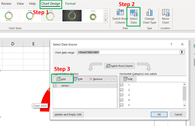
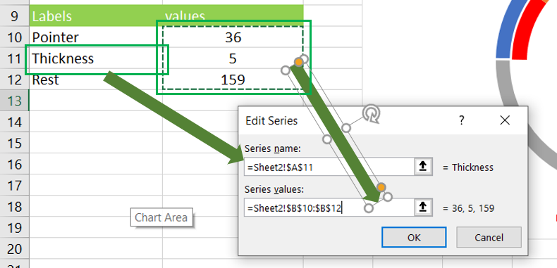
- Series name as a Pointer or Thickness(for this first select first box and A11)
- Then for “Series values” select the values, here, selected 36, 5 & 153.
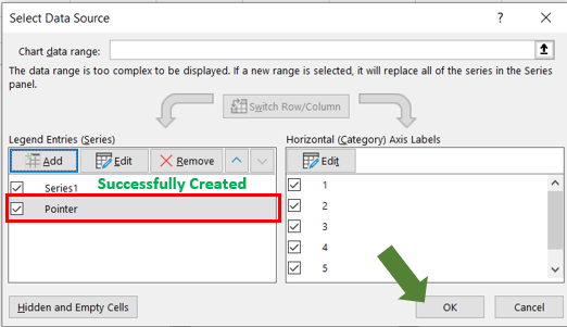
- Now select the new chart and make it “No Fill” except the pointer(The smaller data point).
Step 7: Change chart type.
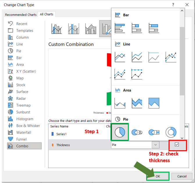
- Select chart -> chart Design -> change chart type -> combo. Then for series chart select Doughnut.
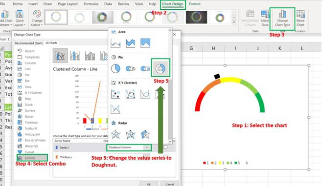
- Same as series select pie chart Type for “thickness” Then Select “Ok”.
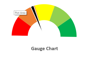
- Now the last Step is to change the angle of the chart as 271.
- Give Data Labels.
Like Article
Suggest improvement
Share your thoughts in the comments
Please Login to comment...