How to Create a Forest Plot in R?
Last Updated :
04 Jan, 2022
In this article, we will discuss how to create a Forest Plot in the R programming language.
A forest plot is also known as a blobbogram. It helps us to visualize estimated results from a certain number of studies together along with the overall results in a single plot. It is extensively used in medical research for visualizing a meta-analysis of the results of randomized controlled trials. The x-axis of the plot contains the value of the interest in the studies and the y-axis displays the results from the different trials.
To create a Forest Plot in the R Language, we use a combination of scatter plots along with the error bar. The geom_point() function of the ggplot package helps us to create a scatter plot. To create an error bar plot as an overlay on top of the scatter plot, we use the geom_errorbarh() function. The geom_errorbarh() function is used to draw a horizontal error bar plot.
Syntax:
ggplot(data, aes( y, x, xmin, xmax )) + geom_point() + geom_errorbarh( height )
Parameter:
- data: determines the data frame to be used for plotting.
- x and y: determines the axes variables
- xmin and xmax: determines the x-axis limits
- height: determines the width of the error bar
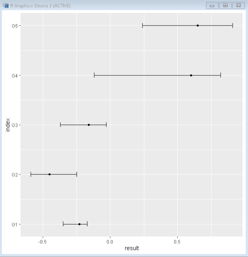
Example: Basic forest plot.
R
sample_data <- data.frame(study=c('G1', 'G2', 'G3', 'G4', 'G5'),
index=1:5,
result=c(-.23, -.45, -.16, .6, .65),
error_lower=c(-.35, -.59, -.37, -.12, .24),
error_upper=c(-.17, -.25, -.03, .82, .91))
library(ggplot2)
ggplot(data=sample_data, aes(y=index, x=result,
xmin=error_lower,
xmax=error_upper)) +
geom_point() +
geom_errorbarh(height=.1) +
scale_y_continuous(labels=sample_data$study)
|
Output:
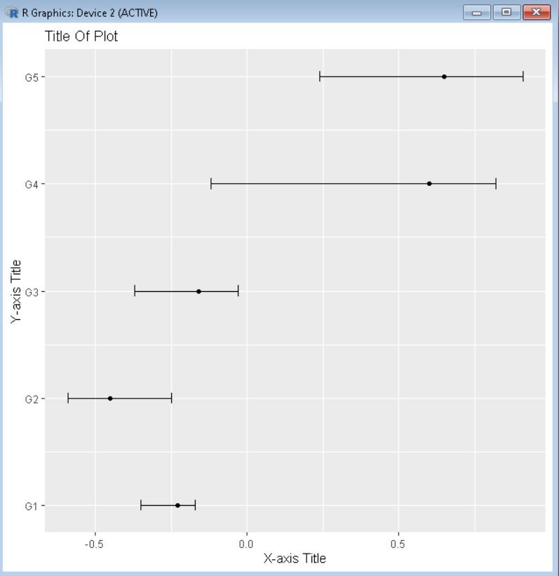
Add Title and change axis label of Plot
To add the title to the plot, we use the title argument of the labs() function of the R Language. We can also change axis labels of the x-axis and y-axis using the x and y argument of the labs() function respectively.
Syntax:
plot() + labs( title, x, y )
Parameter:
title: determines the title of the plot.
x and y: determines the axis titles for the x-axis and y-axis respectively.
Example: Forest plot with a custom title for the plot and both axes.
R
sample_data <- data.frame(study=c('G1', 'G2', 'G3', 'G4', 'G5'),
index=1:5,
result=c(-.23, -.45, -.16, .6, .65),
error_lower=c(-.35, -.59, -.37, -.12, .24),
error_upper=c(-.17, -.25, -.03, .82, .91))
library(ggplot2)
ggplot(data=sample_data, aes(y=index, x=result,
xmin=error_lower,
xmax=error_upper)) +
geom_point() +
geom_errorbarh(height=.1) +
scale_y_continuous(labels=sample_data$study)+
labs(title='Title Of Plot', x='X-axis Title', y = 'Y-axis Title')
|
Output:
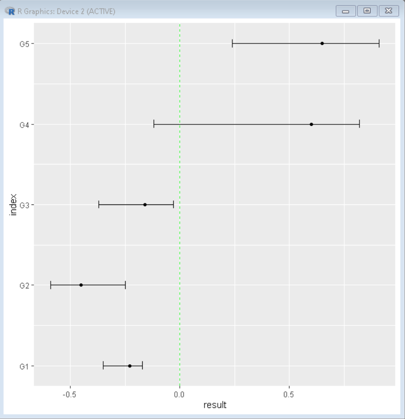
Add a Vertical Line to the Plot
To add a vertical line to the plot as an overlay in the R Language by using the geom_vline() function. We can add a vertical line in the plot to show the position of zero for better visualization of the data. We can use the xintercept, linetype, color, and alpha argument of the geom_vline() function to customize the position, the shape of the line, color, and transparency of the vertical line respectively.
Syntax:
plot + geom_vline( xintercept, linetype, color, alpha )
Parameter:
- xintercept: determines the position of the line on the x-axis.
- linetype: determines the shape of the line.
- color: determines the color of the line.
- alpha: determines the transparency of the line.
Example: Forest plot with a vertical line at x=0.
R
sample_data <- data.frame(study=c('G1', 'G2', 'G3', 'G4', 'G5'),
index=1:5,
result=c(-.23, -.45, -.16, .6, .65),
error_lower=c(-.35, -.59, -.37, -.12, .24),
error_upper=c(-.17, -.25, -.03, .82, .91))
library(ggplot2)
ggplot(data=sample_data, aes(y=index, x=result,
xmin=error_lower,
xmax=error_upper)) +
geom_point() +
geom_errorbarh(height=.1) +
scale_y_continuous(labels=sample_data$study)+
geom_vline(xintercept=0, color='green', linetype='dashed', alpha=.8)
|
Output:
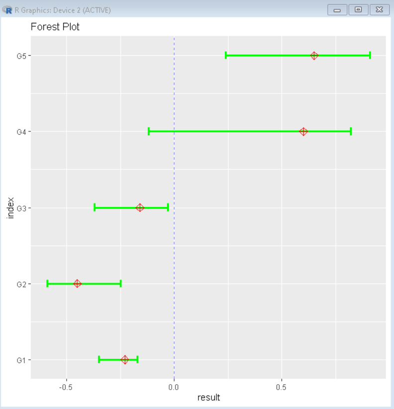
Customization of Forest Plot
To customize the forest plot, we can change the color and shape of the bar and point to make it more informative as well as aesthetically pleasing. For changing color and size we can use basic aesthetic arguments such as color, lwd, pch, etc.
Syntax:
ggplot(data, aes(y, x, xmin, xmax)) + geom_errorbarh(height, color, lwd) + geom_point( color, pch, size)
Parameter:
- color: determines the color of point or errorbar
- lwd: determines the line width of error bar
- pch: determines the shape of point.
Example:
Here, is a completely customized forest plot.
R
sample_data <- data.frame(study=c('G1', 'G2', 'G3', 'G4', 'G5'),
index=1:5,
result=c(-.23, -.45, -.16, .6, .65),
error_lower=c(-.35, -.59, -.37, -.12, .24),
error_upper=c(-.17, -.25, -.03, .82, .91))
library(ggplot2)
ggplot(data=sample_data, aes(y=index, x=result,
xmin=error_lower,
xmax=error_upper)) +
geom_errorbarh(height=.1, color= "green", lwd=1.2) +
geom_point( color= "red", pch= 9, size=3) +
scale_y_continuous(labels=sample_data$study)+
labs(title="Forest Plot")+
geom_vline(xintercept=0, color='blue', linetype='dashed', alpha=.5)
|
Output:
Like Article
Suggest improvement
Share your thoughts in the comments
Please Login to comment...