How to Create a custom CheckBox Component in React Native?
Last Updated :
03 Mar, 2022
React Native is all about components. It provides many built-in components for us to use. By using this component, we can create a beautiful UI for mobile applications. But it lacks some of the components. And CheckBox is one of them. React Native does not provide any built-in component that we can use as a checkbox. A checkbox is a graphical widget that allows the user to make multiple choices. Users can select multiple checkboxes from the given options at once. Because we don’t have any checkbox component in React Native, we will create a custom CheckBox component on our own. Third-party libraries like React-Native-elements also provide checkbox components but by creating our own, we can have more control over its functionality and customization.
Creating Application:
Step 1: Open your Terminal and run the below command. It will install Expo CLI globally in your system.
npm install -g expo-cli
Step 2: Now, create a new React Native Project by running the below command.
expo init "Your_Project_Name"
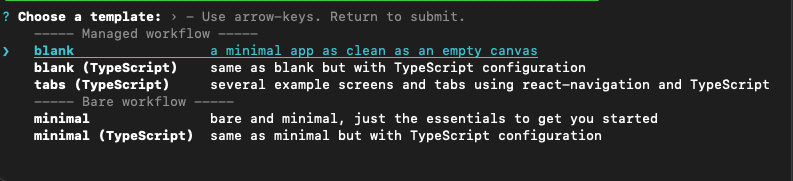
Step 3: You’ll be asked to choose a template. Select blank template.
Step 4: Now go to the project folder and run the below command to start the server.
cd "Your_Project_Name"
Step 5: Create a new file called CheckBox.js. This file is a custom component that we will use to display the checkbox.
touch CheckBox.js
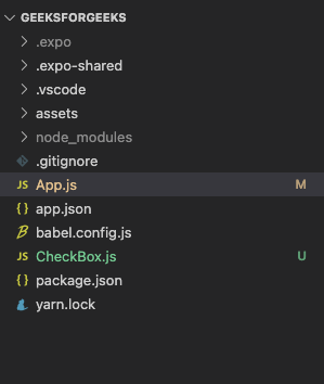
Project Structure: It will look like the following.
CheckBox.js file
Approach: We will create a custom component called CheckBox in React Native. We will write this code in the CheckBox.js file. And then we use this component at every place we want to use the checkbox.
In this example, we will create a custom CheckBox component. This component we will later use in the main App.js file.
Step 1: Open the CheckBox.js file that we have created earlier. Write below code in that file.
In this file, we will return a view with 2 components. It has one icon for the checkbox and a text for that checkbox. This custom CheckBox will take 3 props.
- title: Text for the checkbox.
- isChecked: Boolean value to show if the checkbox is checked or not. The icon of the checkbox will change according to the isChecked prop.
- onPress: A function that will be called when the user presses that checkbox.
CheckBox.js
import { Pressable, StyleSheet, Text, View } from "react-native";
import React from "react";
import { MaterialCommunityIcons } from "@expo/vector-icons";
const CheckBox = (props) => {
const iconName = props.isChecked ?
"checkbox-marked" : "checkbox-blank-outline";
return (
<View style={styles.container}>
<Pressable onPress={props.onPress}>
<MaterialCommunityIcons
name={iconName} size={24} color="#000" />
</Pressable>
<Text style={styles.title}>{props.title}</Text>
</View>
);
};
export default CheckBox;
const styles = StyleSheet.create({
container: {
justifyContent: "flex-start",
alignItems: "center",
flexDirection: "row",
width: 150,
marginTop: 5,
marginHorizontal: 5,
},
title: {
fontSize: 16,
color: "#000",
marginLeft: 5,
fontWeight: "600",
},
});
|
Step 2: Open the App.js file and write the below code in that file.
App.js is the main file that renders first when you run your app. In this file, we will use our custom CheckBox component. We will create 3 states for 3 checkboxes. Initially, it will have a boolean value of false. We assign this state to CheckBox’s isChecked property. We will also provide a title for each checkbox and a function to check/uncheck the specific checkboxes.
App.js
import { StyleSheet, View } from "react-native";
import { useState } from "react";
import CheckBox from "./CheckBox";
export default function App() {
const [music, setMusic] = useState(false);
const [dancing, setDancing] = useState(false);
const [reading, setReading] = useState(false);
return (
<View style={styles.container}>
<CheckBox
onPress={() => setMusic(!music)}
title="Music"
isChecked={music}
/>
<CheckBox
onPress={() => setDancing(!dancing)}
title="Dancing"
isChecked={dancing}
/>
<CheckBox
onPress={() => setReading(!reading)}
title="Reading"
isChecked={reading}
/>
</View>
);
}
const styles = StyleSheet.create({
container: {
flex: 1,
backgroundColor: "#fff",
justifyContent: "center",
alignItems: "center",
},
});
|
Output:
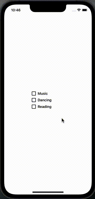
Custom CheckBox Component
This is how you can create a custom CheckBox component in React Native. You can reuse it as many times as you want. And you can customize it according to your requirement.
Like Article
Suggest improvement
Share your thoughts in the comments
Please Login to comment...