Column Charts provide advanced options that are not available with some other chart types such as trendlines and adding a secondary axis. This tutorial will walk you through the step-by-step process of creating a column chart in Microsoft Excel.
Column charts are used for making comparisons over time or illustrating changes. In the column chart, the horizontal bar shows categories, while the vertical bar shows values.
What is a Column Chart in Excel?
A Column Chart is a Chart in Excel that represents data in vertical columns. The height of the column represents the value for the specific data series in a chart. For comparing the column from left to right column chart can be used. Comparison can be easily seen when there is a single data series.
How to Create a Column Chart in Excel
To draw a column chart in Excel, you first need to have a table, whose values are required for displaying through the chart. So is our first step.
Step 1: Let’s have a scorecard of the previous match as our table and try to visualize it.

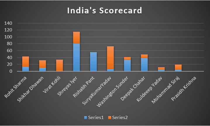
Let’s consider this as our desired table. Here the scorecard of India vs West Indies 3rd ODI 2022 is presented.
Step 2: Now, we have to represent this table in a form of a column chart. Then go to the “Insert” menu and select the desired chart or use all chart options (highlighted in sky color). If working on Excel 2013, then charts are under the design tab.

Step 3: You can find different table options there or can manually go see all charts which is the down arrow type button and go to all charts.

Step 4: Select the desired chart and click on OK. The chart will appear in the Excel sheet. You can customize the Excel as per your requirement. We have used Stacked Column as it is best suited for our data. You may use Clustered Column, Stacked Column, 100% Stacked Column, 3D Clustered Column, 3D Stacked Column, 3D 100% Stacked Column, and 3-D Column charts under the column chart option.
Our created charts look like this now:-

How to Customize the Column Chart in Excel
For customizing the Column Chart, click on the chart, and three pop-ups will appear, which can help you customize the tile chart title, axis title, colors used, styles, filters used, etc.
- Chart Title: Add a Descriptive title to the Chart to provide context for the data.
- Axis Labels: Label the X-axis and Y-axis so that it should be clearly understood the data categories and values.
- Data Labels: Display data labels on the Column Chart to give exact values.
- Legend: To identify each data series in the Chart customize the legend.
- Colors and Styles: You can change the colors and styles of the Columns to make the Chart visually engaging.
Let’s customize our chart as per requirement and have a better look.
Step 1: From here I have selected the axis title for more clarification, you can further go for any of the options available.
Step 2: Now, let’s change the style of the chart, for this, click on the brush just below the previous plus option.

I have selected my preferred style, you can choose any of them or can create a custom style from the color option.
Step 3: Now, the final thing is dealing with the filters, i.e., which data you want to show and which to hide. For this, go to the filter option just below the style menu.

Step 4: In this pop up If you will uncheck any then the particular data about them will be removed from the chart. We don’t require excluding any, so keep it as it is. Our final look at the chart is as below.

Here I have customized the titles and the style for a better look and clarification.
How to Choose a Column Chart in Excel
You can select the Column chart from the drop-down menu as per your requirement. The most commonly used ones are:
- Clustered Column: In this chart columns are displayed side by side, making it easy to compare values within each category.
- Stacked Column: Columns are stacked on top of each other, which shows the total value for each category highlighting the individual contributions of each data series.
- 100% Stacked Column: Columns are stacked to represent 100% of the value for each category, making it easier to compare the relative proportions of different data series.
How to Create Column Chart with Multiple Bars
To create a column chart with multiple bars in Excel, you can follow these steps using the following data:
Step 1: Prepare your Data
First, create a table with the data you want to visualize.
Step 2: Select the data
Highlight the whole data range, including both category labels.
Step 3: Insert the Column Chart
Go to the “Insert” tab on the Excel ribbon.
Click on the “CLustered Column” Chart icon in the ” Charts” Group. This will insert a column chart with multiple bars.
Step 4: Customize the Chart.
How to Make a Stacked Column Chart
Stacked column charts are excellent. Compared to clustered column charts, they play a slightly distinct function.
It was straightforward to compare the performance of players from various matches thanks to the clustered column charts.
We can compare the runs made by each player in various matches using the stacked column chart.
Click Insert > Insert Column or Bar Chart>Stacked Column using the exact same set of cells as in the preceding illustration.
-min.png)
Why are Column Charts so Useful
Some reasons why making column charts are so great:
- With column charts, a plethora of formatting options are accessible.
- In just a few keystrokes, a Column Chart can be created.
- They can be used to compare data, see progress toward a goal, percentage contributions, distribution of data, etc. They are incredibly flexible.
Conclusion
In this article, I’ve demonstrated how to create a column chart in Excel and make some common formatting adjustments. After that, we also discussed why column charts in Excel are helpful. I advise you to read more articles on Excel if you want to understand more. I appreciate your time and look forward to hearing from you soon!
FAQs on How to Create a Column Chart in Excel
Q1: What is a Column Chart in Excel?
Answer:
A Column Chart is a Chart in Excel that represents data in vertical columns. The height of the column represents the value for the specific data series in a chart. For comparing the column from left to right column chart can be used. Comparison can be easily seen when there is single data series.
Q2: How to create a basic column chart in Excel?
Answer:
To create a basic column chart in Excel, Follow the below steps:
Step 1: Prepare your data in a table format.
Step 2: Select the data you want to Visualize.
Step 3: Go to the “Insert” tab on the Excel Ribbon.
Step 4: In the charts group, click on the Column Chart icon.
Step 5: Choose the column chart type as per your need.
Q3: How to change the order of the Columns in the chart?
Answer:
To change the order of the Columns in the Chart, reorder the data series in your original data table. Excel will reflect the changes accordingly. Else you can right click on the chart and click on the Chart, choose the”select data”, and use the “Move up” or “Move down” to change the order of the data Series.
Q4: How to add data labels to specific columns in the Chart?
Answer:
If you want to Add data labels to specific columns in the chart follow the below steps:
Step 1: Right-click on the data series or individual columns.
Step 2: Choose “Add Data labels”, and the label will appear on the selected column only.
Like Article
Suggest improvement
Share your thoughts in the comments
Please Login to comment...