How to Color Scatter Plot Points in R ?
Last Updated :
26 Dec, 2022
A scatter plot is a set of dotted points to represent individual pieces of data in the horizontal and vertical axis. But by default, the color of these points is black and sometimes there might be a need to change the color of these points.
In this article, we will discuss how to change the color of points in scatterplot in the R Programming Language.
Method 1: Using plot()
The simple scatterplot is created using the plot() function.
Syntax: plot(x, y, main, xlab, ylab, xlim, ylim, axes)
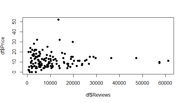
Let us first create a scatterplot without any color so that the difference is apparent.
Example:
R
df<-read.csv("bestsellers.csv")
plot(df$Reviews,df$Price,pch=16)
|
Output:
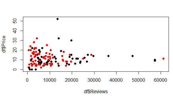
Now to change the colors of a scatterplot using plot(), simply select the column on basis of which different colors should be assigned to various points. Pass the column that will help differentiate between points to “col” attribute.
Example:
R
df<-read.csv("bestsellers.csv")
plot(df$Reviews,df$Price,pch=16,col=df$Genre)
|
Output:
Method 2: Using ggplot
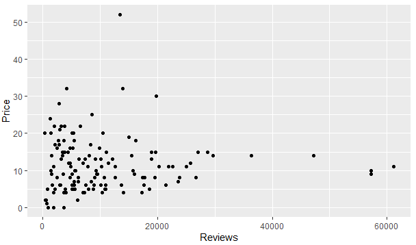
ggplot2 module supports geom_point() function that can help plot scatterplot. Let us first see how a scatterplot will appear without providing any mechanism for changing colors.
Example:
R
library("ggplot2")
df<-read.csv("bestsellers.csv")
ggplot(df,aes(x=Reviews,y=Price))+geom_point()
|
Output:
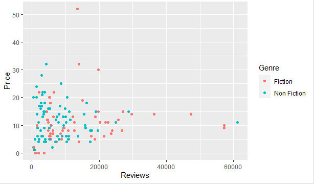
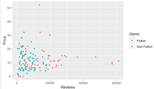
By using, ggplot there are various ways of adding colors to a scatterplot. Let us first discuss how colors are changed by default. For this simply pass the differentiating column to col attribute.
Example:
R
library("ggplot2")
df<-read.csv("bestsellers.csv")
ggplot(df,aes(x=Reviews,y=Price,col=Genre))+geom_point()
|
Output:
Another way of producing the same result is to provide the grouping column to group attribute and again to color in geom_point()
Example:
R
library("ggplot2")
df<-read.csv("bestsellers.csv")
ggplot(df,aes(x=Reviews,y=Price,group=Genre))+
geom_point(aes(color=Genre))
|
Output:
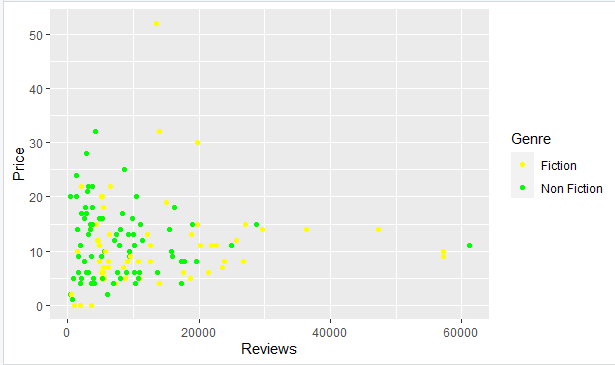
We can also add custom colors by using scale_color_manual() function with the list of colors to choose from.
Example
R
library("ggplot2")
df<-read.csv("bestsellers.csv")
ggplot(df,aes(x=Reviews,y=Price,group=Genre))+
geom_point(aes(color=Genre))+
scale_color_manual(values=c('Yellow','Green'))
|
Output:
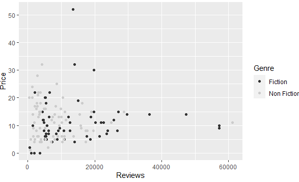
A scatterplot can also display colors only from grayscale, for this use scale_color_grey() function.
Example:
R
library("ggplot2")
df<-read.csv("bestsellers.csv")
ggplot(df,aes(x=Reviews,y=Price,group=Genre))+
geom_point(aes(color=Genre))+
scale_color_grey()
|
Output:
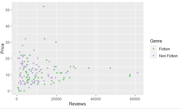
scale_color_brewer() function is also a method to add colors to a scatterplot. This function takes the name of the palette to pick colors from.
Example:
R
library("ggplot2")
df<-read.csv("bestsellers.csv")
ggplot(df,aes(x=Reviews,y=Price,group=Genre))+
geom_point(aes(color=Genre))+
scale_color_brewer(palette="Accent")
|
Output:
Share your thoughts in the comments
Please Login to comment...