How To Color a Scatter Plot by a Variable in Altair?
Last Updated :
12 Nov, 2020
Altair is a simple and easy to use statistical visualization library for python. It provides many types of visualizations ranging from simple bar charts to compound visualizations like box plots. Scatter Plot is one of the most useful visualizations in the Altair library for bivariate analysis and finding relationships between two data columns in a data set.
Getting Started
Sometimes a simple scatter plot is not enough to gauge the relationships between the variables in a data set. A better visualization would be a plot between two quantitative variables/data columns with respect to a third variable. This third variable is almost always a nominal or categorical variable. We can color the data points in the scatter plot using this third variable. Coloring the scatter plot will help us to recognize which data point corresponds to which category of the third variable.
To color to scatter plot, the user simply has to map a nominal variable from the dataset to the color encoding.
Let us understand the importance of scatter plot coloring using an example:
The Iris dataset is one of the most popular datasets used in Data Science and is available in most dataset libraries. The dataset documents the iris flowers across three species. The data columns available in the dataset are sepalLength, sepalWidth, petalLength, petalWidth and species. First, we will visualize this dataset using a simple scatter plot and then see what can be achieved by coloring this scatter plot.
To make a simple scatter plot, we use the iris dataset from the Vega_datasets library and pass it to the Chart object and use the mark_point() method. Then, we map the x and y-axis encoding to be sepalLength and petalLength variables.
The simple scatter plot using iris without coloring:
Python3
import altair as alt
from vega_datasets import data
iris = data.iris()
alt.Chart(iris).mark_point().encode(
x = 'sepalLength',
y = 'petalLength',
)
|
Output:
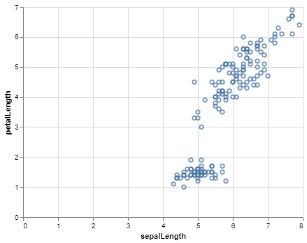
Scatter Plot for the Iris dataset without coloring
As you can see, we can infer from this scatter plot that one group of points is linearly separable from the other group but we can’t see which data points correspond to which species and what types of relationships are present. To make this plot more informative, we will color this scatter plot using the species variable.
Code:
Python3
import altair as alt
from vega_datasets import data
iris = data.iris()
alt.Chart(iris).mark_point().encode(
x = 'sepalLength',
y = 'petalLength',
color = 'species'
)
|
Output:
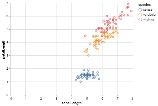
Scatter Plot for the Iris dataset with coloring
Altair automatically generates the legend specifying which color represents which category of the color variable. On seeing the colored data points, we can infer that the setosa species has long sepals but short petals. The versicolor species have almost equal and medium-sized petals and sepals whereas the virginica species also have almost equal but large-sized petals and sepals.
As you can see, we can extract more information by coloring a scatter plot.
Customizing Colors
If you don’t like the colors chosen by Altair for your scatter plot, you can customize the colors. The default colors can be changed using the scale argument of the Color class, By passing the Scale class to the scale argument. The available customizations are:
- Custom mapping of colors to discrete values: For custom mapping, we use domain and range parameters of the Scale and pass list for values and colors resp.
- Color Schemes: There are many color schemes given by the Vega project. If you like dark colors, you can use the ‘dark2’ scheme and if there are more than 10 categories you can use the ‘category20’ scheme.
Example 1: Custom mapping of colors to discrete values:
Python3
import altair as alt
from vega_datasets import data
cars = data.cars()
dom = ['Europe', 'Japan', 'USA']
rng = ['red', 'green', 'black']
alt.Chart(cars).mark_point().encode(
x='Miles_per_Gallon',
y='Horsepower',
color=alt.Color('Origin', scale=alt.
Scale(domain=dom, range=rng))
)
|
Output:
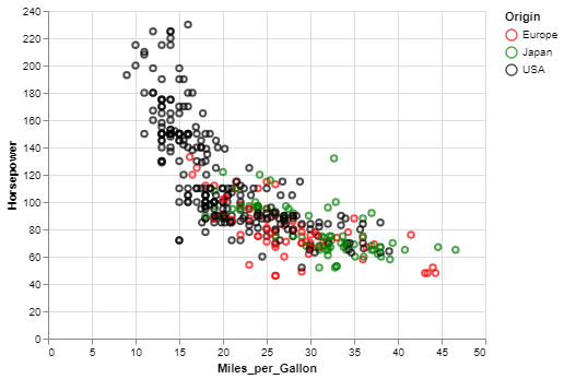
Scatter Plot for the cars dataset using custom mapping of colors and values
Example 2(Color Schemes):
Python3
import altair as alt
from vega_datasets import data
cars = data.cars()
alt.Chart(cars).mark_point().encode(
x='Miles_per_Gallon',
y='Horsepower',
color = alt.Color('Origin', scale=alt.
Scale(scheme = 'dark2'))
)
|
Output:
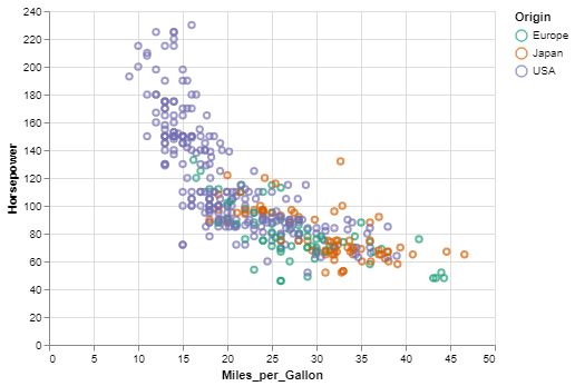
Scatter Plot for the cars dataset using color scheme
Like Article
Suggest improvement
Share your thoughts in the comments
Please Login to comment...