How to Choose the Best Colors For The User Interface?
Last Updated :
12 Jan, 2022
Coca-Cola, McDonald’s, Dell, Cafe Coffee day, Paytm, Starbucks….. What comes to your mind when you think about these famous services or brands… Maybe your favorite delicious food, gadgets, drinks, or maybe the iconic logo and color of these brands which they have used to make their products and services more attractive. Now read some interesting facts below…
Do you know that 85% of shoppers place color as a primary reason for why they buy a particular product?
Do you know that 80% increases in brand recognition when using color? Which means brand recognition directly links to consumer confidence.
Colors really play an important role in brand recognition and getting the attention of the customers for a specific service or product. Customers instantly make a judgement about any service or product thinking about the color used to represent the service and the product. It is directly connected with human emotions and it can create a positive or negative impact on users. According to the book, ‘Management decision’ by Satyendra Singh “People make up their minds within 90 seconds of their initial interactions with websites or products. About 62-90 percent of the assessment is based on colors alone.”
Now you might have understood that colors play a huge role in building trust, making consumers feel comfortable, and creating brand recognition. Colors you choose for the headline text to the color you pick for the background every color sets the mood for your website and what your brand says all about. Picking up the right color scheme and mixing them together is not an easy task, especially for those who are not confident about their color coordination ability and who aren’t deep into graphic designing. Now the question is… how to choose the appropriate color for the UI design? Let’s discuss some steps, tips, and techniques to choose the right color scheme for your website…
1. Choose Your Primary (Dominant) and Secondary Color
The primary color or the dominant color is the base color of your UI. Generally, designers choose the primary color from the logo of the website. Dominant color represents the brand of your website and it brings out certain emotion when a user visits on your website or think about your services and product. When you think about Coca-Cola the color red comes to your mind and that triggers emotional responses like excitement, boldness, love, and passion for coke. As a rule of thumb, experts recommend that you should not use more than three primary colors in your UI.
Apart from the primary color, designers use secondary color on the website. Using secondary color is optional but it makes your UI more attractive and provides the opportunity to differentiate your products.
How to choose the right dominant color?
Are you trying to attract younger, more energetic customers or the kids between the age group of 5-15 years? Are you trying to sell some beauty and anti-aging products or your services are related to games and technology? You need to ask yourself what is your brand represents and what emotions or feelings do you associate with your brand? Every color is associated with different emotions and feelings and different colors attract different types of customers. Consider certain factors like age, gender, and the target audience. Keep in mind the psychological role of colors in UI design and choose the color according to that. Below are some short meanings of colors…
- Red: Love, confidence, passion, power and anger. It is often used to create urgency for people to buy. Example: Coca-Cola, Zomato, Target, Netflix.
- Orange: Friendliness, enthusiasm, creativity, uniqueness autumn. It’s usually a warm and vibrant color and promotes people to take action: buy and subscribe. Use this color when you’re trying to set a warm and inviting atmosphere for your customer. Example: Amazon, Payless, Crush Soda.
- Yellow: Warning, youthfulness, happiness, optimism, cheerfulness, sunlight, joy, warmth or wealth, in a golden shade. Example: McDonald’s, Hertz, National Geographic, Nikon
- Green: Nature, luck, wealth, health, cleanliness, growth, harmony, endurance, renewal. Example: Tropicana, Animal Planet, Organic India, Whole foods.
- Blue: Sadness, calm, reliability, trust, corporate, communication, loyalty, inner security. Often used in IT services, businesses, and banks to create a sense of security and trust in the brand. Example: Dell, Facebook, LinkedIn, Twitter, American Express, Oral-B.
- Purple: Royalty, creativity, wealth, success, wisdom, mystery and magic, spirituality. Mostly used in beauty and anti-aging products. Example: Cadbury, Qatar Airways, Thai Airways, Crown Royal.
- Pink: Feminine, romance, sweetness, innocence, sensitivity. Often used to provide the service to women or young girls. Example: Pink victoria secret, Barbie, Lyft.
- Black: Elegance, power, luxury, strength, mystery. Example: L’Oréal Paris, Under Armour, Channel.
- Grey: Conservative, simplicity, neutral, modernity, calm, logic, futuristic, luxury. Often used for technology, industry, precision, competence, and sophistication. Example: Apple, Mercedes-Benz, Bosch.
The above meaning of colors helps in choosing the dominant color for your website. In short, you need to take care of certain factors like age, gender (male or female), and the emotions which you want to reflect through your website.
2. Accent Colors
Accent colors are generally used to highlight the UI elements such as progress bar, buttons, quotes, subtitles, links, headlines, sliders, switches, and some important information.
Choosing an accent color is not an easy task, it should blend well together with other colors used on the website. You should have a good understanding of color theory. Accent colors have generally more saturation and brightness and that encourages user interaction. Below is an example of material UI where the accent color is used in the floating action button.

Image Source – Google Analytics
You can easily find the accent color using some color matching tools like Adobe Color CC Tool.
3. Background or Neutral Colors
Neutral colors or the background colors are generally used for the text or the background of the website. A user should feel comfortable when he/she sees the background color of the website. Imagine you enter a room and you notice the color of the wall. The color of the wall should not be overwhelming and it should be soothing enough that you can spend hours in the room and gives you the feeling of relaxation. Choosing this color is also a tricky game because if you choose the wrong color then it can make the reverse impact and the room may also give the feeling of boredom or dullness.
Choose the background color depends on what you want your visitors to focus on or the purpose of your website. For example, e-commerce companies generally use a white or grey background color with bold dominant & accent colors. why? because their main focus is to promote ideas or products rather than the design of the website. Light or neutral background colors help in making the content more visible and readable. There is no rule for the background color used in fashion, design, restaurant, beauty, and creative industries. You can use the black menu bar or you can also use colors of the rainbow to create an inspirational background image. You’re free here and you can choose any color but while choosing the color make sure that the text or content shouldn’t be hard to read.
4. Semantic Colors
Semantic colors are generally used to deliver information such as warning, danger, success, and error. These colors are generally reserved colors that UI designers use in the websites. Red is used for errors, green for success, yellow for warning, and blue for informational messages.
Tips
In the end, we want to give some tips that will help you in choosing the right color scheme for your website…
1. 60–30–10 Rule: This rule come from the interior design where the colors should be combined as 60% is dominant hue, 30% is secondary color and 10% is for accent color.
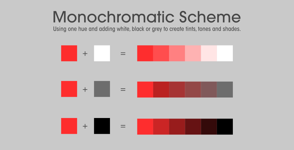
2. Consider how colors work together: You need to understand the color combination that amazingly blends well together. To create a pleasant and harmonious color combination you can use traditional color scheme patterns, like analogous, monochromatic, and complementary. The rule of using these color schemes is built upon Chromatic Circle or Color Wheel which is a useful tool to create color combinations.

- Monochromatic color schemes uses variations (shades) of a single hue and it is made up of different tones, shades, and tints.
- Complementary schemes created by uniting colors from the opposite sides of the color wheel. These schemes uses only two colors but you can expand it using different shades, tints and tones.
- Analogous color schemes are created by using three different colors present next to each other on the color wheel.
- Triadic colors can be obtained by overlapping an equilateral triangle to the Chromatic Circle
- Split-complementary colors can be obtained by matching the main color to the two colors adjacent to its complementary.
- Square colors can be obtained by overlapping a square to the Chromatic Circle.
- Take inspiration from nature: People always feel comfortable when they connect themselves with nature. People loves to enjoy sunset, dawns, autumns, forest or mountains. The best color combination come from nature. You can find the color combination and design solution for your website if you pay attention to your environments and surroundings.
- Don’t forget cultural differences: Every culture has their own tradition and belief so before you choose any color combination make sure that they will be interpreted the way you mean. One color may have different meanings in different countries so keep in mind the cultural differences while choosing the color for your website.
Like Article
Suggest improvement
Share your thoughts in the comments
Please Login to comment...