How to Change X and Y Axis Values from Real to Integers in ggplot2 in R
Last Updated :
23 Sep, 2021
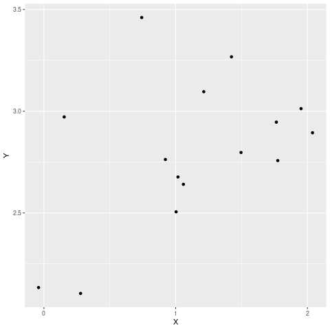
In this article, we will discuss how to change X and Y-Axes values from Real to Integers using ggplot2 in the R programming language. Let us first create a plot that contains Real values on axes and then change them to integers so that the difference will be apparent.
Example: Initial plot
R
library(dplyr)
library(ggplot2)
set.seed(10)
df <- data.frame(X = rnorm(15,mean=1.199, sd=0.7622377),
Y =(rnorm(15,mean=3.057, sd= 0.4358663)))
df %>%
ggplot(aes(x = X, y = Y)) +
geom_point()
|
Output:

As you can see in the above code, the values of the X and Y axes are Real. Now let us look at various methods by which these can be changed to integer values.
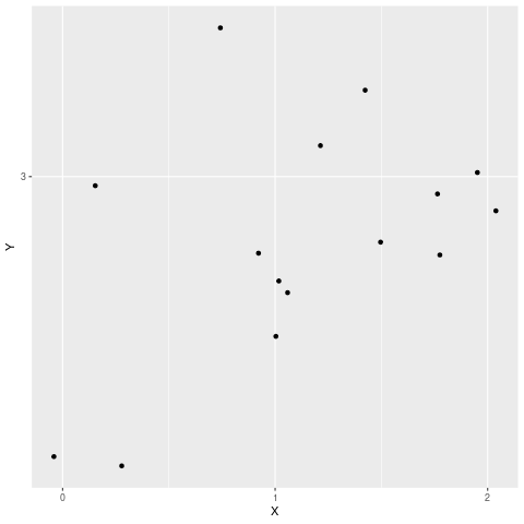
Method 1: Change values of X-axis to Integer
To change real axis values to integer we can use scale_x_continuous() or scale_y_continuous() functions to fix x-axis and y-axis respectively. By passing appropriate interval values to break argument the job can be done.
Syntax: scale_x_continuous(breaks =c(b1,b2,b3….bn))
Parameters:
breaks: this specifies at what intervals the value should be displayed
b1,b2,b3…bn: these values specifies each intervals
Example: Changing real values on x-axis to integer
R
library(dplyr)
library(ggplot2)
set.seed(10)
df <- data.frame(X = rnorm(15,mean=1.199, sd=0.7622377),
Y =(rnorm(15,mean=3.057, sd= 0.4358663)))
df %>%
ggplot(aes(x = X, y = Y)) +
geom_point()+
scale_x_continuous(breaks =c(0,1,2))
|
Output:
Similarly, both values can be changed if both the functions are called together.
Syntax:
scale_y_continuous(breaks =c(b1,b2,b3,…bn))+ scale_x_continuous(breaks =c(b1,b2,b3,…bn))
Example: Changing values for both axes
R
library(dplyr)
library(ggplot2)
set.seed(10)
df <- data.frame(X = rnorm(15,mean=1.199, sd=0.7622377),
Y =(rnorm(15,mean=3.057, sd= 0.4358663)))
df %>%
ggplot(aes(x = X, y = Y)) +
geom_point()+
scale_x_continuous(breaks =c(0,1,2))+
scale_y_continuous(breaks =c(3))
|
Output:
Method 2: Using a custom function
Here we will write a custom function that carries the task of converting real values to Integers. In the previous approaches we have to manually provide the intervals, however, in this approach, our function automatically determines the intervals. This function internally uses the pretty() function which produces rounded intervals.
Syntax:
function(e, num) pretty(e, num)[round(pretty(e, num),1) %% 1 == 0]
Example: Custom function to change axis values
R
library(dplyr)
library(ggplot2)
set.seed(10)
df <- data.frame(X = rnorm(15,mean=1.199, sd=0.7622377),
Y =(rnorm(15,mean=3.057, sd= 0.4358663)))
custom_breaks <- function(e, num = 5) pretty(e, num)
[round(pretty(e, num),1) %% 1 == 0]
df %>%
ggplot(aes(x = X, y = Y)) +
geom_point()+
scale_x_continuous(breaks = custom_breaks)+
scale_y_continuous(breaks = custom_breaks)
|
Output:

Like Article
Suggest improvement
Share your thoughts in the comments
Please Login to comment...