How to change ticks label sizes using Python’s Bokeh?
Last Updated :
25 Feb, 2021
Bokeh is an interactive data plotting visualization library for modern web browsers. It provides elegant, concise construction of versatile graphics, and affords high-performance interactivity over large or streaming datasets.
In this article, we are going to discuss How to change ticks label sizes using Python’s Bokeh.
Step-by-step Approach:
- Now to plot any dataset using bokeh, the easiest way is to import the ‘figure’ and ‘show’ functions from the plotting class. The others are optional imports that help customize the graph.
- Create a figure object, that is going to plot the values from our provided dataset onto the graph.
- Now the ‘plot’ variable is going to be our figure object with a width of 700px and a height of 500px.
- Bokeh also gives us the ability to customize each axis.
- Assign or create a dataset.
- No use label_text_font_size attribute decides the size of the tick label.
- Finally, depict the visualization.
Below are some examples based on the above approach:
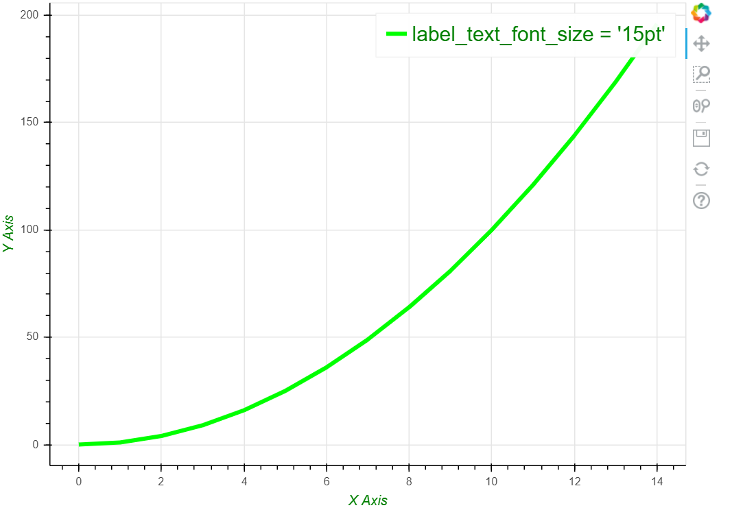
Example 1:
Python3
from bokeh.plotting import figure, show
from bokeh.models import Legend
plot = figure(plot_width=700, plot_height=500)
plot.xaxis.axis_label = "X Axis"
plot.xaxis.axis_label_text_color = "green"
plot.yaxis.axis_label = "Y Axis"
plot.yaxis.axis_label_text_color = "green"
x = list(range(15))
y = [i**2 for i in x]
plot.line(x, y, line_width=4, line_color='lime',
legend_label="label_text_font_size = '15pt'")
plot.legend.label_text_font_size = "15pt"
plot.legend.label_text_color = "green"
show(plot)
|
Output:
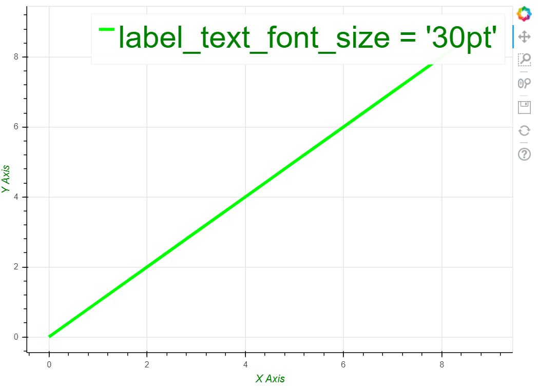
Example 2:
Python3
from bokeh.plotting import figure, show
from bokeh.models import Legend
from math import sin
plot = figure(plot_width=700, plot_height=500)
plot.xaxis.axis_label = "X Axis"
plot.xaxis.axis_label_text_color = "green"
plot.yaxis.axis_label = "Y Axis"
plot.yaxis.axis_label_text_color = "green"
x = y = list(range(10))
plot.line(x, y, line_width=4, line_color='lime',
legend_label="label_text_font_size = '30pt'")
plot.legend.label_text_font_size = '30pt'
plot.legend.label_text_color = "green"
show(plot)
|
Output:
Like Article
Suggest improvement
Share your thoughts in the comments
Please Login to comment...