How to Change the Color of a Graph Plot in Matplotlib with Python?
Last Updated :
12 Nov, 2020
Prerequisite: Matplotlib
Python offers a wide range of libraries for plotting graphs and Matplotlib is one of them. Matplotlib is simple and easy to use a library that is used to create quality graphs. The pyplot library of matplotlib comprises commands and methods that makes matplotlib work like matlab. The pyplot module is used to set the graph labels, type of chart and the color of the chart. The following methods are used for the creation of graph and corresponding color change of the graph.
Syntax: matplotlib.pyplot.bar(x, height, width, bottom, align, **kwargs)
Parameter:
- x : sequence of scalers along the x axis
- height : sequence of scaler determining the height of bar ie y-axis
- width : width of each bar
- bottom : Used to specify the starting value along the Y axis.(Optional)
- align : alignment of the bar
- **kwargs : other parameters one of which is color which obviously specifies the color of the graph.
Return Value: Returns the graph plotted from the specified columns of the dataset.
In this article, we are using a dataset downloaded from kaggel.com for the examples given below. The dataset used represent countries against the number of confirmed covid-19 cases. The dataset can be downloaded from the given link:
Link to the dataset: Corona virus report
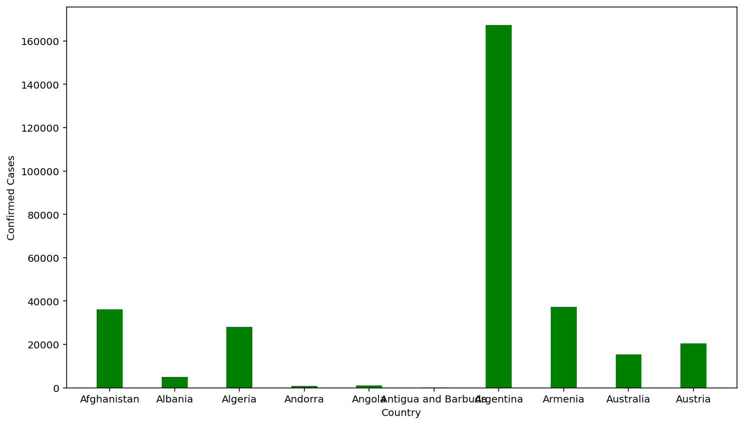
Example 1:
Python3
import pandas as pd
import matplotlib
import matplotlib.pyplot as plt
df = pd.read_csv('country_wise_latest.csv')
country = df['Country/Region'].head(10)
confirmed = df['Confirmed'].head(10)
plt.xlabel('Country')
plt.ylabel('Confirmed Cases')
plt.bar(country, confirmed, color='green', width=0.4)
plt.show()
|
Output
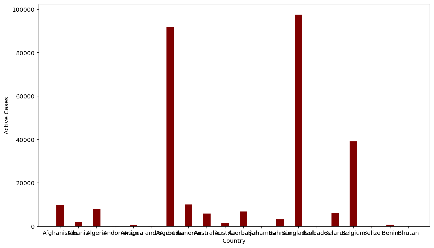
Example 2:
Python3
import pandas as pd
import matplotlib
import matplotlib.pyplot as plt
df = pd.read_csv('country_wise_latest.csv')
country = df['Country/Region'].head(20)
confirmed = df['Active'].head(20)
plt.xlabel('Country')
plt.ylabel('Active Cases')
plt.bar(country, confirmed, color='maroon', width=0.4)
plt.show()
|
Output
Like Article
Suggest improvement
Share your thoughts in the comments
Please Login to comment...