How to change colorbar labels in matplotlib ?
Last Updated :
29 Dec, 2021
In this article, we are going to see how to change color bar labels in matplotlib using Python.
The colorbar() function is used to plot the color bar which belongs to the pyplot module of matplotlib adds a colorbar to a plot indicating the color scale.
Syntax: matplotlib.pyplot.colorbar(mappable=None, cax=None, ax=None, **kwarg)
Parameters:
- ax: This parameter is an optional parameter and it contains Axes or list of Axes.
- **kwarg(keyword arguments): This parameter is an optional parameter and are of two kinds:
- colorbar properties:
- extend:{‘neither’, ‘both’, ‘min’, ‘max’} makes pointed end(s) for out-of-range values.
- label:The label on the colorbar’s long axis.
- ticks:None or list of ticks or Locator.
Returns:colorbar which is an instance of the class ‘matplotlib.colorbar.Colorbar’.
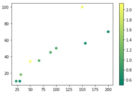
Create a simple colorbar for demonstration
To create the colorbar we will use color() methods, for this, we will create the dataset and then use a scatterplot for demonstration.
Python3
import numpy as np
import matplotlib.pyplot as plt
purchaseCount = [100, 200, 150, 23, 30, 50,
156, 32, 67, 89]
likes = [50, 70, 100, 10, 10, 34, 56, 18, 35, 45]
ratio = [1, 0.53, 2, 0.76, 0.5, 2.125, 0.56,
1.28, 1.09, 1.02]
plt.scatter(x=purchaseCount, y=likes, c=ratio, cmap="summer")
plt.colorbar()
plt.show()
|
Output:
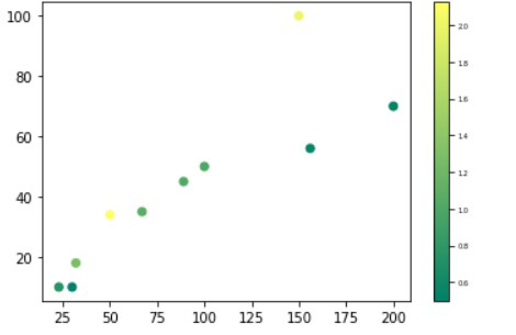
Method 1: Change labels font size in a color label
To change the label’s font size we will use ax.tick_params() methods which increase the font of the labels.
Python3
import numpy as np
import matplotlib.pyplot as plt
purchaseCount = [100, 200, 150, 23, 30, 50,
156, 32, 67, 89]
likes = [50, 70, 100, 10, 10, 34, 56, 18, 35, 45]
ratio = [1, 0.53, 2, 0.76, 0.5, 2.125, 0.56,
1.28, 1.09, 1.02]
plt.scatter(x=purchaseCount, y=likes, c=ratio,
cmap="summer")
plt.colorbar().ax.tick_params(labelsize=10)
plt.show()
|
Output:
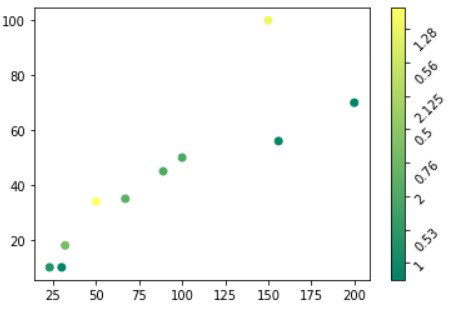
Method 2: Change and Rotate the position of the label
To rotate the colorbar labels we will use set_xticklabels() and set_yticklabels() methods for horizontal and vertical.
Example 1: Changing position horizontally
Python3
import numpy as np
import matplotlib.pyplot as plt
purchaseCount = [100, 200, 150, 23, 30, 50,
156, 32, 67, 89]
likes = [50, 70, 100, 10, 10, 34, 56, 18, 35, 45]
ratio = [1, 0.53, 2, 0.76, 0.5, 2.125, 0.56,
1.28, 1.09, 1.02]
plt.scatter(x=purchaseCount, y=likes, c=ratio,
cmap="summer")
plt.colorbar().ax.set_ylabel('Label',
rotation=120)
plt.show()
|
Output:
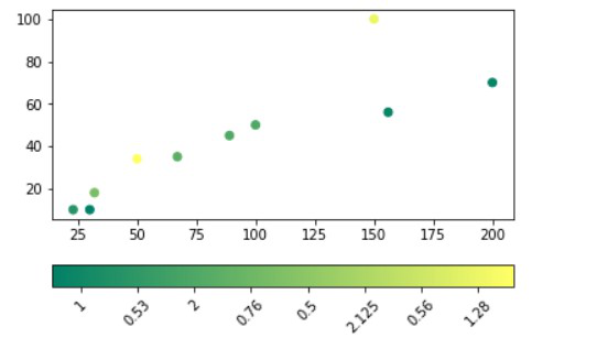
Example 2: Changing position vertically
Python3
import numpy as np
import matplotlib.pyplot as plt
purchaseCount = [100, 200, 150, 23, 30, 50,
156, 32, 67, 89]
likes = [50, 70, 100, 10, 10, 34, 56, 18, 35, 45]
ratio = [1, 0.53, 2, 0.76, 0.5, 2.125, 0.56,
1.28, 1.09, 1.02]
plt.scatter(x=purchaseCount, y=likes, c=ratio, cmap="summer")
plt.colorbar(orientation="horizontal").ax.set_xticklabels(ratio, rotation=45)
plt.show()
|
Output:
Like Article
Suggest improvement
Share your thoughts in the comments
Please Login to comment...