How to apply multiple transform property to an element using CSS ?
Last Updated :
31 Dec, 2019
There is a variety of procedures to apply multiple transform property in an element. In this article we will discuss the easiest and popular ones. In the 1st method we will be combining the transform property itself. In the 2nd method, we will use the nested classes to apply other transforms.
Method 1: In this method, we will combine the transform property. The transform property can be given multiple values that are applied one after another. It applies the rightmost value and then the ones on the left, which means that the value which is last in the list would be applied first. This is important as changing the order of the values would change the overall result of the property.
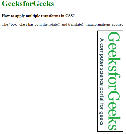
- Example: In this example we will apply both the transform property on the loaded image, one will rotate the image and another one will shift the image.
<!DOCTYPE html>
<html>
<head>
<style>
body {
margin: 20px;
}
.box {
background: url(
no-repeat;
background-size: cover;
height: 100px;
width: 400px;
border: 2px solid black;
/* The transformations are
applied from right to left */
transform: rotate(90deg)
translate(150px, -230px);
}
h1 {
color: green;
}
</style>
</head>
<body>
<h1>
GeeksforGeeks
</h1>
<b>
How to apply multiple transforms in CSS?
</b>
<p>
The "box" class has both the rotate() and
translate() transformations applied.
</p>
<div class="box"></div>
</body>
</html>
|
- Output:
Method 2: Here we are using nested classes to apply other transforms. This method works by nesting one element with a certain transform with another one with another transform. This can be repeated with multiple nesting of elements to apply multiple transforms. The topmost element, that is the parent of the nested elements would be applied first and then subsequently each of the children’s transforms would be applied next.
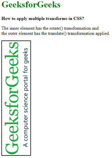
- Example: In this example, we will apply both the transform property on the loaded image one will rotate the image and another one will shift the image.
<!DOCTYPE html>
<html>
<head>
<style>
.outer-transform {
/* This transformation
will be applied first */
transform: translate(-150px, 150px);
}
.inner-transform {
background: url(
no-repeat;
background-size: cover;
height: 100px;
width: 400px;
border: 2px solid black;
/* This transformation
would be applied next */
transform: rotate(-90deg);
}
</style>
</head>
<body>
<h1 style="color: green;">
GeeksforGeeks
</h1>
<b>
How to apply multiple transforms in CSS?
</b>
<p>
The inner element has the rotate() transformation and
<br> the outer element has the translate() transformation
applied.
</p>
<div class="outer-transform">
<div class="inner-transform"></div>
</div>
</body>
</html>
|
- Output:
Like Article
Suggest improvement
Share your thoughts in the comments
Please Login to comment...