How To Annotate a Plot with Circle in R
Last Updated :
17 Oct, 2021
In this article, we will discuss how to Annotate a Plot with Circle in R Programming Language. We can do by using ggplot2 package
Aesthetic mappings can be created to the plot object to determine the relationship between the x and y axis respectively. Additional components can be added to the created ggplot object.
Syntax:
ggplot(data = NULL, mapping = aes())
Parameters :
- data – Default dataset to use for plot.
- mapping – List of aesthetic mappings to use for plot.
Geoms can be added to the plot to compute various graphical representations of the data in the plot (points, lines, bars). The geoms may also be specified with the additional mappings, like color to differently color the points pertaining to different groups.
Syntax:
geom_point(aes(color = ))
Annotating a plot with a circle is used to highlight a specific portion of the plot in R. A circle at a specific location and radius can be added to the existing scatter plot in R.
The geom_circle() method in ggforce package annotates the plot with the circle at the given location. It takes as input the x and y coordinates as the center and the radius to annotate a circle around the plot.
Syntax:
geom_circle( mapping , inherit.aes )
Parameters :
- mapping – Set of aesthetic mappings for the method
- inherit.aes – Indicator of whether to inherit default mappings
Example:
R
library("ggplot2")
library("ggforce")
df < - data.frame(col1=sample(rep(c(1, 20, 40), each=26)),
col2=sample(rep(c(1: 6), each=13))
)
ggplot(df, aes(x=col1, y=col2)) +
geom_point(aes(color=factor(col1)))+
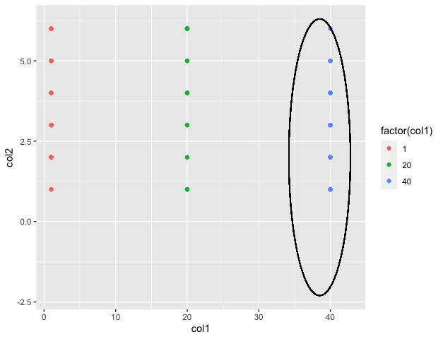
geom_circle(aes(x0=38.5, y0=2, r=4.3),
inherit.aes=FALSE)
|
Output
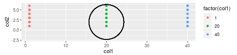
Example: The coord_fixed() method can be added in order to fix the aspect ratio of the plot
R
library("ggplot2")
library("ggforce")
df < - data.frame(col1=sample(rep(c(1, 20, 40), each=26)),
col2=sample(rep(c(1: 6), each=13))
)
ggplot(df, aes(x=col1, y=col2)) +
geom_point(aes(color=factor(col1)))+
geom_circle(aes(x0=20, y0=2, r=4.3),
inherit.aes=FALSE)+
coord_fixed()
|
Output
Like Article
Suggest improvement
Share your thoughts in the comments
Please Login to comment...