How to animate a straight line in linear motion using CSS ?
Last Updated :
27 Apr, 2020
The linear motion of a straight line means the line will start from one point, goes to the second point, and then came back to the starting point. It is a kind of to and from motion. We will be doing it using CSS only.
Approach: The approach is to first create a straight line and then animate it using keyframes. It will be done in a two-step. First for forwarding movement and second for backward movement. The below code will follow the same approach.
HTML: In HTML, we have created a div element that is used to make a straight line.
<!DOCTYPE html>
<html lang="en">
<head>
<meta charset="UTF-8" />
<meta name="viewport" content=
"width=device-width, initial-scale=1.0" />
<title>GeeksforGeeks</title>
</head>
<body>
<div class="geeks"></div>
</body>
</html>
|
CSS:
- Create a straight line by providing minimum height and width of your preference.
- Animate this straight line using before selector and provide it a linear animation with keyframes identifier named as animate.
- The animation for keyframes is very simple. For the first half-frames make width 100%(forward movement) and then reduce it to 0%(backward movement) for the next half frames.
<style>
body {
margin: 0;
padding: 0;
background: green;
}
.geeks {
width: 400px;
height: 2px;
background: #fff;
position: absolute;
top: 50%;
left: 50%;
transform: translate(-50%, -50%);
}
.geeks::before {
content: "";
position: absolute;
top: 0;
left: 0;
width: 100%;
height: 100%;
background: green;
animation: animate 5s linear infinite;
}
@keyframes animate {
0% {
left: 0;
}
50% {
left: 100%;
}
0% {
left: 0;
}
}
</style>
|
Complete Code: In this section, we will combine both HTML and CSS code to make a straight line animation effect.
<!DOCTYPE html>
<html lang="en">
<head>
<meta charset="UTF-8" />
<meta name="viewport" content=
"width=device-width, initial-scale=1.0" />
<title>
How to animate a straight
line in linear motion?
</title>
<style>
body {
margin: 0;
padding: 0;
background: green;
}
.geeks {
width: 400px;
height: 2px;
background: #fff;
position: absolute;
top: 50%;
left: 50%;
transform: translate(-50%, -50%);
}
.geeks::before {
content: "";
position: absolute;
top: 0;
left: 0;
width: 100%;
height: 100%;
background: green;
animation: animate 5s linear infinite;
}
@keyframes animate {
0% {
left: 0;
}
50% {
left: 100%;
}
0% {
left: 0;
}
}
</style>
</head>
<body>
<div class="geeks"></div>
</body>
</html>
|
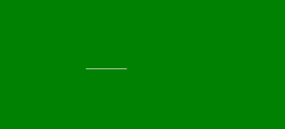
Output:
Share your thoughts in the comments
Please Login to comment...