How to align flexbox columns left and right using CSS ?
Last Updated :
28 Jan, 2020
The flex columns can be aligned left or right by using the align-content property in the flex container class. The align-content property changes the behavior of the flex-wrap property. It aligns flex lines. It is used to specify the alignment between the lines inside a flexible container.
- For aligning columns to the left, the align-content property will set to ‘flex-start’.
- For aligning columns to the right, the align-content property will set to ‘flex-end’.
- For aligning columns to the extreme ends, the align-content property will set to ‘space-between’.
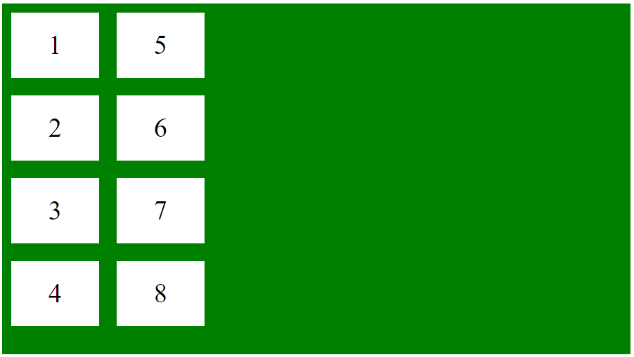
Example 1: This example display the flex box into the columns.
<!DOCTYPE html>
<html>
<head>
<style>
.flex-container {
display: flex;
height:400px;
flex-flow: column wrap;
background-color: green;
}
.flex-container > div {
background-color: #fff;
width: 100px;
margin: 10px;
text-align: center;
line-height: 75px;
font-size: 30px;
}
</style>
</head>
<body>
<div class="flex-container">
<div>1</div>
<div>2</div>
<div>3</div>
<div>4</div>
<div>5</div>
<div>6</div>
<div>7</div>
<div>8</div>
</div>
</body>
</html>
|
Output:

Example 2: This example align the flex box columns into the left.
<!DOCTYPE html>
<html>
<head>
<style>
.flex-container {
display: flex;
height:400px;
flex-flow: column wrap;
background-color: green;
align-content: flex-start;
}
.flex-container > div {
background-color: #fff;
width: 100px;
margin: 10px;
text-align: center;
line-height: 75px;
font-size: 30px;
}
</style>
</head>
<body>
<div class="flex-container">
<div>1</div>
<div>2</div>
<div>3</div>
<div>4</div>
<div>5</div>
<div>6</div>
<div>7</div>
<div>8</div>
</div>
</body>
</html>
|
Output:
Example 3: This example align the flex box columns into right.
<!DOCTYPE html>
<html>
<head>
<style>
.flex-container {
display: flex;
height:400px;
flex-flow: column wrap;
background-color: green;
align-content: flex-end;
}
.flex-container > div {
background-color: #fff;
width: 100px;
margin: 10px;
text-align: center;
line-height: 75px;
font-size: 30px;
}
</style>
</head>
<body>
<div class="flex-container">
<div>1</div>
<div>2</div>
<div>3</div>
<div>4</div>
<div>5</div>
<div>6</div>
<div>7</div>
<div>8</div>
</div>
</body>
</html>
|
Output:

Example 3: This example align the flex box into both end points.
<!DOCTYPE html>
<html>
<head>
<style>
.flex-container {
display: flex;
height:400px;
flex-flow: column wrap;
background-color: green;
align-content: space-between;
}
.flex-container > div {
background-color: #fff;
width: 100px;
margin: 10px;
text-align: center;
line-height: 75px;
font-size: 30px;
}
</style>
</head>
<body>
<div class="flex-container">
<div>1</div>
<div>2</div>
<div>3</div>
<div>4</div>
<div>5</div>
<div>6</div>
<div>7</div>
<div>8</div>
</div>
</body>
</html>
|
Output:

Like Article
Suggest improvement
Share your thoughts in the comments
Please Login to comment...