How to add text to Matplotlib?
Last Updated :
16 Feb, 2022
Matplotlib is a plotting library in Python to visualize data, inspired by MATLAB, meaning that the terms used (Axis, Figure, Plots) will be similar to those used in MATLAB. Pyplot is a module within the Matplotlib library which is a shell-like interface to Matplotlib module.
It provides almost any kind of plot that we can think of. In this post, we will focus on a more specific topic which is adding text on matplotlib plot. The following commands are used to create text in the matplotlib plot.
| Commands |
Description |
| text |
This is used for adding text at an arbitrary location of the Axes. |
| annotate |
This is used for adding an annotation, with an optional arrow, at an arbitrary location of the Axes. |
| set_xlabel |
This is used for adding label to the Axes’ x-axis. |
| set_ylabel |
This is used for adding label to the Axes’ y-axis. |
| set_title |
This is used for adding title to the Axes. |
| text |
This is used for adding text at an arbitrary location of the Figure. |
| suptitle |
This is used for adding title to the Figure. |
We will see each of the commands one by one, first, let’s create a basic plot of Day v/s Question on which we will add various text objects.
Code:
Python3
import matplotlib.pyplot as plt
x = [1, 2, 3, 4, 5]
y = [5, 8, 4, 7, 5]
fig = plt.figure()
ax = fig.add_subplot(111)
ax.plot(x, y)
plt.show()
|
Output:
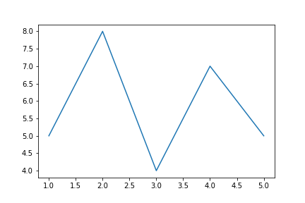
The output plot looks very simple. Now, let’s see some text commands to add it on our plot.
- set_title() is used to add the title of axes. The first and mandatory argument is the title you want to give and the rest are optional to format it.
- Similarly, set_xlabel() and set_ylabel() are used to add titles to x-axis and y-axis. It also takes title as an argument.
It is better to adjust the range on y-axis so that we can have some space to add text later on. For this, we will use ax.axis() which allows specifying value ranges (the first two for x-axis and the other two for y-axis).
Now, let’s add its title and names of x-axis and y-axis.
Code:
Python3
ax.set_title('Day v/s No of Questions on GFG', fontsize=15)
ax.set_xlabel('Day', fontsize=12)
ax.set_ylabel('No of Questions', fontsize=12)
ax.axis([0, 10, 0, 15])
|
Output:
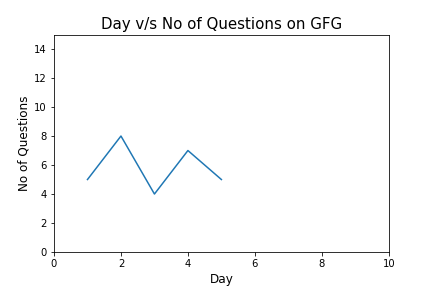
Now, it looks better than the previous version. It’s the time to add text to our plot. First, let’s see about them.
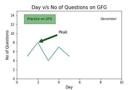
axes.text() is used to add text at an arbitrary location of the Axes. For this we need to specify the location of the text and of course what the text is. For instance, the following code will add “Practice on GFG” text. It will located according to the point whose coordinates are specified ([1,13] in this case). The parameter bbox is used to capture the text with a box. As argument to bbox parameter, we pass a dictionary which includes formatting styles.
Code:
Python3
ax.text(1, 13, 'Practice on GFG', style='italic', bbox={
'facecolor': 'grey', 'alpha': 0.5, 'pad': 10})
|
If we want to do not have to box the text then simply do not assign anything to the bbox parameter. The following code adds the specified text without a box.
Code:
Python3
ax.text(8, 13, 'December', style='italic')
|
We can also add text with annotations.
axes.annotate() is used to add an annotation, with an optional arrow, at an arbitrary location of the Axes. Its xy parameter contains the coordinates for arrow and xytext parameter specifies the location of the text. Arrowprops parameter is used to style the arrow.
For instance, we can mark the peak value of the Day-Question data with an annotation.
Code:
Python3
ax.annotate('Peak', xy=(2, 8), xytext=(4, 10), fontsize=12,
arrowprops=dict(facecolor='green', shrink=0.05))
|
Let’s put all this together and see the final code.
Code:
Python3
import matplotlib.pyplot as plt
x = [1, 2, 3, 4, 5]
y = [5, 8, 4, 7, 5]
fig = plt.figure()
ax = fig.add_subplot(111)
ax.plot(x, y)
ax.set_title('Day v/s No of Questions on GFG', fontsize=15)
ax.set_xlabel('Day', fontsize=12)
ax.set_ylabel('No of Questions', fontsize=12)
ax.axis([0, 10, 0, 15])
ax.text(1, 13, 'Practice on GFG', style='italic', bbox={
'facecolor': 'green', 'alpha': 0.5, 'pad': 10})
ax.text(8, 13, 'December', style='italic')
ax.annotate('Peak', xy=(2, 8), xytext=(4, 10), fontsize=12,
arrowprops=dict(facecolor='green', shrink=0.05))
plt.show()
|
Output:
Like Article
Suggest improvement
Share your thoughts in the comments
Please Login to comment...