How to add gradients to your project using CSS ?
Last Updated :
22 May, 2023
The Gradient in CSS is a special type of image that is made up of progressive & smooth transitions between two or more colors. The gradient can be formed in 3 ways:
Gradients are generally merging two or more colors in each other, although, in CSS, you can control those changes. For instance, you can change the direction, angle, position, fading intensity, etc. As gradients are simply a background image, so
CSS Gradient
we can set the background image as either a linear gradient or a radial gradient, ultimately passing it into the starting or the ending colors.
There is a progressive transition between the colors in an image along a straight line in the case of the Linear-gradient function whereas progressive transition between the colors in an image along a radius(radiate from an origin) in the case of the radial-gradient function. The conic gradient angle starts from 0 degrees – 360 degrees. Conic are circular and use the center of the element as the source point for color stop. In this article, we will learn all these kinds of gradients in CSS & will also understand its implementation through the examples.
Color stops: Color stops inform the browsers what color to use, at the starting point of the gradient & where to stop. By default, they are equally spaced but we can overrule it by providing the specific color stops.
There are various ways for creating a gradient, a few of them are given below:
- Angle: You can specify a gradient CSS property using angles. Here 0deg represents the upward direction, positive values represent the clockwise rotation. As we increase the value of a degree in a positive direction say moving from 0deg to 90 deg, the color stops moving from upward towards the right and hence 90deg would represent the right direction.
linear-gradient(30deg, red, blue);
- Side or Corner: It consists of two words to and up to(two keywords). One specifies the horizontal side i.e. left or right and the other specifies the vertical side i.e. top and bottom. If unspecified, it takes ‘to the bottom’ by default.
linear-gradient(to right, red, green);
- Percentage: You can also specify the gradient property in the percentage value. They are color hints( also called color interpolation hints), which specify how the two color stops on either side should be interpolated in the space between them.
linear-gradient ( to top, red 10%, purple 45%);
Let’s discuss & understand all the categories of the gradient sequentially.
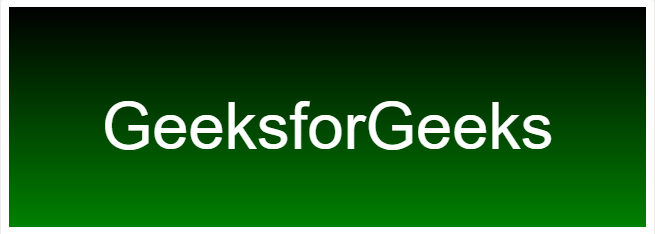
Linear Gradient: It includes smooth color transitions to going up, down, left, right, and diagonally. The minimum two-color is required to create a linear gradient. More than two-color elements can be possible in linear gradients. The starting point and the direction are needed for the gradient effect. The default direction is top to bottom.
Syntax:
background-image: linear-gradient(
    direction, color-stop1, color-stop2, ...);
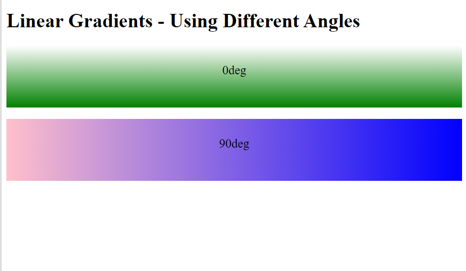
Example 1: This example illustrates the use of the linear-gradient() function for using it in different angles.
HTML
<!DOCTYPE html>
<html>
<head>
<style>
#grad1 {
line-height: 5rem;
font-size: 20px;
text-align: center;
height: 100px;
background-color: red;
background-image:
linear-gradient(0deg, green, white);
}
#grad2 {
line-height: 5rem;
font-size: 20px;
height: 100px;
background-color: red;
background-image:
linear-gradient(90deg, pink, blue);
}
</style>
</head>
<body>
<h1>Linear Gradients - Using Different Angles</h1>
<div id="grad1"
style="text-align: center">
0deg
</div>
<br />
<div id="grad2"
style="text-align: center">
90deg
</div>
<br />
</body>
</html>
|
Output:
Example 2: This example illustrates the use of the linear-gradient() function by using a multi-color from right to left Linear Gradient.
HTML
<!DOCTYPE html>
<html>
<head>
<style>
#grad {
width: 100%;
height: 200px;
text-align: center;
font-size: 50px;
color: white;
line-height: 170px;
font-weight: bold;
background-image: linear-gradient(
to right, orange, #ec38bc,
#7303c0, cyan);
}
</style>
</head>
<body>
<div id="grad">
geeksforgeeks
</div>
</body>
</html>
|
Output:
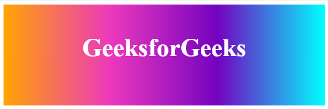
From Right To Left Linear Gradient
Example 3: This example illustrates the use of the linear-gradient() function by using a transparent gradient using rgba( ) function.
HTML
<!DOCTYPE html>
<html>
<head>
<style>
#grad {
width: 100%;
height: 200px;
text-align: center;
font-size: 50px;
color: black;
line-height: 170px;
font-weight: bold;
background-image: linear-gradient(to right,
rgba(255, 0, 0, 0),
rgba(206, 16, 225, 0.58));
}
</style>
</head>
<body>
<div id="grad">GeeksforGeeks</div>
</body>
</html>
|
Output:
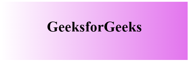
transparency gradient using rgba( ) function.
The text gradient: To add a gradient to the text, we use the background-clip property. For this, first, write your selected text and then apply a gradient on its background. Background-clip property removes the background except for the region behind the text. Then we make the text color transparent so that the gradient can clearly be seen in the text.
Example 4: This example illustrates the use of the Background-clip property to remove the background except for the region behind the text.
HTML
<!DOCTYPE html>
<html>
<head>
<style>
body {
background: #f2f2f2;
}
#grad {
height: 200px;
width: 100%;
text-align: center;
font-size: 50px;
line-height: 170px;
font-weight: bold;
background-image: linear-gradient(to right,
#307e2b,
#20e3b2,
#29ffc6);
-webkit-background-clip: text;
background-clip: text;
color: transparent;
}
</style>
</head>
<body>
<div id="grad">GeeksforGeeks</div>
</body>
</html>
|
Output:
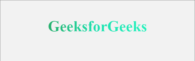
Gradient on Text
Radial Gradients: It is an inbuilt function in CSS that is used to set a radial gradient as the background image. It starts at a single point and emanates outward. By default, the first color starts at the center position of the element and then fades to the end color towards the edge of the element. Fade happens at an equal rate until specified. It can be used for making concentric circles that start from a single point(center) and spread outwards.
Syntax:
background-image: radial-gradient(
    shape size at position, start-color, ..., last-color);
Example: This example illustrates the use of the radial-gradient() function.
HTML
<!DOCTYPE html>
<html>
<head>
<style>
#grad {
height: 200px;
width: 100%;
text-align: center;
font-size: 50px;
color: black;
line-height: 170px;
font-weight: bold;
background-image: radial-gradient(
circle at top left,
#fdbb2d,
#22c1c3);
}
</style>
</head>
<body>
<div id="grad">GeeksforGeeks</div>
</body>
</html>
|
Output:
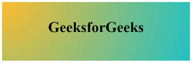
Radial Gradient
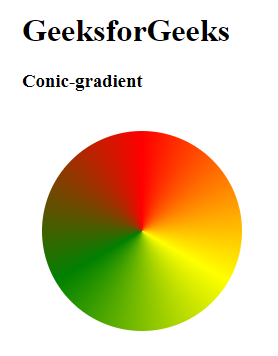
Conic-gradient: It is an inbuilt function in CSS that is used to set a conic gradient as the background image. The conic gradient angle starts from 0 degrees – 360 degrees. Conic are circular and use the center of the element as the source point for color stop.
Conic Gradients include pie charts and color wheels. The result of the conic-gradient() function is an object of the data type, which is a special kind of image.
Syntax:
Background image: conic-gradient(color degree, color degree, ...);
Conic gradients are similar to radial gradients, except that the color stops are on the outer edge of the circle that gets created.
Example: This example illustrates the use of the conic-gradient() function.
HTML
<!DOCTYPE html>
<html>
<head>
<title>conic gradient</title>
<style>
.box {
background-color: yellow;
height: 200px;
width: 200px;
float: left;
margin: 20px;
border-radius: 50%;
}
.c {
background-image: conic-gradient(
red, yellow, green, red);
}
.a {
background-image: conic-gradient(
red, yellow, green);
}
</style>
</head>
<body>
<h1>GeeksforGeeks</h1>
<h3>Conic-gradient</h3>
<div class="box c"></div>
</body>
</html>
|
Output:
Like Article
Suggest improvement
Share your thoughts in the comments
Please Login to comment...