How to Add Color Bars in Bokeh?
Last Updated :
26 Jan, 2022
Bokeh is one of the promising libraries of Python in recent times. It provides high performance and efficiency in data visualizations. One of the big advantages of bokeh is that we can get the output file in various formats such as HTML, notebooks etc. In this article, we will be learning about how to add Color Bars in Bokeh.
Now, there are various visualization interfaces that bokeh provides us such as bokeh.models, bokeh.plotting, bokeh.transform etc so that we can import various modules out of it and use them to create and define various properties in the plots.
One can use Google colab that has everything preinstalled in it but if we are using the local device, then it is very important to install bokeh in our device, else the functionalities won’t work. First, we need to open a command prompt on our desktop and go to the following directory where we want to install bokeh. Be sure, you already have node.js installed on your local device, else you can refer to this website for download. After going to the directory, write the following code in the command prompt.
pip install bokeh
Now, we can use any text editor for the implementation of the above concept.
Code:
Python3
import numpy as np
from bokeh.plotting import figure, show
from bokeh.models import LinearColorMapper, ColorBar
d = [[0.11023,0.97382,0.5634],
[0.66382,0.2484,0.36524],
[0.6845,0.9824,0.15498]]
color = LinearColorMapper(palette = "Cividis256",
low = 0, high = 1)
plot = figure(x_range = (0, 1),
y_range = (0,1))
plot.image(image = [d], color_mapper = color,
dh = [1], dw = [1], x = [0], y = [0])
cb = ColorBar(color_mapper = color, location = (5,6))
plot.add_layout(cb, 'right')
show(plot)
|
Output:
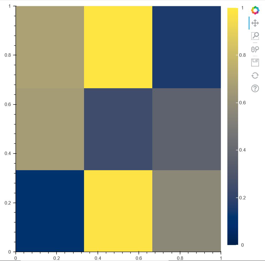
Code Explain: After importing all the necessary packages in the code, we are creating a scalar data d where we are storing values ranging from 0 to 1. After that, using LinearColorMapper, we are defining the color of the palette and the range in the color-bar. Then, we are creating a figure where we are setting the X-Axis range and Y-Axis Range from 0 to 1. After that, we are plotting the above plot using .image() where we are defining the width and height of the plot along with the starting point of the plot as parameters. So, after fixing the position and labels of the color map, we are finally showing the above plot as an HTML file.
Example 2:
Instead of creating a heatmap, we can also create a simple plot and add a color bar to it. But for that, we need to create a dataframe in python. We need to install pandas in our local device if we are using it or if we use google colab , then we don’t need to install anything. Open a command prompt and write the following code :
pip install pandas
After the creation of the dataframe, we can process the data and add a color bar to it. The following implementation is shown below:
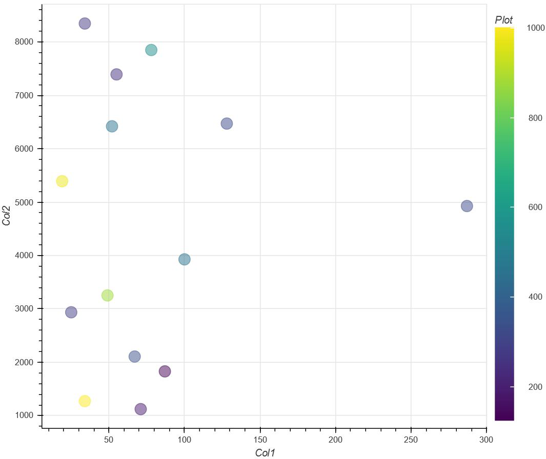
In this second example, we are not creating a heat map. Instead, we are creating a plot with points plotted on the graph in the shape of a circle with the color based on the colors from the color-bar. So, in order to achieve this, we need to create a set of data that is needed to be dataframed in order to get them in a tabular format. After getting the above implementation done, we will be using LinearColorMapper() in order to define the color and the range of the color-map. After that, we are creating a figure where we are defining the plot width and plot height along with X and Y-Axis Labels. Then, we are defining the shape of the points plotted i.e a circle and along with that we are using transform() inside which we are defining our color-map and the values that each of the points(x, y) will carry at that location. This means that at every point the color will be according to the value that it carries and the values are made from the ‘col0’ of the dataframe. Finally, we are showing our resultant plot.
Code:
Python3
from bokeh.models import LinearColorMapper, ColorBar
from bokeh.transform import transform
from bokeh.plotting import figure,show
import pandas as pd
d={'Col0':[ 190, 320, 270, 874, 459, 124, 546,
285, 341, 980, 1002, 453, 324, 245],
'Col1':[ 71, 128, 34, 49, 52, 87, 78, 25, 67,
19, 34, 100, 287, 55],
'Col2':[ 1123, 6471, 8345, 3253, 6420, 1830,
7849, 2937, 2108, 5392, 1273, 3928, 4927, 7392]}
df = pd.DataFrame(d)
color = LinearColorMapper(palette = 'Viridis256',
low = df.Col0.min(),
high = df.Col0.max())
colorbar = figure(plot_width = 750, plot_height = 600,
x_axis_label = 'Col1', y_axis_label = 'Col2')
colorbar.circle(x = 'Col1', y = 'Col2',
source = df, color = transform('Col0', color),
size = 15, alpha = 0.5)
color_bar = ColorBar(color_mapper = color,
label_standoff = 14,
location = (0,0),
title = 'Plot')
colorbar.add_layout(color_bar, 'right')
show(colorbar)
|
Output:
Example 3:
In this example, we will be importing a dataset ‘autompg‘ from bokeh.sampledata.autompg.
Python3
from bokeh.plotting import figure,show
from bokeh.sampledata.autompg import autompg
from bokeh.models import LinearColorMapper, ColorBar
from bokeh.transform import transform
print(autompg)
color_mapper = LinearColorMapper(palette = "Viridis256",
low = autompg.weight.min(),
high = autompg.weight.max())
p = figure(x_axis_label = 'Horsepower',
y_axis_label = 'MPG')
p.circle(x = 'hp', y = 'mpg', color = transform('weight',
color_mapper),
size = 20, alpha = 0.6, source = autompg)
color_bar = ColorBar(color_mapper = color_mapper,
label_standoff = 12,
location = (0,0),
title = 'Weight')
p.add_layout(color_bar, 'right')
show(p)
|
Output:
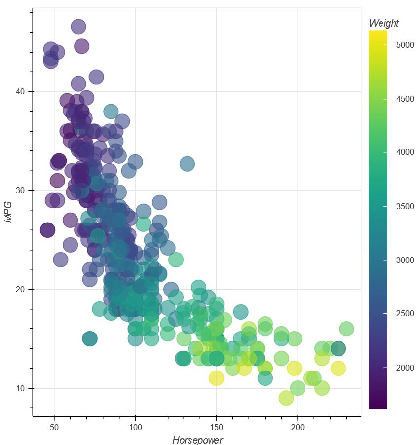
In the third example, we are importing a dataset using bokeh.sampledata.autompg and since it is already in tabular format, we don’t need to use dataframing. Then we are following the same steps to that of Example 2 and showing the above plot.
Like Article
Suggest improvement
Share your thoughts in the comments
Please Login to comment...