How To Add Circles Around Specific Data Points in R
Last Updated :
17 Oct, 2021
In this article, we will discuss how to add circles around specific data points in R Programming Language.
Method 1: Using geom_point method
The ggplot2 package in R is used to perform data visualization. To install this package type the below command in the terminal.
Syntax:
install.packages("ggplot2")
Aesthetic mappings can be created to the plot object to determine the relationship between the x and y axis respectively. Additional components can be added to the created ggplot object.
Syntax:
ggplot(data = NULL, mapping = aes())
Parameters :
- data – Default dataset to use for plot.
- mapping – List of aesthetic mappings to use for plot.
The geoms may also be specified with the additional mappings, like color to differently color the points pertaining to different groups.
Syntax:
geom_point(cond, pch, size, colour)
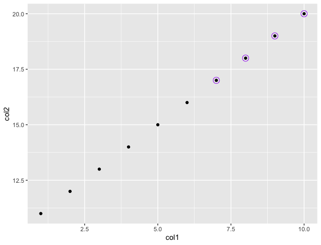
Circles can be added around data points by specifying the condition to apply on the data frame. The size of the circle and its corresponding colour can be specified using the arguments of the geom_point() method.
Example:
R
library("ggplot2")
df < - data.frame(col1=c(1: 10),
col2=c(11: 20))
df % >%
ggplot(aes(x=col1, col2))+
geom_point()+
geom_point(data=df % > % filter(col1 > 6),
pch=21,
size=4,
colour="purple")
|
Output
Method 2: Using symbols method
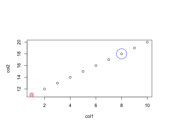
The plot() method in base R is used to plot a set of data points specified using the x and y coordinates. The symbols() method in R can be used for adding circles around them.
Syntax:
symbols (x, y , circles = c() , add , fg)
Parameters :
- x, y – the x and y co-ordinates for the centres of the symbols.
- circles – a vector giving the radii of the circles.
- add – In case the argument value of the add is TRUE, the symbols are added to an existing plot, otherwise a new plot is created.
- fg – a vector of the colour(s) the symbols are to be drawn in.
Example: This Code encircles the points belonging to coordinates (1,11) and (8,18) respectively with red and blue colours :
R
col1 = c(1: 10)
col2 = c(11: 20)
print("X coordinates")
print(col1)
print("Y coordinates")
print(col2)
plot(col1, col2)
symbols(x=c(1, 8), y=c(11, 18), circles=c(0.16, 0.4),
add=T, inches=F, fg=c('red', 'blue'))
|
Output
[1] "X coordinates"
[1]  1  2  3  4  5  6  7  8  9 10
[1] "Y coordinates"
[1] 11 12 13 14 15 16 17 18 19 20
Like Article
Suggest improvement
Share your thoughts in the comments
Please Login to comment...