How to add a pressed effect on button click in CSS?
Last Updated :
04 Dec, 2023
In this tutorial, we are going to learn how to add a pressed effect on a button using CSS. This effect is a part of modern UI design and is used on many websites. This effect allows the user to experience an interaction with the button element as compared to the normal behavior.
We’ll take advantage of the active pseudo class. This class is added to an HTML element automatically when it is clicked.
We can use the CSS transform property to add a pressed effect on the button when it is active. CSS transform property allows us to scale, rotate, move, and skew an element.
Example: In this example, we have used CSS transform property
html
<!DOCTYPE html>
<html>
<head>
<style>
/* Adding some basic styling to button */
.btn {
text-decoration: none;
border: none;
padding: 12px 40px;
font-size: 16px;
background-color: green;
color: #fff;
border-radius: 5px;
box-shadow: 7px 6px 28px 1px rgba(0, 0, 0, 0.24);
cursor: pointer;
outline: none;
transition: 0.2s all;
}
/* Adding transformation when the button is active */
.btn:active {
transform: scale(0.98);
/* Scaling button to 0.98 to its original size */
box-shadow: 3px 2px 22px 1px rgba(0, 0, 0, 0.24);
/* Lowering the shadow */
}
</style>
</head>
<body>
<button class="btn">Button</button>
</body>
</html>
|
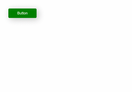
Output:
Method 2: Using translate function
For this method, we can play with the translate function in CSS. We’ll use translateY(length) function on active state of button. The translateY() function moves an element on y-axis to a given length (in px).
Example: In this example, we have used Translate function in CSS.
html
<!DOCTYPE html>
<html>
<head>
<style>
/* Adding basic styling to a button */
.btn {
padding: 15px 40px;
font-size: 16px;
text-align: center;
cursor: pointer;
outline: none;
color: #fff;
background-color: green;
border: none;
border-radius: 5px;
box-shadow: box-shadow:
7px 6px 28px 1px rgba(0, 0, 0, 0.24);
}
/* Adding styles on 'active' state */
.btn:active {
box-shadow: box-shadow:
7px 6px 28px 1px rgba(0, 0, 0, 0.24);
transform: translateY(4px);
/* Moving button 4px to y-axis */
}
</style>
</head>
<body>
<button class="btn">Click Me</button>
</body>
</html>
|
Output:

You can play with other methods when the active pseudo-class is active to create your own effects when the button is clicked.
CSS is the foundation of webpages, is used for webpage development by styling websites and web apps.You can learn CSS from the ground up by following this CSS Tutorial and CSS Examples.
Like Article
Suggest improvement
Share your thoughts in the comments
Please Login to comment...