How hovering over a division element to gradually change the width in CSS ?
Last Updated :
28 Apr, 2021
You can use transition property in CSS to make some transition effect as changing the width of an element. The transition effect can be defined in two states (hover and active) using pseudo-classes like : hover or: active or classes dynamically set by using JavaScript.
Syntax:
transition: transition-property transition-duration
Note:
- transition-property : t specifies the CSS properties to which a transition effect should be applied like height, width etc.
- transition-duration : It specifies the length of time a transition animation should take to complete.
Note: If any of the values are not defined then the browser assumes the default values.
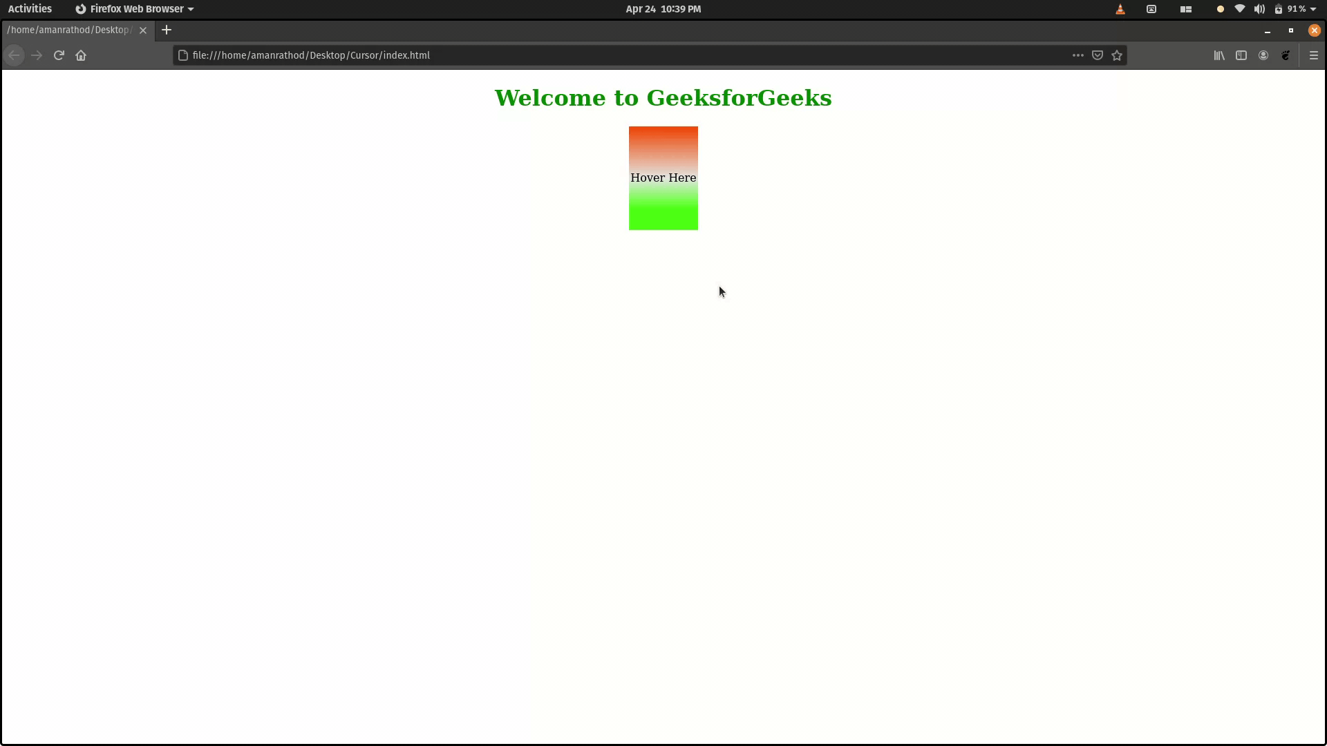
Example 1:
HTML
<!DOCTYPE html>
<html>
<head>
<style>
h1{
color: green;
}
div {
width: 100px;
height: 150px;
background: linear-gradient(
0deg,
rgb(65, 233, 14) 20%,
rgb(229, 231, 229) 50%,
rgb(255, 85, 7) 98%
);
transition: width 2s;
}
.text {
display: flex;
align-items: center;
justify-content: center
}
div:hover {
width: 300px;
}
</style>
</head>
<body>
<center>
<h1>Welcome to GeeksforGeeks</h1>
<div class="text">Hover Here</div>
</center>
</body>
</html>
|
Output:
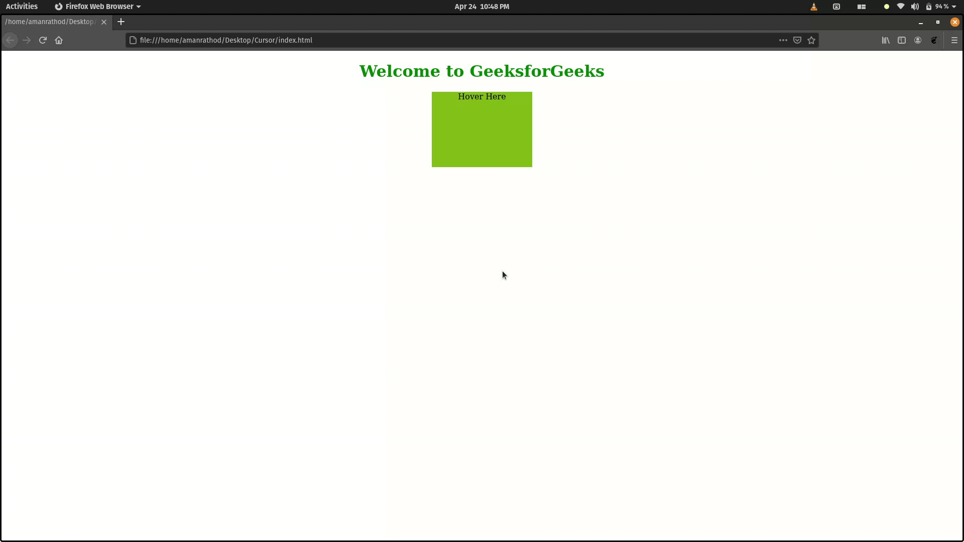
Example 2: Below example is to change width, height and color on hovering
HTML
<!DOCTYPE html>
<html>
<head>
<style>
h1{
color: green;
}
div {
width: 200px;
height: 150px;
background:#81b214;
transition: width 2s, height 2s;
}
div:hover {
width: 500px;
height: 100px;
background: #29bb89;
}
</style>
</head>
<body>
<center>
<h1>Welcome to GeeksforGeeks</h1>
<div class="text">Hover Here</div>
</center>
</body>
</html>
|
Output:
Like Article
Suggest improvement
Share your thoughts in the comments
Please Login to comment...