Histograms in R language
Last Updated :
13 Jun, 2023
A histogram contains a rectangular area to display the statistical information which is proportional to the frequency of a variable and its width in successive numerical intervals. A graphical representation that manages a group of data points into different specified ranges. It has a special feature that shows no gaps between the bars and is similar to a vertical bar graph.
R – Histograms
We can create histograms in R Programming Language using the hist() function.
Syntax: hist(v, main, xlab, xlim, ylim, breaks, col, border)
Parameters:
- v: This parameter contains numerical values used in histogram.
- main: This parameter main is the title of the chart.
- col: This parameter is used to set color of the bars.
- xlab: This parameter is the label for horizontal axis.
- border: This parameter is used to set border color of each bar.
- xlim: This parameter is used for plotting values of x-axis.
- ylim: This parameter is used for plotting values of y-axis.
- breaks: This parameter is used as width of each bar.
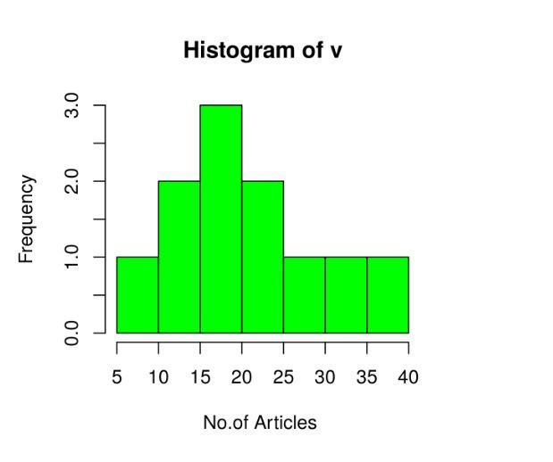
Creating a simple Histogram in R
Creating a simple histogram chart by using the above parameter. This vector v is plot using hist().
Example:
R
v <- c(19, 23, 11, 5, 16, 21, 32,
14, 19, 27, 39)
hist(v, xlab = "No.of Articles ",
col = "green", border = "black")
|
Output:
Histograms in R language
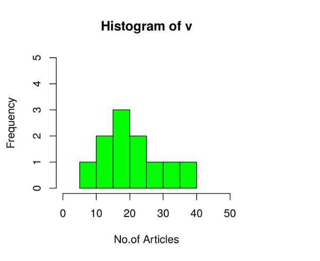
Range of X and Y values
To describe the range of values we need to do the following steps:
- We can use the xlim and ylim parameters in X-axis and Y-axis.
- Take all parameters which are required to make a histogram chart.
Example
R
v <- c(19, 23, 11, 5, 16, 21, 32, 14, 19, 27, 39)
hist(v, xlab = "No.of Articles", col = "green",
border = "black", xlim = c(0, 50),
ylim = c(0, 5), breaks = 5)
|
Output:
Histograms in R language
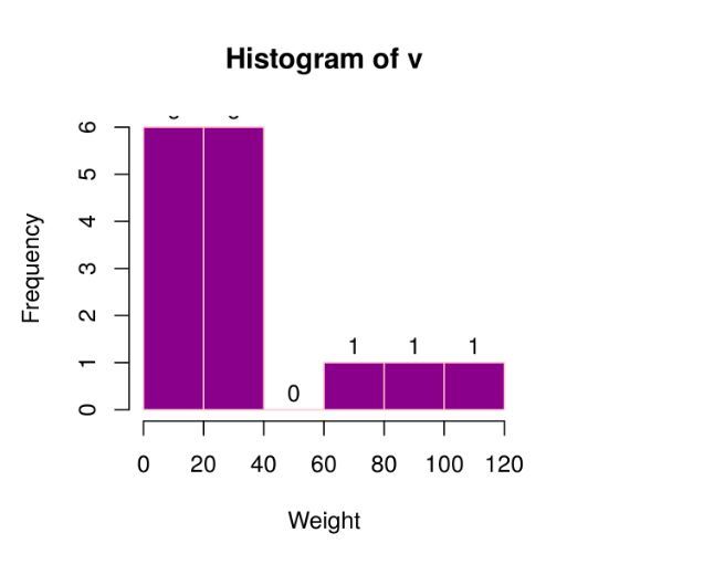
Using histogram return values for labels using text()
To create a histogram return value chart.
R
v <- c(19, 23, 11, 5, 16, 21, 32, 14, 19,
27, 39, 120, 40, 70, 90)
m<-hist(v, xlab = "Weight", ylab ="Frequency",
col = "darkmagenta", border = "pink",
breaks = 5)
text(m$mids, m$counts, labels = m$counts,
adj = c(0.5, -0.5))
|
Output:
Histograms in R language
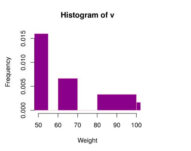
Histogram using non-uniform width
Creating different width histogram charts, by using the above parameters, we created a histogram using non-uniform width.
Example
R
v <- c(19, 23, 11, 5, 16, 21, 32, 14,
19, 27, 39, 120, 40, 70, 90)
hist(v, xlab = "Weight", ylab ="Frequency",
xlim = c(50, 100),
col = "darkmagenta", border = "pink",
breaks = c(5, 55, 60, 70, 75,
80, 100, 140))
|
Output:
Histograms in R language
Like Article
Suggest improvement
Share your thoughts in the comments
Please Login to comment...