Histograms and Density Plots in R
Last Updated :
26 Mar, 2024
A histogram is a graphical representation that organizes a group of data points into user-specified ranges and an approximate representation of the distribution of numerical data.
In R language the histogram is built with the use of the hist() function.
Syntax: hist(v,main,xlab,xlim,ylim,breaks,col,border)
Parameters:
- v:- It is a vector containing numeric values used in the histogram.
- main:-It indicates the title of the chart.
- col:- It is used to set the color of the bars.
- border:-It is used to set the border color of each bar.
- xlab:-It is used to give a description of the x-axis.
- xlim:-It is used to specify the range of values on the x-axis.
- ylim:-It is used to specify the range of values on the y-axis.
- breaks:-It is used to mention the width of each bar.
Return: It will return the histogram.
R
v <-  c(5,9,13,2,50,20,59,36,23,2,8,27,72,14)

hist(v,xlab = "Weight",col = "red",border = "black")
Output:
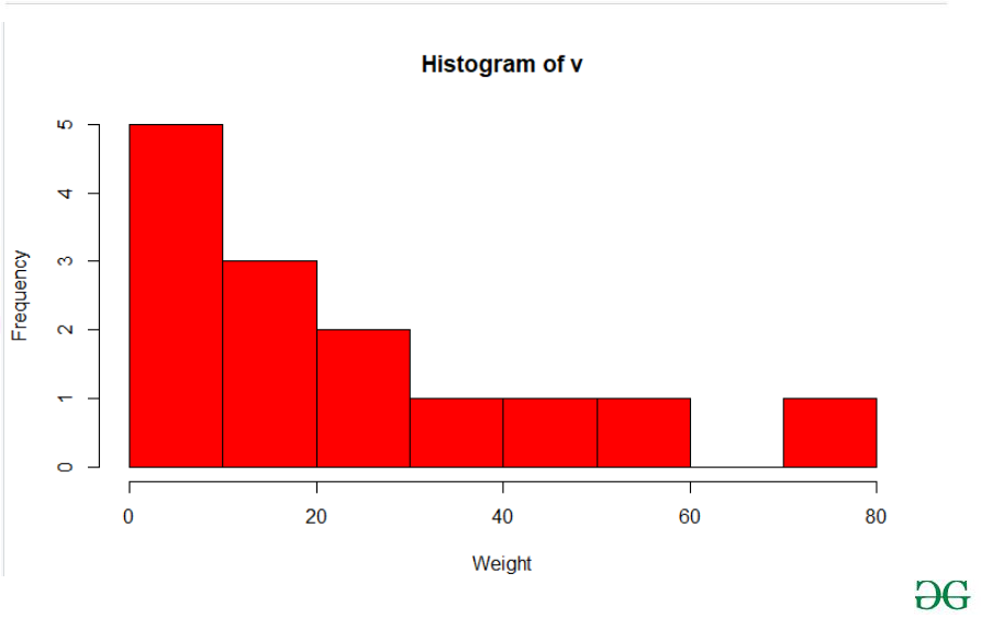
Histogram Plot in R
A density plot is a representation of the distribution of a numeric variable that uses a kernel density estimate to show the probability density function of the variable. In R Language we use the density() function which helps to compute kernel density estimates. And further with its return value, is used to build the final density plot.
Syntax: density(x)
Parameters:
- x: the data from which the estimate is to be computed
Returns:
It will return the kernel density.
Used dataset link:-Link
R
library(readxl)
library(ggplot2)

Salary_Data <- read_excel("Salary_Data.xls")

den <- density(Salary_Data$YearsExperience)
library(ggplot2)

ggplot(Salary_Data, aes(x = Salary)) +
  geom_density(fill = "skyblue", alpha = 0.7) +
  labs(title = "Kernel Density Plot of Salary",
       x = "Salary",
       y = "Density")
Output:

Density Plots in R
Customized Color and Line Type of Density Plots in R
R
library(ggplot2)

ggplot(Salary_Data, aes(x = Salary)) +
  geom_density(fill = "purple", color = "black", linetype = "dashed", alpha = 0.5) +
  labs(title = "Customized Density Plot of Salary",
       x = "Salary",
       y = "Density")
Output:

Density Plots in R
Adjusted Bandwidth of Density Plots in R
R
library(ggplot2)

ggplot(Salary_Data, aes(x = Salary)) +
  geom_density(fill = "blue", alpha = 0.7, bw = 2500) +
  labs(title = "Density Plot of Salary with Adjusted Bandwidth",
       x = "Salary",
       y = "Density")
Output:
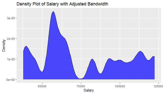
Density Plots in R
Create a histogram and a density plot in the same frame
R
hist(beaver1$temp,
     col="green",
     border="black",
     prob = TRUE,
     xlab = "temp",
     main = "GFG")

lines(density(beaver1$temp),
      lwd = 2,
      col = "chocolate3")
Output:

Histogram and Density plot in R
Customize the Histogram plots and Density Plot in R
R
hist(beaver1$temp,
     col = "green",
     border = "black",
     prob = TRUE,
     xlab = "temp",
     main = "GFG",
 # Add fill color option
     fill = "lightblue",
 # Add line type option
     lty = "dashed"
)

lines(density(beaver1$temp),
      lwd = 2,
      col = "chocolate3"
)
Output:

Histogram and Density plot in R
Conclusion
Histograms and density plots in R are powerful tools for visualizing the distribution of a variable in a dataset. These two types of plots provide valuable insights into the shape, central tendency, and spread of the data, allowing for a comprehensive understanding of its underlying patterns.
Like Article
Suggest improvement
Share your thoughts in the comments
Please Login to comment...