Histogram in R using ggplot2
Last Updated :
20 Dec, 2023
ggplot2 is an R Package that is dedicated to Data visualization. ggplot2 Package Improve the quality and the beauty (aesthetics) of the graph. By Using ggplot2 we can make almost every kind of graph In RStudio.
What is Histogram?
A histogram is an approximate representation of the distribution of numerical data. In a histogram, each bar groups numbers into ranges. Taller bars show that more data falls in that range. A histogram displays the shape and spread of continuous sample data.
Basic ggplot2 Histogram in R
Histograms roughly give us an idea about the probability distribution of a given variable by depicting the frequencies of observations occurring in certain ranges of values. Histograms are used to show distributions of a given variable while bar charts are used to compare variables. Histograms plot quantitative data with ranges of the data grouped into intervals while bar charts plot categorical data.
geom_histogram() function is an in-built function of the ggplot2 module.
- Import module
- Create data frame
- Create a histogram using the function
- Display plot
Basic ggplot2 Histogram in R
R
set.seed(123)
df <- data.frame(
gender=factor(rep(c(
"Average Female income ", "Average Male incmome"), each=20000)),
Average_income=round(c(rnorm(20000, mean=15500, sd=500),
rnorm(20000, mean=17500, sd=600)))
)
head(df)
|
Output :
                  gender Average_income
1 Average Female income           15220
2 Average Female income           15385
3 Average Female income           16279
4 Average Female income           15535
5 Average Female income           15565
6 Average Female income           16358
- In the above line,123 is set as the random number value.
- The main point of using the seed is to be able to reproduce a particular sequence of ‘random’ numbers. and sed(n) reproducesrandom numbers results by seed.
R
library(ggplot2)
ggplot(df, aes(x=Average_income)) + geom_histogram()
|
Output:
Histogram in R using ggplot2
The histogram figure is made using the geom_histogram() tool. By default, it uses the data to automatically calculate the number of bins. However, by using the binwidth and bins options, you can adjust the bin width and specify the number of bins, accordingly.
To set the title, x-axis label, and y-axis label, use the labs() method. Change the text within the function to suit your needs.
The plot’s minimalist theme is established via theme_minimal(). If you want to use a different theme or further alter the appearance, you can change or remove this line.
Customize the Basic ggplot2 Histogram in R
R
set.seed(123)
df <- data.frame(
gender = factor(rep(c("Average Female income", "Average Male income"), each = 20000)),
Average_income = round(c(rnorm(20000, mean = 15500, sd = 500),
rnorm(20000, mean = 17500, sd = 600)))
)
library(ggplot2)
ggplot(df, aes(x = Average_income)) +
geom_histogram(color = "black", fill = "steelblue") +
labs(x = "Average Income", y = "Frequency") +
ggtitle("Histogram of Average Income") +
theme_minimal()
|
Output:

Histogram in R using ggplot2
The color argument within color in this modified code is set to “black” to indicate the border color of the histogram bars.
Change the width Basic ggplot2 Histogram in R
R
ggplot(df, aes(x=Average_income)) +
geom_histogram(binwidth=1)
|
Output:

Histogram in R using ggplot2
In this code, the dataframe ‘df’ is specified and the variable ‘Average_income’ is mapped to the x-axis by the formula ggplot(df, aes(x = Average_income)).
The histogram is produced by the geom_histogram(binwidth = 1) function with a specified bin width of 1. According to your data and desired level of detail, you can change the bin width.
Change colors of the Basic ggplot2 Histogram in R
R
p<-ggplot(df, aes(x=Average_income)) +
geom_histogram(color="white", fill="red")
p
|
Output:

Histogram in R using ggplot2
Add Descriptive Statistics to Histogram Using geom_vline()
R
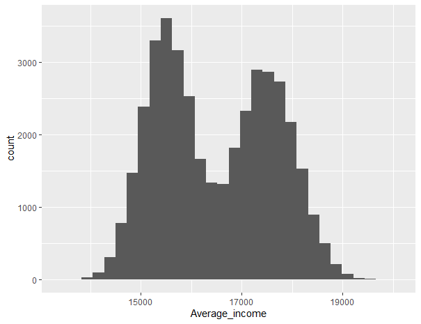
histogram_plot <- ggplot(df, aes(x = Average_income, fill = gender)) +
geom_histogram(binwidth = 500, position = "identity", alpha = 0.7) +
geom_vline(aes(xintercept = mean(Average_income, na.rm = TRUE), color = gender),
linetype = "dashed", size = 1) +
geom_vline(aes(xintercept = median(Average_income, na.rm = TRUE), color = gender),
linetype = "dotted", size = 1) +
scale_fill_manual(values = c("blue", "green")) +
scale_color_manual(values = c("red", "black")) +
theme_minimal() +
ggtitle("Distribution of Average Income by Gender") +
xlab("Average Income") +
ylab("Frequency") +
theme(legend.position = "top")
print(histogram_plot)
|
Output:

Basic ggplot2 Histogram in R
The geom_vline lines for mean and median in our code. These lines are used to add vertical dashed lines for the mean and dotted lines for the median in the histogram plot.
Just to clarify, the aes(xintercept = mean(Average_income, na.rm = TRUE), color = gender) specifies that a separate vertical line should be drawn for each gender, and the linetype and size parameters customize the appearance of the lines.
Plotting Probability Densities of Basic ggplot2 Histogram in R
R
library(ggplot2)
ggplot(df, aes(x = Average_income, y = after_stat(density))) +
geom_histogram(aes(y = after_stat(density)), bins = 30, fill = "lightblue",
color = "black", alpha = 0.7) +
geom_vline(aes(xintercept = mean(Average_income, na.rm = TRUE)), color = "red",
linetype = "dashed", size = 1.5) +
geom_density(color = "black", size = 1.5, alpha = 0.5) +
ggtitle("Distribution of Home Prices") +
xlab("Price") +
ylab("Density") +
theme_minimal()
|
Output:
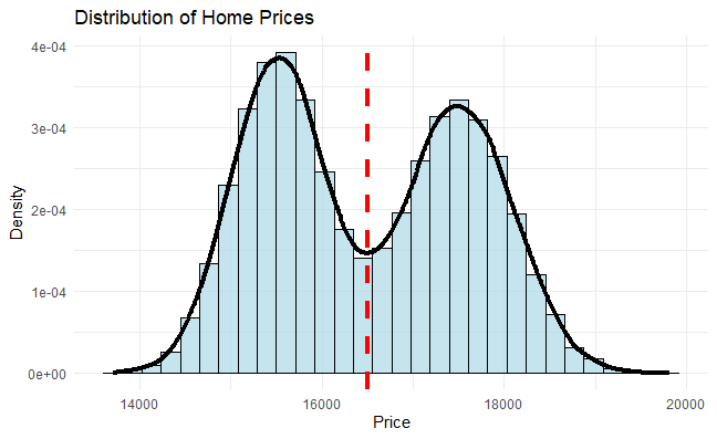
Histogram in R using ggplot2
Basic ggplot2 Histogram Based on Groups
R
library(ggplot2)
ggplot(iris, aes(x = Sepal.Length, fill = Species)) +
geom_histogram(bins = 30, color = "black", alpha = 0.7) +
ggtitle("Distribution of Sepal Length by Species") +
xlab("Sepal Length") +
ylab("Frequency") +
scale_fill_manual(values = c("blue", "pink", "red")) +
theme_minimal()
|
Output:
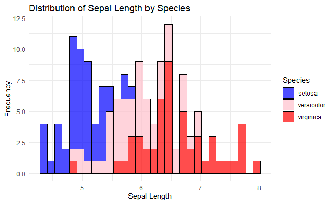
Histogram in R using ggplot2
fill = Species: Inside the aes() function, this maps the different values in the ‘Species’ column (setosa, versicolor, virginica) to different fill colors in the histogram.scale_fill_manual: This allows you to manually set the fill colors for each level of the ‘Species’ column. You can customize the color palette by adjusting the hex values.
R
library(ggplot2)
ggplot(iris, aes(x = Sepal.Length, fill = Species)) +
geom_histogram(bins = 30, color = "black", alpha = 0.7) +
facet_wrap(~Species, scales = "free") +
ggtitle("Histogram of Sepal Length by Species") +
xlab("Sepal Length") +
ylab("Frequency") +
theme_minimal()
|
Output:

Histogram in R using ggplot2
facet_wrap(~Species, scales = "free"): Facets the histogram by the ‘Species’ column, creating separate panels for each species. The scales = "free" argument allows each facet to have independent scales.
Frequency of Mean Ozone (O3) histogram
R
plot_hist <- ggplot(airquality, aes(x = Ozone)) +
geom_histogram(aes(fill = ..count..), binwidth = 10)+
scale_x_continuous(name = "Mean ozone(03) in ppm parts per million ",
breaks = seq(0, 200, 25),
limits=c(0, 200)) +
scale_y_continuous(name = "Count") +
ggtitle("Frequency of mean ozone(03)") +
scale_fill_gradient("Count", low = "green", high = "red")
plot_hist
|
Output :
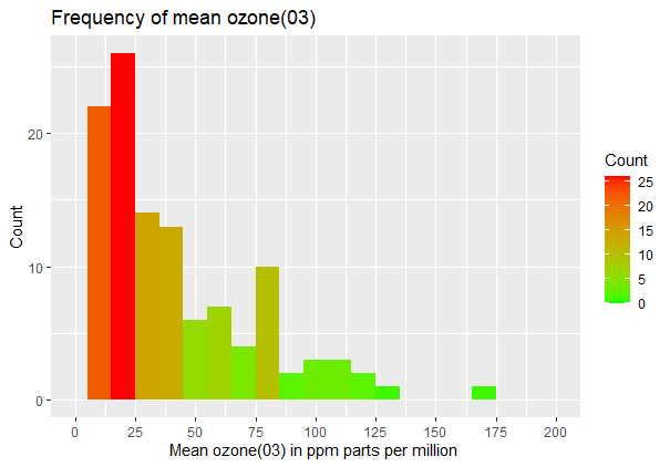
Histogram in R using ggplot2
The histogram is made using the geom_histogram() function, and the fill color is determined using the aes(fill) mapping depending on the number of values in each bin.
- The names of the x-axis and y-axis are specified using the scale_x_continuous() and scale_y_continuous() functions, respectively.
- The chart’s title is set via the ggtitle() function.
- Based on the count values, the scale_fill_gradient() function creates a color gradient for the fill color. The gradient in this illustration changes from green (low count) to red (high count).
- By calling the plot_hist object or by including extra customizations or layers before displaying the plot, you may utilize it to display the plot.
Like Article
Suggest improvement
Share your thoughts in the comments
Please Login to comment...