Grouped Barplots in Python with Seaborn
Last Updated :
02 Dec, 2020
Prerequisites: Seaborn
In this article, we will discuss ways to make grouped barplots using Seaborn in Python. Before that, there are some concepts one must be familiar with:
- Barcharts: Barcharts are great when you have two variables one is numerical and therefore the other may be a categorical variable. A barplot can reveal the relationship between them.
- Grouped Barplot: A Grouped barplot is beneficial when you have a multiple categorical variable. Python’s Seaborn plotting library makes it easy to form grouped barplots.
- Groupby: Pandas dataframe.groupby() function is used to split the data into groups based on some criteria. Pandas objects can be split on any of their axes. The abstract definition of grouping is to provide a mapping of labels to group names.
Procedure
- Import Libraries.
- Load or create data.
- Perform groupby with an aggregate function.
- Plot the barplot with grouped attributes.
Following are implementation to explain the same:
Example 1:
Python3
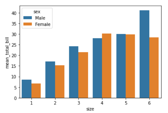
import seaborn as sb
df = sb.load_dataset('tips')
df = df.groupby(['size', 'sex']).agg(mean_total_bill=("total_bill", 'mean'))
df = df.reset_index()
sb.barplot(x="size",
y="mean_total_bill",
hue="sex",
data=df)
|
Output:
Example 2:
Python3
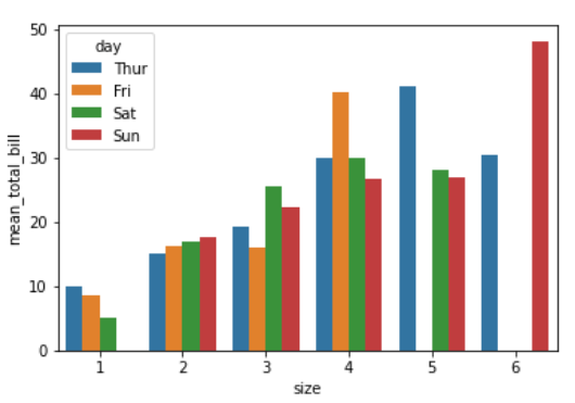
import seaborn as sb
df = sb.load_dataset('tips')
df = df.groupby(['size', 'day']).agg(mean_total_bill=("total_bill", 'mean'))
df = df.reset_index()
sb.barplot(x="size",
y="mean_total_bill",
hue="day",
data=df)
|
Output:
Example 3:
Python3
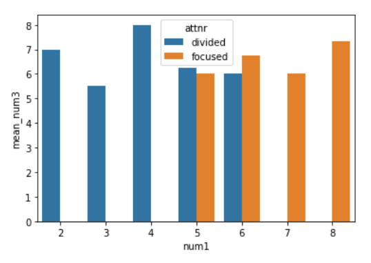
import seaborn as sb
df = sb.load_dataset('anagrams')
df = df.groupby(['num1', 'attnr']).agg(mean_num3=("num3", 'mean'))
df = df.reset_index()
sb.barplot(x="num1",
y="mean_num3",
hue="attnr",
data=df)
|
Output:
Like Article
Suggest improvement
Share your thoughts in the comments
Please Login to comment...