Bokeh is a library of Python which is used to create interactive data visualizations. In this article, we will discuss glyphs in Bokeh. But at first let’s see how to install Bokeh in Python.
Installation
To install this type the below command in the terminal.
conda install bokeh
Or
pip install bokeh
Plotting with glyphs
Usually, a plot consists of geometric shapes either in the form of a line, circle, etc. So, Glyphs are nothing but visual shapes that are drawn to represent the data such as circles, squares, lines, rectangles, etc.
Creating a basic line chart:
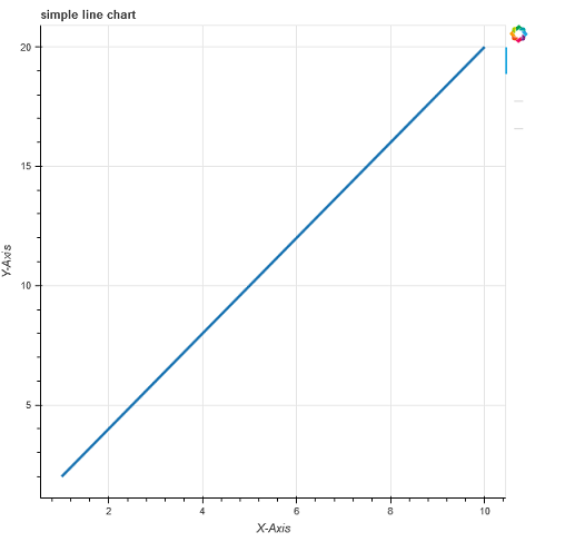
The line chart displays the visualization of x and y-axis points movements in the form of a line. To draw a line glyph to the figure, we use the line() method of the figure object.
Syntax:
my_plot.line(a, b, line_width)
Code:
Python
from bokeh.plotting import figure, show, output_file
a = [1, 2, 3, 4, 5, 6, 7, 8, 9, 10]
b = [2, 4, 6, 8, 10, 12, 14, 16, 18, 20]
my_plot = figure(title="simple line chart", x_axis_label="X-Axis",
y_axis_label="Y-Axis")
my_plot.line(a, b, line_width=3)
output_file("line.html")
show(my_plot)
|
Output:
Combining multiple graphs
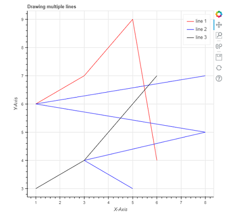
You can also add multiple graphs with the use of bokeh.plotting interface. To do so, you just need to call the line() function multiple times by passing different data as parameters as shown in the example.
Syntax:
p.line(x1, y2, legend_label, line_color, line_width)
Code:
Python
from bokeh.plotting import figure, show
from bokeh.io import output_notebook
x1 = [1, 3, 4, 5, 6]
x2 = [5, 3, 8, 1, 8]
y1 = [6, 7, 8, 9, 4]
y2 = [3, 4, 5, 6, 7]
p = figure(title="Drawing multiple lines",
x_axis_label="X-Axis", y_axis_label="Y-Axis")
p.line(x1, y1, legend_label="line 1", line_color="red", line_width=1)
p.line(x2, y2, legend_label="line 2", line_color="blue", line_width=1)
p.line(x1, y2, legend_label="line 3", line_color="black", line_width=1)
output_notebook()
show(p)
|
Output:
Rendering Circles
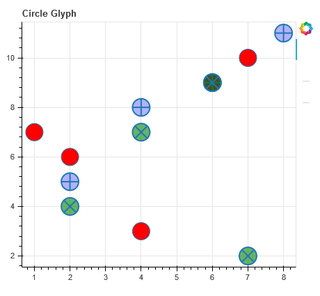
In order to add the circle glyph to your plot, we use the circle() method instead of the line() method used in the above example.
Circle(): We use this method to add a circle glyph to the plot. It takes x and y coordinates of the center as parameters. Apart from these, it takes parameters such as size, fill_color,fill_alpha,angle, line_color, line_alpha,radius,radius_dimensions,etc
Syntax:
p.circle(x, y, size, fill_color)
Criss_cross(): this method adds a circle glyph with a ‘+’ mark through the center of the circle and it takes x and y coordinates of the center.
Syntax:
p.circle_cross(x, y, size, fill_color, fill_alpha, line_width)
Circle_X(): This method adds a circle glyph with an ‘X’ mark through the center of the circle and it takes x and y coordinates of the center.
Syntax:
p.circle_x(x, y, size,fill_color, fill_alpha, line_width)
Code:
Python
from bokeh.plotting import figure, show
from bokeh.io import output_file
x = [1, 2, 4, 6, 7]
y = [7, 6, 3, 9, 10]
p = figure(title="Circle Glyph", plot_width=450, plot_height=400)
p.circle(x=x, y=y, size=25, fill_color="red")
p.circle_cross(x=[2, 4, 6, 8], y=[5, 8, 9, 11], size=25,
fill_color="blue", fill_alpha=0.3, line_width=2)
p.circle_x(x=[4, 7, 2, 6], y=[7, 2, 4, 9], size=25,
fill_color="green", fill_alpha=0.6, line_width=2)
output_file('circle.html')
show(p)
|
Output:
Rendering Bars
Similarly, we can render bars using vbar() function for vertical bars and hbar() function for horizontal bars.
Creating vbar
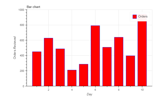
To draw vbar, we specify center x-coordinate, bottom, and top endpoints as shown in the below example:
Syntax:
p.vbar(x, bottom, top,
color, width, fill_color,legend_label)
Code:
Python
from bokeh.io import output_notebook
from bokeh.plotting import figure, show
day = [1, 2, 3, 4, 5, 6, 7, 8, 9, 10]
no_orders = [450, 628, 488, 210, 287,
791, 508, 639, 397, 943]
output_notebook()
p = figure(title='Bar chart',
plot_height=400, plot_width=600,
x_axis_label='Day', y_axis_label='Orders Received',
x_minor_ticks=2, y_range=(0, 1000),
toolbar_location=None)
p.vbar(x=day, bottom=0, top=no_orders,
color='blue', width=0.75, fill_color='red',
legend_label='Orders')
show(p)
|
Output:
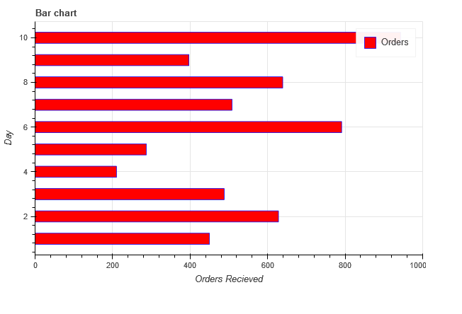
Creating hbar
To draw hbar , we specify center y-coordinate, left and right endpoints, and height as shown in the below example:
Syntax:
p.hbar(y, height, left, right,
 color, width, fill_color,
legend_label)
Example Code:
Python
from bokeh.plotting import figure, show, output_file
day = [1, 2, 3, 4, 5, 6, 7, 8, 9, 10]
no_orders = [450, 628, 488, 210, 287, 791,
508, 639, 397, 943]
p = figure(title='Bar chart',
plot_height=400, plot_width=600,
x_axis_label='Orders Received', y_axis_label='Day',
x_range=(0, 1000), toolbar_location=None)
p.hbar(y=day, height=0.5, left=0, right=no_orders,
color='blue', width=0.75, fill_color='red',
legend_label='Orders')
show(p)
output_file("ex.html")
|
Output:
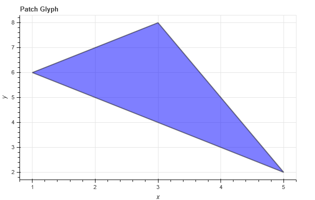
Patch Glyph
The patch glyph shades a region of space in a particular color. We use the patch() method to develop a single patch and patches() method to develop multiple patches.
Single patch
Syntax:
p.patch(x, y, fill_color, line_color, alpha, line_width)
Code:
Python
from bokeh.plotting import figure, show, output_file
x = [1, 2, 3, 4, 5]
y = [6, 7, 8, 5, 2]
p = figure(title='Patch Glyph',
plot_height=400, plot_width=600,
x_axis_label='x', y_axis_label='y',
toolbar_location=None)
p.patch(x, y, fill_color="blue", line_color='black',
alpha=0.5, line_width=2)
show(p)
output_file("ex.html")
|
Output:
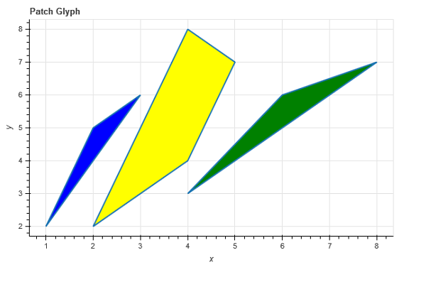
Multiple Patches
Multiple patches can be created in a similar way by using the function patches() instead of patch(). We are passing the data in the form of a list of arrays for creating three patches with different colors in the example shown below.
Code:
Python
from bokeh.plotting import figure, show, output_file
x = [[1, 2, 3], [4, 6, 8], [2, 4, 5, 4]]
y = [[2, 5, 6], [3, 6, 7], [2, 4, 7, 8]]
p = figure(title='Patch Glyph',
plot_height=400, plot_width=600,
x_axis_label='x', y_axis_label='y',
toolbar_location=None)
p.patches(x, y, fill_color=["blue", "green", "yellow"], line_width=2)
show(p)
output_file("ex.html")
|
Output:
Like Article
Suggest improvement
Share your thoughts in the comments
Please Login to comment...