Foundation CSS Button
Last Updated :
06 Apr, 2022
Foundation CSS is an open-source and responsive front-end framework built by ZURB foundation in September 2011, that makes it easy to design beautiful responsive websites, apps, and emails that look amazing & can be accessible to any device. It is used by many companies such as Facebook, eBay, Mozilla, Adobe, and even Disney. The framework is built on SaaS-like bootstrap. It is more sophisticated, flexible, and easily customizable. It also comes with CLI, so it’s easy to use it with module bundlers. It offers the Fastclick.js tool for faster rendering on mobile devices.
Buttons are very useful tools when you need more traditional actions. So when it comes to Foundation CSS, it has many easy-to-use button styles that you can customize or override to fit your needs. Foundation provides additional classes that can be added to your button component to change its color, size, hollow styles, etc.
In this article, we will know how to use different properties of buttons to alter them using Foundation CSS.
Foundation CSS Button classes:
- Basics: This class creates a basic button group in Foundation CSS.
- Sizing: This class is used to create different sizes of buttons. The different sizes of button groups are tiny, small, and large.
- Coloring: This uses .success, .primary, .info, .secondary, .disabled class to give colors to the buttons.
- Hollow styles: This uses a .hollow class that alters a button to give it a hollow style.
- Disabled buttons: This uses the .disabled class to make the class fade.
- Clear style: This uses the .clear class to give buttons a clear style.
- Dropdown arrow: This uses a .dropdown class to add an arrow icon to the button.
- Accessibility: It uses a .show-for-sr class to show content only when it is being read by a screen reader.
Syntax:
<a class="button button-classes" href="link">Button</a>
Example 1: The following code demonstrates a basic button.
HTML
<!DOCTYPE html>
<html lang="en">
<head>
<link rel="stylesheet"
href=
crossorigin="anonymous">
</head>
<body>
<center>
<h1 style="color:green;"> GeeksforGeeks </h1>
<h3> Foundation CSS Button Basics </h3>
<a href="#" class="button">
GFG Button 1
</a>
<a href="#" class="button">
GFG Button 2
</a>
<a href="#" class="button">
GFG Button 3
</a>
<a href="#" class="button">
GFG Button 4
</a>
</center>
</body>
</html>
|
Output:
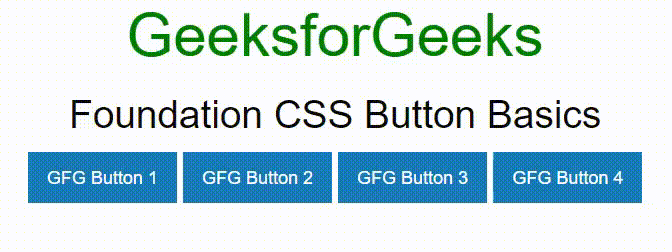
Foundation CSS Basic Button
Example 2: The following code demonstrates a button using sizing classes.
HTML
<!DOCTYPE html>
<html lang="en">
<head>
<title>Foundation CSS Button Sizing</title>
<link rel="stylesheet"
href=
crossorigin="anonymous"/>
<script src=
crossorigin="anonymous">
</script>
<link rel="stylesheet"
href=
<script src=
</script>
</head>
<body
class="grid-x align-middle align-center grid-container"
style="height: 95vh; width: 95vw">
<div>
<h2 style="color: green">GeekforGeeks</h2>
<h4>Foundation CSS Button Sizing</h4>
<a class="button tiny" href="#">
Tiny Button
</a>
<a class="button small" href="#">
Small Button
</a>
<a class="button" href="#"
>Default Button
</a>
<a class="button large" href="#">
Large Button
</a>
<a class="button expanded" href="#">
Expanded Button
</a>
<a class="button small expanded" href="#">
Small Expanded Button
</a>
</div>
<script>
$(document).ready(function () {
$(document).foundation();
});
</script>
</body>
</html>
|
Output:
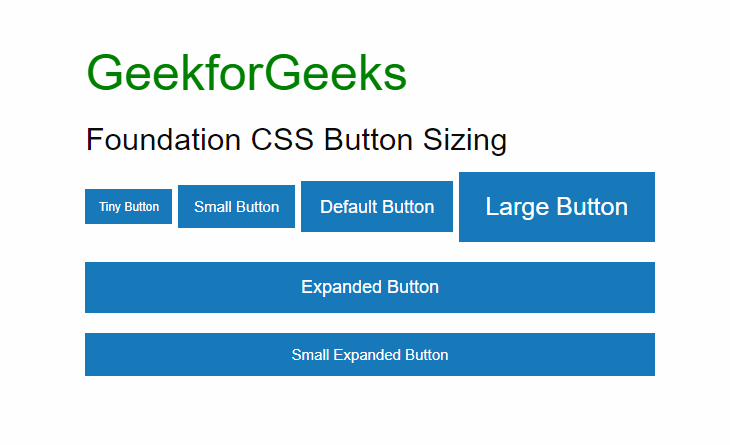
Foundation CSS Sizing Button
Example 3: The following code demonstrates a button using coloring classes.
HTML
<!DOCTYPE html>
<html lang="en">
<head>
<title>Foundation CSS: Colored Button</title>
<link rel="stylesheet"
href=
crossorigin="anonymous">
</head>
<body>
<center>
<h1 style="color:green;"> GeeksforGeeks </h1>
<h3>Foundation CSS: Colored Button</h3>
<button href="#" class="button">
Default
</button>
<button href="#" class="button success">
Success
</button>
<button href="#" class="button info">
Info
</button>
<button href="#" class="button secondary">
Secondary
</button>
<button href="#" class="button alert">
Alert
</button>
<button href="#" class="button disabled">
Disabled
</button>
</center>
</body>
</html>
|
Output:
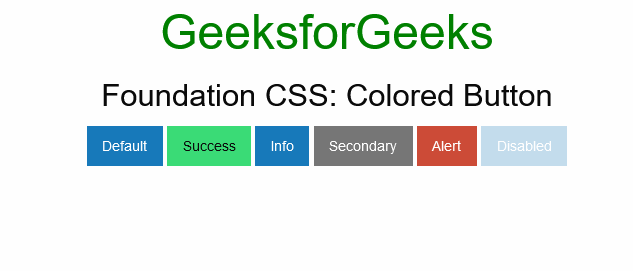
Foundation CSS Button Coloring
Example 4: The following code demonstrates a button using hollow class.
HTML
<!DOCTYPE html>
<html lang="en">
<head>
<title>Foundation CSS Button Hollow Style</title>
<link rel="stylesheet" href=
crossorigin="anonymous">
<script src=
crossorigin="anonymous"></script>
</head>
<body>
<center>
<h1 style="color: green;">
GeeksforGeeks
</h1>
<h3>Foundation CSS Button Hollow Style</h3>
<a class="button hollow primary" href="#">
Hollow Button 1
</a>
<a class="button hollow secondary" href="#">
Hollow Button 2
</a>
<a class="button hollow success" href="#">
Hollow Button 3
</a>
<a class="button hollow alert" href="#">
Hollow Button 4
</a>
<a class="button hollow warning" href="#">
Hollow Button 5
</a>
</center>
</body>
</html>
|
Output:
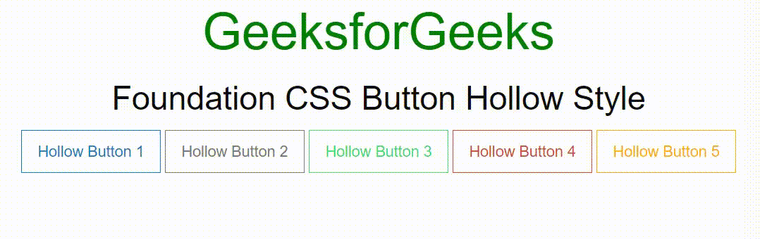
Foundation CSS Hollow Style Button
Example 5: The following code demonstrates a button using a disabled class.
HTML
<!DOCTYPE html>
<html lang="en">
<head>
<title>Foundation CSS Button Disabled</title>
<link rel="stylesheet" href=
crossorigin="anonymous">
<script src=
crossorigin="anonymous"></script>
</head>
<body>
<center>
<h1 style="color: green;">
GeeksforGeeks
</h1>
<h3>Foundation CSS Button Disabled</h3>
<a class="button disabled primary"
href="#" aria-disabled>
Button 1
</a>
<a class="button disabled secondary"
href="#" aria-disabled>
Button 2
</a>
<a class="button disabled success"
href="#" aria-disabled>
Button 3
</a>
<a class="button disabled alert"
href="#" aria-disabled>
Button 4
</a>
<a class="button disabled warning"
href="#" aria-disabled>
Button 5
</a>
</center>
</body>
</html>
|
Output:
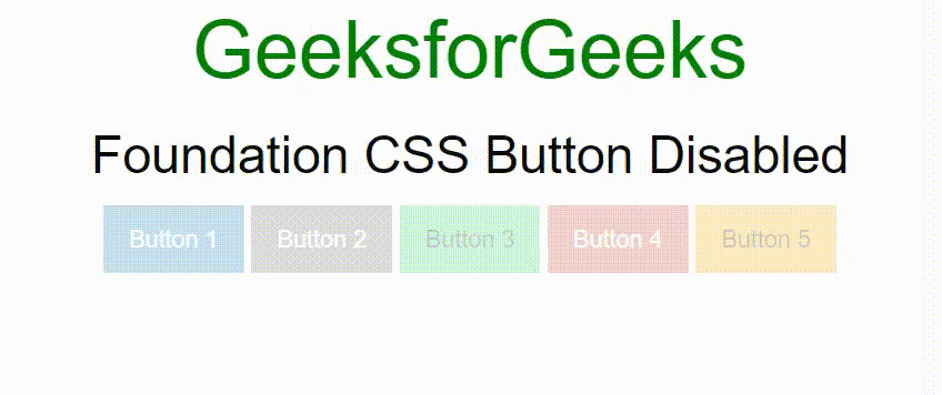
Foundation CSS disabled Button
Example 6: The following code demonstrates a button using clear class.
HTML
<!DOCTYPE html>
<html lang="en">
<head>
<title>Foundation CSS Button Clear Style</title>
<link rel="stylesheet" href=
crossorigin="anonymous">
<script src=
crossorigin="anonymous"></script>
</head>
<body>
<center>
<h1 style="color: green;">
GeeksforGeeks
</h1>
<h3>Foundation CSS Button Clear Style</h3>
<a class="button clear primary" href="#">
Clear Primary Button
</a>
<a class="button clear secondary" href="#">
Clear Secondary Button
</a>
<a class="button clear success" href="#">
Clear Success Button
</a>
<br>
<a class="button clear alert" href="#">
Clear Alert Button
</a>
<a class="button clear warning" href="#">
Clear Warning Button
</a>
<a class="button clear disabled"
href="#" aria-disabled>
Clear Disabled Button
</a>
</center>
</body>
</html>
|
Output:
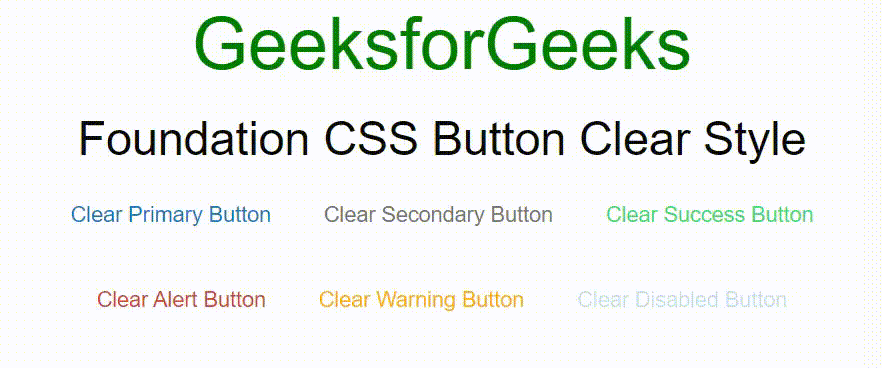
Foundation CSS clear style Button
Example 7: The following code demonstrates a button using a dropdown class.
HTML
<!DOCTYPE html>
<html lang="en">
<head>
<title>Foundation CSS: Dropdown Button</title>
<link rel="stylesheet"
href=
crossorigin="anonymous">
</head>
<body>
<center>
<h1 style="color:green;"> GeeksforGeeks </h1>
<h3>Foundation CSS: Dropdown Button</h3>
<button href="#" class="button dropdown">
Default
</button>
<button href="#" class="button success dropdown">
Success
</button>
<button href="#" class="button info dropdown">
Info
</button>
<button href="#" class="button secondary dropdown">
Secondary
</button>
<button href="#" class="button alert dropdown">
Alert
</button>
<button href="#" class="button dropdown">
Disabled
</button>
</center>
</body>
</html>
|
Output:
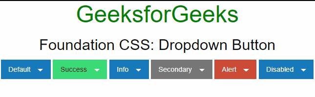
Foundation CSS dropdown Button
Example 8: The following code demonstrates a button using the show-for-sr class.
HTML
<!DOCTYPE html>
<html lang="en">
<head>
<link rel="stylesheet" href=
<link rel="stylesheet" href=
"//cdnjs.cloudflare.com/ajax/libs/foundicons/3.0.0/foundation-icons.min.css" />
<script src=
</script>
</head>
<body style="padding: 20px;">
<h1 style="color: green">GeeksforGeeks</h1>
<h3>Foundation CSS Button Accessibility</h3>
<h5>Screen Reader Friendly Buttons</h5>
<button type="button" class="button primary">
<p class="show-for-sr">Add</p>
<span aria-hidden="true">
<i class="fi-plus"></i>
</span>
</button>
<button type="button" class="button primary">
<p class="show-for-sr">Edit</p>
<span aria-hidden="true">
<i class="fi-pencil"></i>
</span>
</button>
<button type="button" class="button primary">
<p class="show-for-sr">Delete</p>
<span aria-hidden="true">
<i class="fi-trash"></i>
</span>
</button>
<h5>Normal Buttons with Visible Text</h5>
<button type="button" class="button primary">
<span>Add
<i class="fi-plus"></i>
</span>
</button>
<button type="button" class="button primary">
<span>Edit
<i class="fi-pencil"></i>
</span>
</button>
<button type="button" class="button primary">
<span>Delete
<i class="fi-trash"></i>
</span>
</button>
</body>
</html>
|
Output:
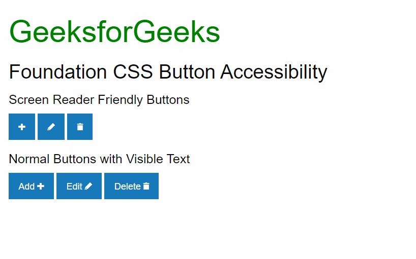
Foundation CSS Accessibility Button
Reference: https://get.foundation/sites/docs/button.html
Like Article
Suggest improvement
Share your thoughts in the comments
Please Login to comment...