Foundation CSS Button Disabled
Last Updated :
16 Feb, 2022
Foundation CSS is an open-source & responsive front-end framework built by ZURB foundation in September 2011, that makes it easy to design beautiful responsive websites, apps, and emails that look amazing & can be accessible to any device. It is used by many companies such as Facebook, eBay, Mozilla, Adobe, and even Disney. The framework is built on Saas-like bootstrap. It is more sophisticated, flexible, and easily customizable. It also comes with CLI, so it’s easy to use it with module bundlers. It offers the Fastclick.js tool for faster rendering on mobile devices.
Foundation CSS Button Disabled is used to create a disabled button. The .disabled class is used to create the disabled button. For the button element, we will use a disabled attribute to disable the button. We will use the aria-disabled attribute if we want to disable the link.
Used Classes:
- disabled: This class is used to disable the button element.
Used Attributes:
- disabled: This attribute is also used to disable the button element.
- aria-disabled: This attribute is used if we want to disable the link element.
Syntax:
<a class="button disabled"
    href="#" aria-disabled>
    Disabled Button
</a>

or

<button type="button"
    class="button" disabled>
    Disabled Button
</button>
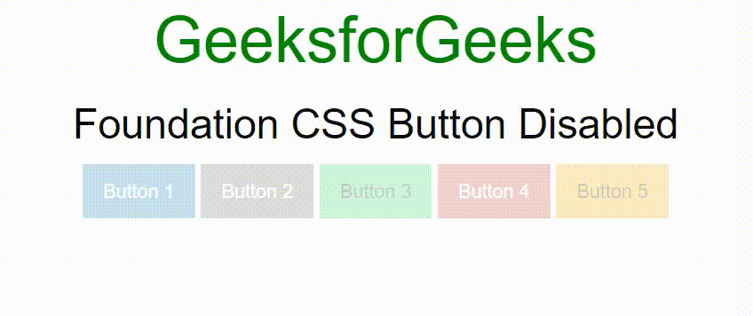
Example 1: In this example, we will create buttons using <a> tag and add button class to make anchor element to button type. Also, add some button color to make the button colorful and use disabled class to make the button disabled.
HTML
<!DOCTYPE html>
<html lang="en">
<head>
<title>Foundation CSS Button Disabled</title>
<link rel="stylesheet" href=
crossorigin="anonymous">
<script src=
crossorigin="anonymous"></script>
</head>
<body>
<center>
<h1 style="color: green;">
GeeksforGeeks
</h1>
<h3>Foundation CSS Button Disabled</h3>
<a class="button disabled primary"
href="#" aria-disabled>
Button 1
</a>
<a class="button disabled secondary"
href="#" aria-disabled>
Button 2
</a>
<a class="button disabled success"
href="#" aria-disabled>
Button 3
</a>
<a class="button disabled alert"
href="#" aria-disabled>
Button 4
</a>
<a class="button disabled warning"
href="#" aria-disabled>
Button 5
</a>
</center>
</body>
</html>
|
Output:
Example 2: In this example, we will create buttons using <button> tag and add button class. Also, add some button color to make the button colorful and use a disabled attribute to make the button disabled.
HTML
<!DOCTYPE html>
<html lang="en">
<head>
<title>Foundation CSS Button Disabled</title>
<link rel="stylesheet" href=
crossorigin="anonymous">
<script src=
crossorigin="anonymous"></script>
</head>
<body>
<center>
<h1 style="color: green;">
GeeksforGeeks
</h1>
<h3>Foundation CSS Button Disabled</h3>
<button type="button" class="button primary"
disabled>
Button 1
</button>
<button type="button" class="button secondary"
disabled>
Button 2
</button>
<button type="button" class="button success"
disabled>
Button 3
</button>
<button type="button" class="button alert"
disabled>
Button 4
</button>
<button type="button" class="button warning"
disabled>
Button 5
</button>
</center>
</body>
</html>
|
Output:
Example 3: In this example, we will create hollow buttons using <a> tag and add button and hollow classes to make anchor element to the hollow button. Also, add some button color to make the hollow buttons colorful and use disabled class to make the button disabled.
HTML
<!DOCTYPE html>
<html lang="en">
<head>
<title>Foundation CSS Button Disabled</title>
<link rel="stylesheet" href=
crossorigin="anonymous">
<script src=
crossorigin="anonymous"></script>
</head>
<body>
<center>
<h1 style="color: green;">
GeeksforGeeks
</h1>
<h3>Foundation CSS Button Disabled</h3>
<a class="button hollow disabled primary"
href="#" aria-disabled>
Button 1
</a>
<a class="button hollow disabled secondary"
href="#" aria-disabled>
Button 2
</a>
<a class="button hollow disabled success"
href="#" aria-disabled>
Button 3
</a>
<a class="button hollow disabled alert"
href="#" aria-disabled>
Button 4
</a>
<a class="button hollow disabled warning"
href="#" aria-disabled>
Button 5
</a>
</center>
</body>
</html>
|
Output:

Example 4: In this example, we will create buttons using <button> tag and add button and hollow class to make anchor element to hollow button type. Also, add some button color to make the hollow button colorful and use disabled class to make the button disabled.
HTML
<!DOCTYPE html>
<html lang="en">
<head>
<title>Foundation CSS Button Disabled</title>
<link rel="stylesheet" href=
crossorigin="anonymous">
<script src=
crossorigin="anonymous"></script>
</head>
<body>
<center>
<h1 style="color: green;">
GeeksforGeeks
</h1>
<h3>Foundation CSS Button Disabled</h3>
<button type="button"
class="button hollow primary" disabled>
Button 1
</button>
<button type="button"
class="button hollow secondary" disabled>
Button 2
</button>
<button type="button"
class="button hollow success" disabled>
Button 3
</button>
<button type="button"
class="button hollow alert" disabled>
Button 4
</button>
<button type="button"
class="button hollow warning" disabled>
Button 5
</button>
</center>
</body>
</html>
|
Output:
Reference: https://get.foundation/sites/docs/button.html#disabled-buttons
Like Article
Suggest improvement
Share your thoughts in the comments
Please Login to comment...