Foundation CSS Button Coloring
Last Updated :
16 Mar, 2022
Foundation CSS is an open-source framework built by ZURB foundation in 2011, it provides various properties that make it easy to design responsive websites, apps, and much more which can be accessible to any device. It is used by many big organizations. This framework is built on Saas-like bootstrap. It is more sophisticated, flexible, and easily customizable. It also comes with CLI. It offers the Fastclick.js tool for faster rendering on mobile devices.
Buttons are very useful tools when you need more traditional actions. So when it comes to Foundation CSS, it has many easy-to-use button styles that you can customize or override to fit your needs. Foundation provides additional classes that can be added to your button component to change its color. Foundation CSS button color styles are the button styles to add multiple colors to buttons.
In this article, we will know how to use different properties of buttons to colorize them using Foundation CSS.
Foundation CSS button coloring Classes:
- success: The success color is green. This class is used to set the color of the button to the successful color of the palette.
- secondary: The secondary color is gray. This class is used to set the color of the button to the secondary color of the palette.
- alert: The alert color is red. This class is used to set the color of the button to the alert color of the palette.
- info: The primary color is blue. This class is used for setting the color of the button to the primary color of the palette.
- disabled: This class is used to disable the button element.
Syntax:
<a href="#" class="button success">
    ....
</a>

// Or

<button class="button success">
    ....
</button>
Example 1: In this example, we will use the <button> tag.
HTML
<!DOCTYPE html>
<html lang="en">
<head>
<title>Foundation CSS: Colored Button</title>
<link rel="stylesheet"
href=
crossorigin="anonymous">
</head>
<body>
<center>
<h1 style="color:green;"> GeeksforGeeks </h1>
<h3>Foundation CSS: Colored Button</h3>
<button href="#" class="button">
Default
</button>
<button href="#" class="button success">
Success
</button>
<button href="#" class="button info">
Info
</button>
<button href="#" class="button secondary">
Secondary
</button>
<button href="#" class="button alert">
Alert
</button>
<button href="#" class="button disabled">
Disabled
</button>
</center>
</body>
</html>
|
Output:
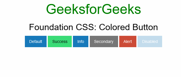
Foundation CSS Button Coloring
Example 2: In this example, we will use the <a> tag.
HTML
<!DOCTYPE html>
<html lang="en">
<head>
<title>Foundation CSS:Colored Button</title>
<link rel="stylesheet"
href=
crossorigin="anonymous">
</head>
<body>
<center>
<h1 style="color:green;">GeeksforGeeks </h1>
<h3>Foundation CSS:Colored Button</h3>
<a href="#" class="button">
Default
</a>
<a href="#" class="button success">
Success
</a>
<a href="#" class="button info">
Info
</a>
<a href="#" class="button secondary">
Secondary
</a>
<a href="#" class="button alert">
Alert
</a>
<a href="#" class="button disabled">
Disabled
</a>
</center>
</body>
</html>
|
Output:
Foundation CSS Button Coloring
Reference: https://get.foundation/sites/docs/button.html#coloring
Like Article
Suggest improvement
Share your thoughts in the comments
Please Login to comment...