Flutter – Splitting App into Widgets
Last Updated :
15 Jan, 2021
Splitting an app into widgets refers to the breaking up of large widgets into smaller, more manageable widgets which can be inferred as smaller chunks of codes. The principal thing here is to understand when to split a widget into smaller ones. We are going to discuss when to split a widget and methods of how to perform this.
When to Split Widgets :
- Large Widget: Whenever we have a large widget with many nested widgets and other smaller widgets inside of it. It is advisable to split the large widgets into smaller widgets that can be managed easily.
- Repeating Widgets: Sometimes we have a situation where we create some custom widget (e.g. custom Button) which we might use at many places, then also it is a good practice to split the piece of code into a separate widget. This helps us clean up extra lines of code and manage the changes to the widget in one place.
- Complex Widget: There are situations when the widget might not be too large, but because of the implementation it becomes complex so to implement the complex parts separately for better understanding we might split the codes into different widgets.
Splitting An App:
1. Using Flutter Outline:
Use the Flutter Outline tool to split an app into widgets as shown below:
- Flutter Outline is present on the right-hand side as a hidden tab. After opening the tab we can see the Widget Tree of the current dart file. Right-click on the widget we want to extract -> click on Extract Widget.
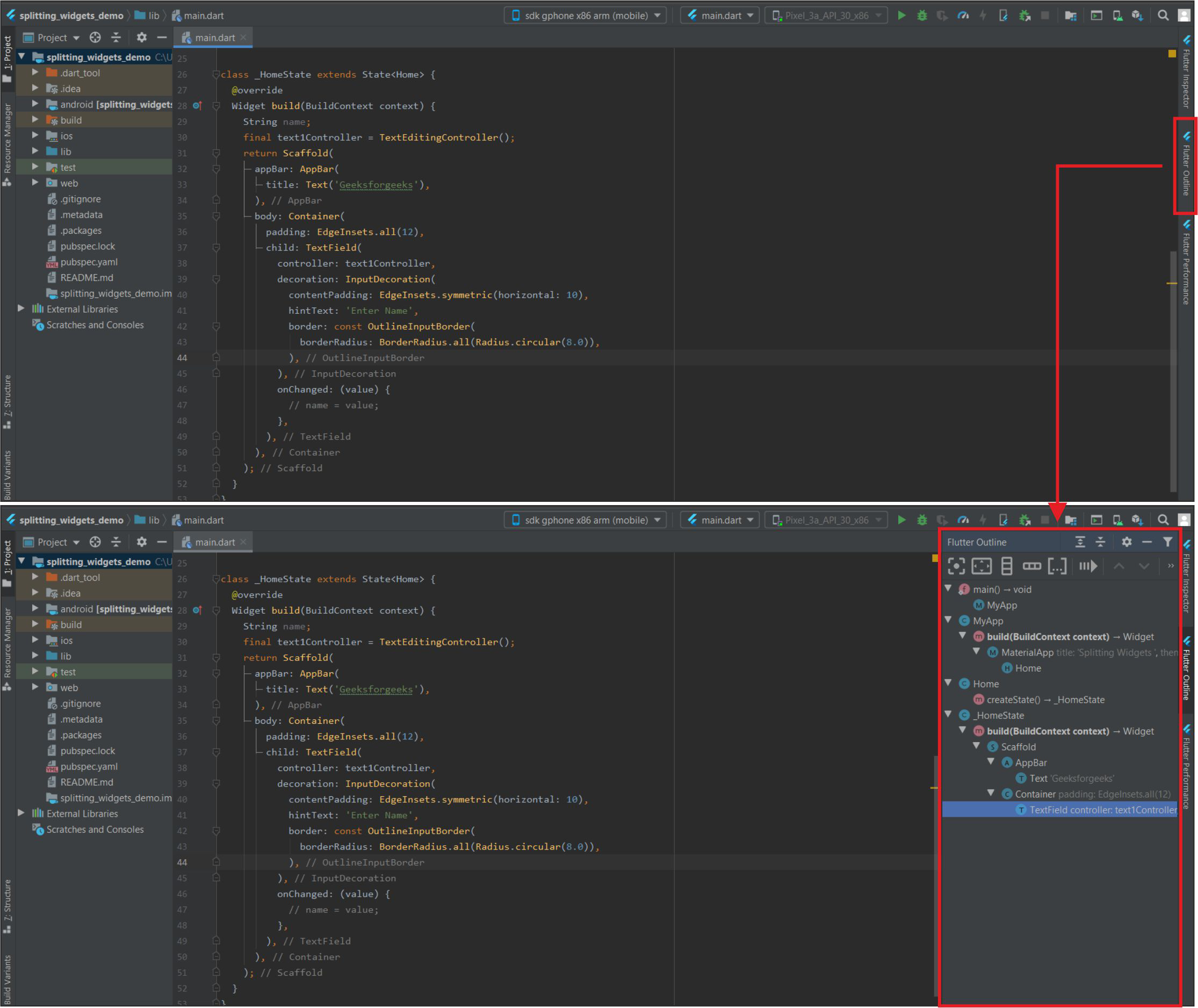
Flutter Outline and Widget Tree
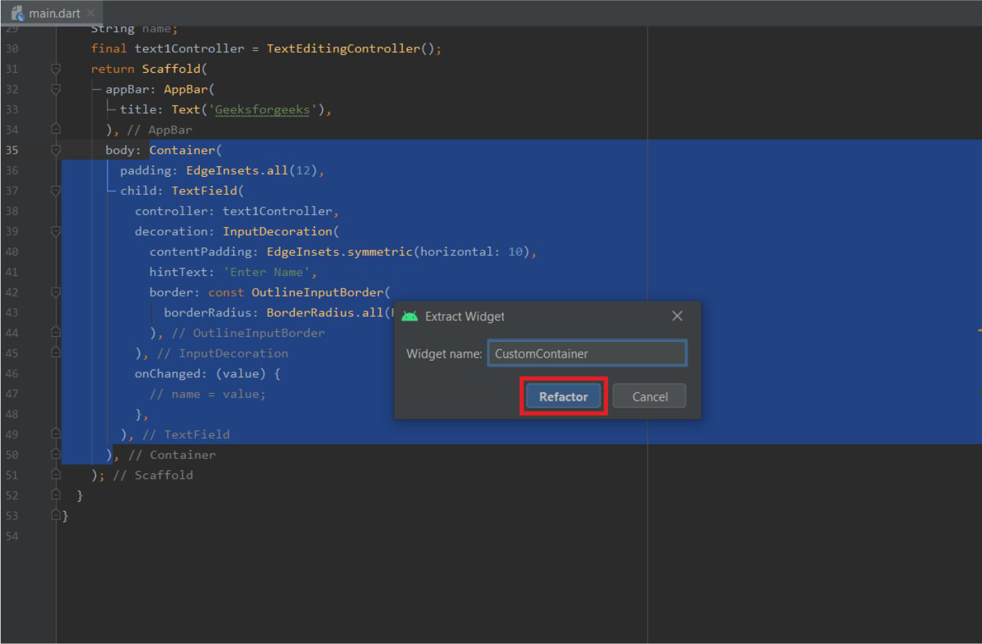
- Give a name for the widget->Click Refactor. The widget will be extracted. We can also place the widget in another file (we have to import it if we keep it in a new file).
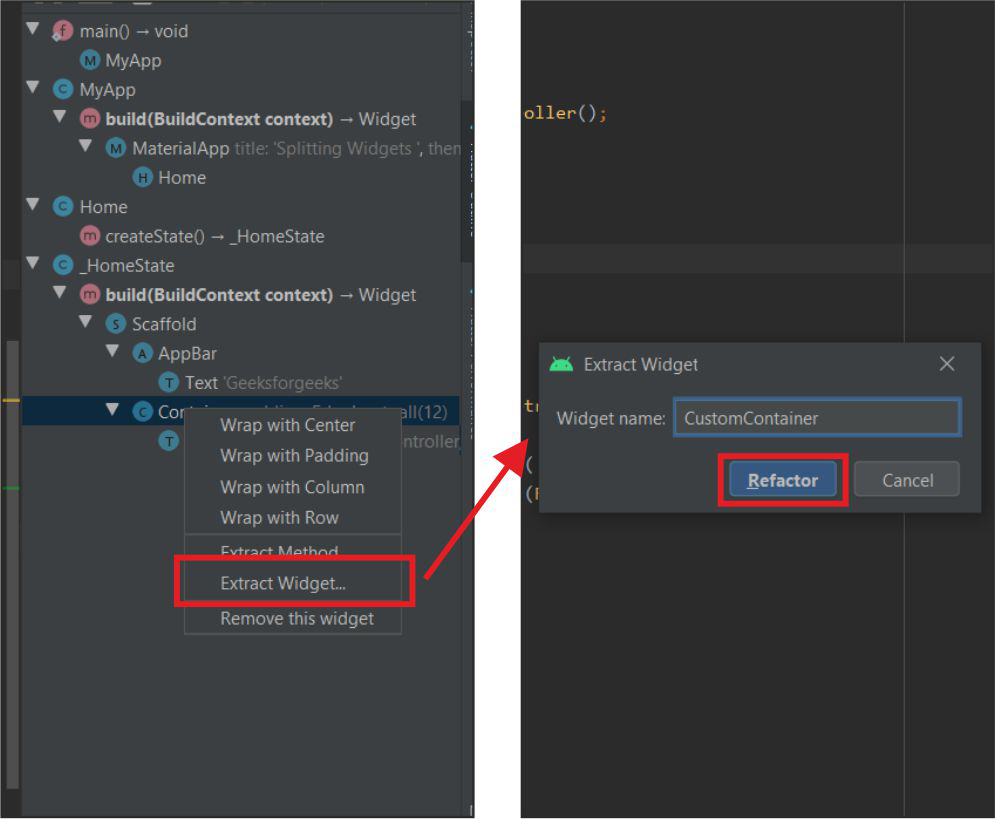
Extract and refactor
This will extract the widgets from the app as shown below:
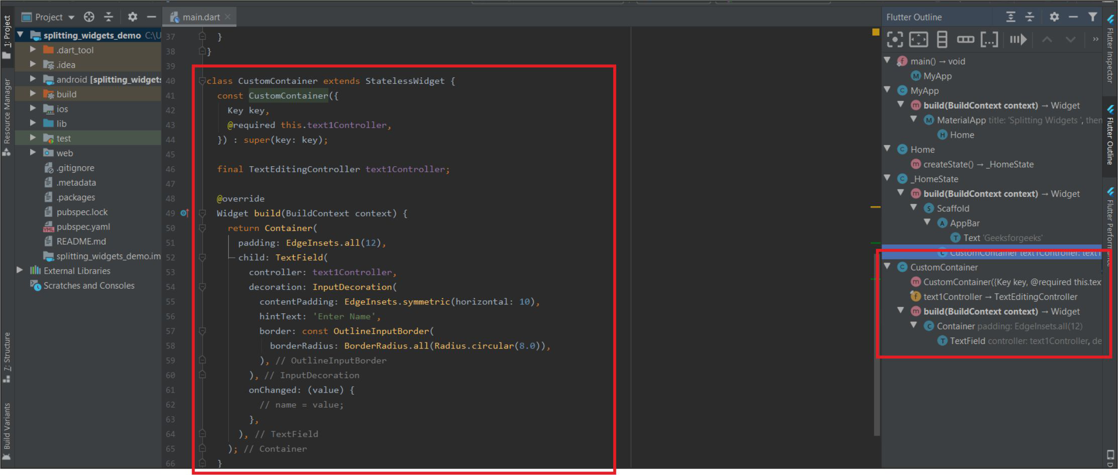
Extracted Widgets
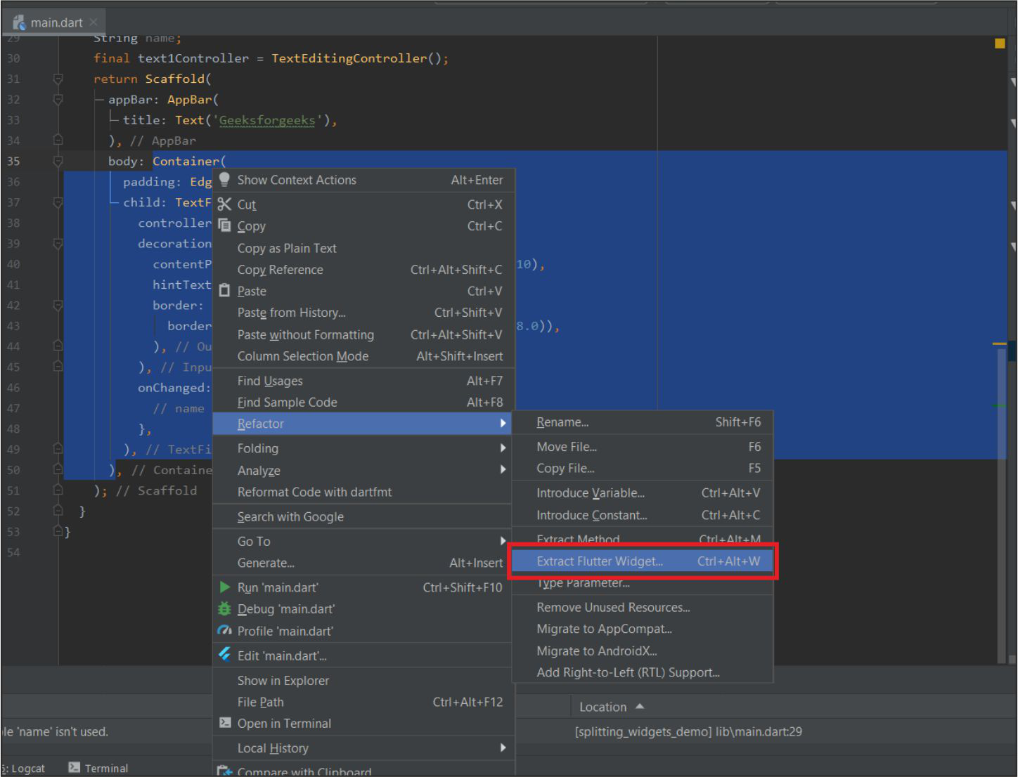
2. By Right Clicking on Widget:
Follow the below shortcut to quickly refactor the widgets in the application.
- By Right-Clicking on the Particular widget -> Refactor -> Extract Flutter Widget (we can also use shortcut Ctrl+Alt+W)
Click on Extract Flutter Widget..
- Give it a name and then click on refactor.
Give a name and Click on Refactor
Example :
Here is an example of a Basic Calculator app that takes two numbers as input from the user and produces an output as the user clicks on any of the addition, subtraction, etc. buttons. There is only one dart file i.e. main.dart in this example.
Dart
import 'package:flutter/cupertino.dart';
import 'package:flutter/material.dart';
void main() {
runApp(MyApp());
}
class MyApp extends StatelessWidget {
@override
Widget build(BuildContext context) {
return MaterialApp(
debugShowCheckedModeBanner: false,
title: 'GeeksforGeeks',
theme: ThemeData(
primarySwatch: Colors.green,
),
home: Home(),
);
}
}
class Home extends StatefulWidget {
@override
_HomeState createState() => _HomeState();
}
class _HomeState extends State<Home> {
double n1, n2, op = 0;
@override
Widget build(BuildContext context) {
return Scaffold(
appBar: AppBar(
title: Text('GeeksforGeeks'),
),
body: Container(
padding: EdgeInsets.all(18),
child: Column(
children: [
Text(
'Simple Calculator',
style: TextStyle(fontSize: 24),
),
SizedBox(
height: 15,
),
Row(
children: [
CustomTextField(
hint: '1st Number',
onChanged: (s) {
n1 = double.parse(s);
print(n1);
}),
SizedBox(width: 10),
CustomTextField(
hint: '2nd Number',
onChanged: (s) {
n2 = double.parse(s);
print(n2);
})
],
),
SizedBox(height: 10),
Row(
mainAxisAlignment: MainAxisAlignment.spaceEvenly,
children: [
CustomButton(
symbol: '+',
onTap: () {
setState(() {
op = (n1 + n2);
});
}),
CustomButton(
symbol: '-',
onTap: () {
setState(() {
op = (n1 - n2);
});
}),
CustomButton(
symbol: '×',
onTap: () {
setState(() {
op = (n1 * n2);
});
}),
CustomButton(
symbol: '÷',
onTap: () {
setState(() {
if (n2 == 0)
op = -1;
else
op = (n1 / n2).toDouble();
});
}),
],
),
SizedBox(height: 10),
Text(
'Output',
style: TextStyle(fontSize: 18),
),
SizedBox(height: 5),
Container(
padding: EdgeInsets.all(10),
width: double.infinity,
height: 50,
decoration: BoxDecoration(
color: Colors.black12,
borderRadius: BorderRadius.circular(18)),
child: Center(
child: Text(
op.toStringAsFixed(2),
style: TextStyle(fontSize: 24),
),
),
)
],
),
),
);
}
}
|
The above lines show the main screen of the app. It comprises several in-built widgets and several custom widgets (made from in-built widgets). These widgets are below the Home widget.
The First Custom Widget is the Custom TextField which is extracted using the above methods and some fields are added in the constructor for better usage and less code.
Dart
class CustomTextField extends StatelessWidget {
const CustomTextField({Key key, this.onChanged, this.hint}) : super(key: key);
final Function onChanged;
final String hint;
@override
Widget build(BuildContext context) {
return Expanded(
child: TextField(
onChanged: onChanged,
style: TextStyle(fontSize: 18),
decoration: InputDecoration(
contentPadding: EdgeInsets.symmetric(horizontal: 20),
filled: true,
fillColor: Colors.black12,
border: OutlineInputBorder(
borderSide: BorderSide.none,
borderRadius: BorderRadius.circular(18)),
hintText: hint,
helperText: 'Keep it Short'),
),
);
}
}
|
The Second Custom Widget Used here is Custom Button which is made using the Gesture Detector.
Dart
class CustomButton extends StatelessWidget {
const CustomButton({Key key, this.onTap, this.symbol}) : super(key: key);
final String symbol;
final Function onTap;
@override
Widget build(BuildContext context) {
return GestureDetector(
onTap: onTap,
child: Container(
height: 60,
width: 60,
decoration: BoxDecoration(
shape: BoxShape.circle,
color: Colors.blueGrey,
),
child: Center(
child: Text(
symbol,
style: TextStyle(
fontSize: 35,
fontWeight: FontWeight.bold,
color: Colors.white,
),
),
),
),
);
}
}
|
Output:
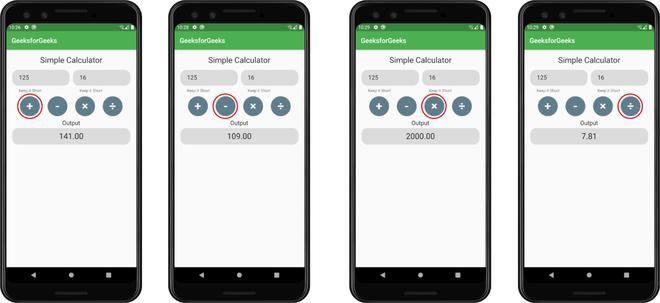
Results obtained by tapping different buttons.
Like Article
Suggest improvement
Share your thoughts in the comments
Please Login to comment...