Flutter – Gradient AppBar
Last Updated :
06 Jan, 2023
AppBar is usually the topmost component of the app (or sometimes the bottom-most), it contains the toolbar and some other common action buttons. As all the components in a flutter application are a widget or a combination of widgets. So AppBar is also a built-in class or widget in flutter which gives the functionality of the AppBar out of the box. Approximately Every mobile Application has AppBar in it which makes the Application well and good. In this article, we will see Gradient AppBar and cover the following content.
- Simple Light AppBar
- Simple Dark AppBar
- AppBar yellow Background with Red Text
- Gradient AppBar Background
- AppBar Grey background centered Indigo Text with the left icon
- AppBar with Left and Right side icons
- AppBar with Double icons on Sides
- AppBar Preferred Size
Simple Light AppBar
Turn the Main Background color to light.
Code
Dart
import 'package:flutter/material.dart';
void main() => runApp(SimpleAppBarLightRun());
class SimpleAppBarLightRun extends StatelessWidget {
@override
Widget build(BuildContext context) {
return MaterialApp(
debugShowCheckedModeBanner: false,
theme: ThemeData.light(),
home: Scaffold(
appBar: AppBar(
title: Text('App Bar'),
),
),
);
}
}
|
Output:
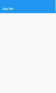
light appbar
Simple Dark AppBar
In the MaterialApp, make the theme Dark, Turn the main background color to dark.
Code
Dart
import 'package:flutter/material.dart';
void main() => runApp(SimpleAppBarLightRun());
class SimpleAppBarLightRun extends StatelessWidget {
@override
Widget build(BuildContext context) {
return MaterialApp(
debugShowCheckedModeBanner: false,
theme: ThemeData.dark(),
home: Scaffold(
appBar: AppBar(
title: Text('App Bar'),
),
),
);
}
}
|
Output:
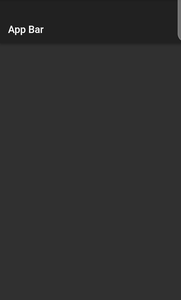
dark appbar
AppBar yellow Background with Red Text
You can still style the AppBar and apply the wanted text and background color. We can give backgroundColor in the AppBar. And in the style property of the text, we can change the text color.
Code
Dart
import 'package:flutter/material.dart';
void main() => runApp(SimpleAppBarLightRun());
class SimpleAppBarLightRun extends StatelessWidget {
@override
Widget build(BuildContext context) {
return MaterialApp(
debugShowCheckedModeBanner: false,
theme: ThemeData.dark(),
home: Scaffold(
appBar: AppBar(
backgroundColor: Colors.yellow,
title: Text('App Bar',style: TextStyle(color: Colors.red),),
),
),
);
}
}
|
Output:
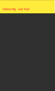
Yellow appbar with red title
Gradient AppBar Background
You can still style the AppBar by using the gradient widget. Following the code below.
Code
Dart
import 'package:flutter/material.dart';
void main() => runApp(GradientAppBarRun());
class GradientAppBarRun extends StatelessWidget {
@override
Widget build(BuildContext context) {
return MaterialApp (
debugShowCheckedModeBanner: false,
theme: ThemeData.light (),
home:
Scaffold (
body:
CustomScrollView (
slivers: <Widget>[
SliverAppBar (
pinned: true,
expandedHeight: 50,
flexibleSpace: Container (
decoration: BoxDecoration (
gradient: LinearGradient (
colors: [
Colors.deepPurpleAccent,
Colors.yellowAccent,
],
),
),
),
title: Text ("Gradient AppBar!"),
),
SliverList (
delegate: SliverChildListDelegate ([
],
),
),
],
),
),
);
}
}
|
Output:
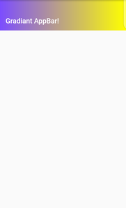
Gradient appbar
AppBar Grey Background centered Indigo Text with left icon
You can Add a left icon to the AppBar using the leading property of the AppBar.
Dart
import 'package:flutter/material.dart';
void main() => runApp(AppBarLeftIconRun());
class AppBarLeftIconRun extends StatelessWidget {
@override
Widget build(BuildContext context) {
return MaterialApp(
debugShowCheckedModeBanner: false,
home: Scaffold(
appBar: AppBar(
centerTitle: true,
leading: new Icon(Icons.ac_unit),
title: Text(
'LeftIcon' ,
textDirection : TextDirection.ltr,
style: TextStyle(
color: Colors.indigo,
),
),
backgroundColor: Colors.grey,
),
),
);
}
}
|
Output:
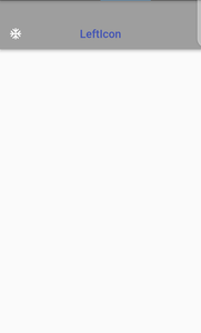
Left Icon
AppBar with Left and Right side icon
You can also add the icon on the right side of the AppBar, using the actions property of the AppBar.
Dart
import 'package:flutter/material.dart';
void main() => runApp(AppBarLeftIconRun());
class AppBarLeftIconRun extends StatelessWidget {
@override
Widget build(BuildContext context) {
return MaterialApp(
debugShowCheckedModeBanner: false,
home: Scaffold(
appBar: AppBar(
centerTitle: true,
leading: IconButton(
onpressed:(){},
icon:Icon(Icons.account),
),
actions:[
IconButton(
onpressed:(){},
icon:Icon(Icons.account),
],
title: Text(
'<--Icon-->' ,
textDirection : TextDirection.ltr,
style: TextStyle(
color: Colors.indigo,
),
),
backgroundColor: Colors.grey,
),
),
);
}
}
|
Output:
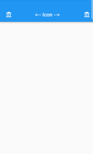
Left and Right Icon
AppBar with Double icons on Sides
You can add multiple icons in the AppBar. In leading we are using row for multiple icons, but actions can take multiple children.
Dart
import 'package:flutter/material.dart';
void main() => runApp(AppBarDoubleSideIconsRun());
class AppBarDoubleSideIconsRun extends StatelessWidget {
@override
Widget build(BuildContext context) {
return MaterialApp(
debugShowCheckedModeBanner: false,
theme: ThemeData.light(),
home: Scaffold(
appBar:AppBar(
leading: Padding(
padding: EdgeInsets.only(left: 2),
child: Row(
children: <Widget>[
IconButton(
onPressed:(){},
icon: Icon(Icons.account_circle),
),
Expanded(
child: IconButton(
onPressed:(){},
icon:
Icon(Icons.account_circle),
),
),
],
),
),
title: Row(
mainAxisAlignment:
MainAxisAlignment.center,
children: <Widget>[
Text('<--Icons-->'),
],
),
actions: <Widget>[
IconButton(
onPressed:(){},
icon: Icon(Icons.account_circle),
),
IconButton(
onPressed:(){},
icon: Icon(Icons.account_circle),
),
],
),
),
);
}
}
|
Output:
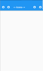
Double icon sides
AppBar Preferred Size
By using the Preferred Size widget we can give the size of the AppBar.
Dart
import 'package:flutter/material.dart';
void main() => runApp(AppBarSize());
class AppBarSize extends StatelessWidget {
@override
Widget build(BuildContext context) {
return MaterialApp(
debugShowCheckedModeBanner: false,
home: Scaffold(
appBar: PreferredSize(
preferredSize:Size.fromHeight(150.0),
child:AppBar(
flexibleSpace:Center(
child:Text('AppBar With Height 150'),
),
),
)
),
);
}
}
|
Output:
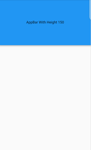
Preferred Size appbar
Like Article
Suggest improvement
Share your thoughts in the comments
Please Login to comment...