Flutter – Circular & Linear Progress Indicators
Last Updated :
15 Feb, 2021
Progress Indicator in any application displays the time which is needed for some tasks to complete such as downloading, installation, uploading, file transfer, etc. This shows the progress of a task or the time to display the length of the processes.
In Flutter, progress can be displayed in two ways:
- CircularProgressIndicator: A CircularProgressIndicator is a widget that shows progress along a circle. It is a circular progress bar that spins to indicate that the application is busy or on hold.
- LinearProgressIndicator: A LinearProgressIndicator also known as a progress bar is a widget that shows progress in a linear direction or along a line to indicate that the application is in progress.
There are two types of progress indicators:
- Indeterminate: Indeterminate progress indicator is an indicator that does not display a specific value at any instance of time and only indicates that progress is being made. It does not indicate how much progress remains to be made. For creating an indeterminate progress bar we set the value property as null.
- Determinate: Determinate progress indicator is an indicator that has a specific value at each instance of time. It also indicates how much progress is completed. The value in the determinate progress indicator increases monotonically from 0 to 1, where 0 indicates that progress is just started and 1 indicates that the progress is completed.
Following are the steps to follow in order to implement the Progress Indicators in the Flutter app.
Step 1: Import the material.dart package in order to display Flutter Progress Indicator widget implementing Material Design.
import 'package:flutter/material.dart';
Step 2: Next, the following code needs to be implemented in the respective main.dart file.
Dart
import 'package:flutter/material.dart';
void main(){
runApp(
MyApp()
);
}
class MyApp extends StatelessWidget {
@override
Widget build(BuildContext context) {
return MaterialApp(
debugShowCheckedModeBanner: false,
home: Loader(),
);
}
}
class Loader extends StatelessWidget {
@override
Widget build(BuildContext context) {
return Scaffold(
appBar: AppBar(
title: Text('GeeksforGeeks'),
backgroundColor: Color(0xFF4CAF50),
centerTitle: true,
),
body: Center(
child: Column(
mainAxisAlignment: MainAxisAlignment.center,
children: [
CircularProgressIndicator(),
SizedBox(
height: 15,
),
LinearProgressIndicator(),
],
),
),
);
}
}
|
Output:
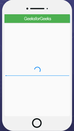
Default Progress Indicator
Step 3: Now in order to improve the user interface of this application we need to implement some significant properties of the progress bar.
Dart
import 'package:flutter/material.dart';
void main(){
runApp(
MyApp()
);
}
class MyApp extends StatelessWidget {
@override
Widget build(BuildContext context) {
return MaterialApp(
debugShowCheckedModeBanner: false,
home: Loader(),
);
}
}
class Loader extends StatelessWidget {
@override
Widget build(BuildContext context) {
return Scaffold(
appBar: AppBar(
title: Text('GeeksforGeeks'),
backgroundColor: Color(0xFF4CAF50),
centerTitle: true,
),
body: Center(
child: Column(
mainAxisAlignment: MainAxisAlignment.center,
children: [
CircularProgressIndicator(
backgroundColor: Colors.redAccent,
valueColor: AlwaysStoppedAnimation(Colors.green),
strokeWidth: 10,
),
SizedBox(
height: 15,
),
LinearProgressIndicator(
backgroundColor: Colors.redAccent,
valueColor: AlwaysStoppedAnimation(Colors.green),
minHeight: 20,
)
],
),
),
);
}
}
|
Output:
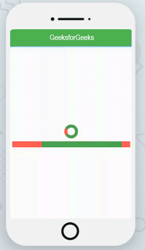
Improved UI Progress Indicator
Explanation:
Following is the explanation of above-mentioned code for implementing Progress Indicators in Flutter:
- backgroundColor: This property is used in order to set the background color of a linear loader and a circular spin loader in the progress bar.
- strokeWidth: This property specifies the width of the line that is used to draw a circle in a CircularProgressIndicator.
- minHeight: It is the minimum height of the line that is used to draw the indicator in a LinearProgressIndicator or in other words it is used to define how thick the line in an indicator looks.
- valueColor: It is used in order to define the progress indicator’s value as an animated value. valueColor property covers the highlights of the completed task valued.
- AlwaysStoppedAnimation: It is used in order to specify a constant color in the valueColor property.
- value: Value property is used in order to differentiate between the determinate and indeterminate progress bar. If the value property is set as null, the progress indicator is indeterminate, which means that it will show the predefined animation on the indicator with its motion that does not indicate how much progress is completed. If set as non-null, then it displays how much progress is being made at a particular instant. A value of 0.0 indicates that progress is just started and a value of 1.0 indicates that the progress is completed.
Like Article
Suggest improvement
Share your thoughts in the comments
Please Login to comment...