Flutter – BorderDirectional Widget
Last Updated :
22 Feb, 2022
BorderDirectional is a built-in widget in flutter SDK. This widget is somewhat similar to the Border widget with the main difference being the inclusion of start and end property which lets the user modify the border according to the text direction right-to-left (rtl) or left-to-right (ltr). If our start and end border sides are the same then Border widget should be used as it will provide better performance optimization.
Constructor of BorderDirectional Class:
 const BorderDirectional(
{BorderSide top: BorderSide.none,
BorderSide start: BorderSide.none,
BorderSide end: BorderSide.none,
BorderSide bottom: BorderSide.none}
)
Properties of BorderDirectional Widget:
- bottom: This property takes in BorderSide ( final )as the object. It controls the bottom side of the border.
- dimensions: The dimension property takes in EdgeInsetsGeometry as the object to control the widths of the side of the border.
- end: This property takes in BorderSide as the object. It controls the end side ( right or left depending on the text direction) of the border.
- hashCode: This property takes an int value (override) as the object. This is responsible for the state representation of an object.
- isUniform: This property takes in a boolean value (read-only, override ) as the object to decide whether all sides of the border will be uniform or not.
- start: This property takes in BorderSide as the object. It controls the start side ( right or left depending on the text direction) of the border.
- top: This property takes in BorderSide (final) as the object. It controls the top side of the border.
Example 1: In this app, we will see how to use the start and end properties when the text direction is set from left to right.
Dart
import 'package:flutter/material.dart';
void main() {
runApp(
MaterialApp(
builder: (context, child) {
return Directionality(
textDirection: TextDirection.ltr,
child: child,
);
},
home: Scaffold(
appBar: AppBar(
title: Text('GeeksforGeeks'),
backgroundColor: Colors.greenAccent[400],
leading: IconButton(
icon: Icon(Icons.menu),
tooltip: 'Menu',
onPressed: () {},
),
actions: <Widget>[
IconButton(
icon: Icon(Icons.comment),
tooltip: 'Comment',
onPressed: () {},
),
],
),
body: Center(
child: Padding(
padding: const EdgeInsets.all(12.0),
child: SizedBox(
height: 250,
child: Container(
decoration: BoxDecoration(
image: const DecorationImage(
image: NetworkImage(
),
border: BorderDirectional(
start: BorderSide(
color: Colors.green,
width: 4,
style: BorderStyle.solid),
end: BorderSide(
color: Colors.blue,
width: 4,
style: BorderStyle.solid),
),
),
),
),
),
),
),
debugShowCheckedModeBanner: false,
),
);
}
|
Output:

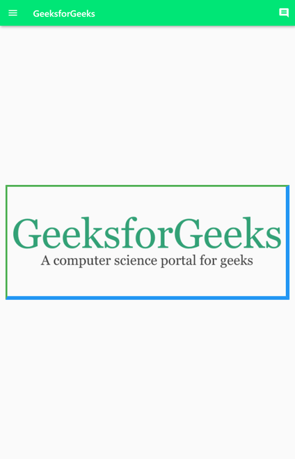
Text direction is set from left to right
Explanation: In this simple flutter app the inside the builder property of the MaterialApp the text direction is set to TextDirection.ltr, which will make the direction of text from left to right ( by default it is set to ltr only). And inside the BorderDirectional widget the start and end property are using BorderSide widget as the object. And in the BorderSide widget of both the properties the color of the border is set to green and blue respectively the width is 4 pixels and the style is set to solid. Now, the thing to notice here is the green color border which is actually assigned to the start property is placed on the left part of the screen. And the blue color border side is on the right side of the image. This is due to the reason that the text direction is from left-to-right, which means the text starts printing from left to right and so the borders.
Example 2: In this app, we will see how to use the start and end properties when the text direction is set to right to left.
Dart
import 'package:flutter/material.dart';
void main() {
runApp(
MaterialApp(
builder: (context, child) {
return Directionality(
textDirection: TextDirection.ltr,
child: child,
);
},
home: Scaffold(
appBar: AppBar(
title: Text('GeeksforGeeks'),
backgroundColor: Colors.greenAccent[400],
leading: IconButton(
icon: Icon(Icons.menu),
tooltip: 'Menu',
onPressed: () {},
),
actions: <Widget>[
IconButton(
icon: Icon(Icons.comment),
tooltip: 'Comment',
onPressed: () {},
),
],
),
body: Center(
child: Padding(
padding: const EdgeInsets.all(12.0),
child: SizedBox(
height: 250,
child: Container(
decoration: BoxDecoration(
image: const DecorationImage(
image: NetworkImage(
),
border: BorderDirectional(
start: BorderSide(
color: Colors.green,
width: 4,
style: BorderStyle.solid),
end: BorderSide(
color: Colors.blue,
width: 4,
style: BorderStyle.solid),
),
),
),
),
),
),
),
debugShowCheckedModeBanner: false,
),
);
}
|
Output:

start and end properties
Explanation: This app is also similar to the previous one except for the fact that the text direction is set to rtl ( right-to-left ). And looking at the code we can see that the BorderDirectional widget is also the same as the previous example. But in the output, we can see that this time the green color border is printed on the right-hand side and the blue border on the left side. Again the reason being text direction which is starting from left and going to the right.
Example 3: In this example, we will see how to add a border in all directions around the image using the BorderDirectional widget.
                    // Code Snippet Border
                   ...
                   border: BorderDirectional(
                    start: BorderSide(
                        color: Colors.green,
                        width: 4,
                        style: BorderStyle.solid), //BorderSide
                    end: BorderSide(
                        color: Colors.blue,
                        width: 8,
                        style: BorderStyle.solid), //BorderSide
                    top: BorderSide(
                        color: Colors.green,
                        width: 4,
                        style: BorderStyle.solid), //BorderSide
                    bottom: BorderSide(
                        color: Colors.blue,
                        width: 8,
                        style: BorderStyle.solid), //BorderSide
                  ), //Border
                  ...
Output:
border in all directions
Explanations: In this app, text direction is not mentioned, and by default, it is set to ltr (left-to-right). Taking a look at the code snippet we can see that the start and top properties are the same and the end and bottom properties are the same. In the top and start properties, the color is set to green, the width is 4 pixels and the border style is set to solid. At the end and bottom border side, the color is set to blue, width to 8 pixels and the style is again set to solid.
Like Article
Suggest improvement
Share your thoughts in the comments
Please Login to comment...