Explain Bootstrap’s collapsing elements
Last Updated :
31 Oct, 2021
In this article, we will see how can we create a collapsing element using Bootstrap classes and also see their different properties, along with understanding their implementation through the example.
Bootstrap Collapsing Element:
Collapsing elements are those elements that show data to the user when the user clicks or hover over it. It is a modern approach that helps us to show a large amount of data to the user. It keeps the website neat and closes or collapses again when the user hovers out or clicks out of it. We can make our own collapsing element using the basic HTML, CSS, and JavaScript. But Bootstrap facilitates the collapsing element property in its components.
Working of Bootstrap Collapsing Element:
Bootstrap collapse is used to show or hide content. Buttons or anchors are used to trigger the request and they are mapped to the specific element that needs to be collapsed. In Bootstrap, the collapsing element animates the height of the element from its current height to 0.
The classes used for collapsing element:
- .collapse: This class hides the content.
- .collapsing: This class is used during the transition.
- .collapse-show: This class shows the content.
Please refer to the Bootstrap 4 Collapse article for further details.
Generally, the collapsing element is done using the button. Here, we will use a button to show the working of the collapsible element.
Syntax:
<button type="button"
        data-bs-toggle="collapse"
        data-bs-target="#collapseExample">Button
</button>
The two attributes are used with the button, are given below:
- data-bs-target: This attribute holds the id of the element that is needed to be hidden or shown on a button click.
- data-bs-toggle: This attribute is always set to “collapse”.
From the below example, we can see a button is given with both the attributes “data-bs-toggle” set to “collapse” and “data-bs-target” with the value set to “#collapseExample” i.e. the id of the div element that should be made collapsible. The “div” is given the class “collapse” to make it collapsible.
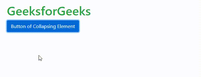
Example: This example describes the collapsing element.
HTML
<!DOCTYPE html>
<html lang="en">
<head>
<meta charset="UTF-8">
<meta http-equiv="X-UA-Compatible"
content="IE=edge">
<meta name="viewport"
content="width=device-width,
initial-scale=1.0">
<link rel="stylesheet"
href=
integrity=
"sha384-B0vP5xmATw1+K9KRQjQERJvTumQW0nPEzvF6L/Z6nronJ3oUOFUFpCjEUQouq2+l"
crossorigin="anonymous">
<script src=
integrity=
"sha384-ka7Sk0Gln4gmtz2MlQnikT1wXgYsOg+OMhuP+IlRH9sENBO0LRn5q+8nbTov4+1p"
crossorigin="anonymous">
</script>
<title>Document</title>
</head>
<body>
<h1 class=text-success>GeeksforGeeks</h1>
<p>
<button class="btn btn-primary"
type="button"
data-bs-toggle="collapse"
data-bs-target="#collapseExample"
aria-expanded="false"
aria-controls="collapseExample">
Button of Collapsing Element
</button>
</p>
<div class="collapse" id="collapseExample">
<div class="card card-body">
This text is shown when the above button
is clicked and hides when user clicks on it again.
</div>
</div>
</body>
</html>
|
Output:
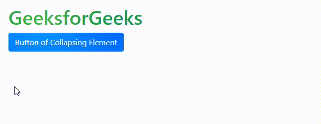
Simple Collapsing Element in Bootstrap
Horizontal Collapsing Element:
We can also make horizontal collapsing elements. Here, instead of vertical the element will collapse horizontally. To make a horizontal collapsing element, we need to add the class “collapse-horizontal” to the element that is to be collapsed. We need the width of the child element to be mentioned either using the inline CSS or using width-utilities only.
Syntax:
<div class="collapse collapse-horizontal"></div>
Example: This example describes the Horizontal Collapsing Element.
HTML
<!DOCTYPE html>
<html lang="en">
<head>
<meta charset="UTF-8">
<meta http-equiv="X-UA-Compatible"
content="IE=edge">
<meta name="viewport"
content="width=device-width,
initial-scale=1.0">
<link rel="stylesheet"
href=
integrity=
"sha384-B0vP5xmATw1+K9KRQjQERJvTumQW0nPEzvF6L/Z6nronJ3oUOFUFpCjEUQouq2+l"
crossorigin="anonymous">
<script src=
integrity=
"sha384-ka7Sk0Gln4gmtz2MlQnikT1wXgYsOg+OMhuP+IlRH9sENBO0LRn5q+8nbTov4+1p"
crossorigin="anonymous">
</script>
<title>Document</title>
</head>
<body>
<h1 class=text-success>GeeksforGeeks</h1>
<p>
<button class="btn btn-primary"
type="button"
data-bs-toggle="collapse"
data-bs-target="#collapseExample"
aria-expanded="false"
aria-controls="collapseExample">
Button of Collapsing Element
</button>
</p>
<div>
<div class="collapse collapse-horizontal"
id="collapseExample">
<div class="card card-body"
style="width: 500px;">
This text is shown when the above
button is clicked and hides when
user clicks on it again.
</div>
</div>
</div>
</body>
</html>
|
Output:
Collapsing Element in Horizontal Manner
Multiple Collapsible:
We can also make a single button to control multiple collapsible elements at once. The idea is very simple, here we have to make multiple-element with the same class name and add that class name to the “data-bs-target”.
Note: We use the class name here not id because id is unique to every element in HTML.
Syntax:
<div class="collapse multi-collapse"></div>
Example: This example describes the Multiple Collapsible Element.
HTML
<!DOCTYPE html>
<html lang="en">
<head>
<meta charset="UTF-8">
<meta http-equiv="X-UA-Compatible"
content="IE=edge">
<meta name="viewport"
content="width=device-width,
initial-scale=1.0">
<link rel="stylesheet"
href=
integrity=
"sha384-B0vP5xmATw1+K9KRQjQERJvTumQW0nPEzvF6L/Z6nronJ3oUOFUFpCjEUQouq2+l"
crossorigin="anonymous">
<script src=
integrity=
"sha384-ka7Sk0Gln4gmtz2MlQnikT1wXgYsOg+OMhuP+IlRH9sENBO0LRn5q+8nbTov4+1p"
crossorigin="anonymous">
</script>
<title>Document</title>
</head>
<body>
<h1 class=text-success>GeeksforGeeks</h1>
<button class="btn btn-primary"
type="button"
data-bs-toggle="collapse"
data-bs-target=".collapse"
aria-expanded="false"
aria-controls="multiCollapseExample1 multiCollapseExample2">
Toggle both elements
</button>
<div class="row">
<div class="col">
<div class="collapse multi-collapse"
id="multiCollapseExample1">
<div class="card card-body">
This text is shown when the above
button is clicked and hides when
user clicks on it again.
</div>
</div>
</div>
<div class="col">
<div class="collapse multi-collapse"
id="multiCollapseExample2">
<div class="card card-body">
This text is shown when the above
button is clicked and hides when
user clicks on it again.
</div>
</div>
</div>
</div>
</body>
</html>
|
Output:

Multiple Collapsible in Bootstrap
In the above code, the “data-bs-target” attribute of the button is given the value of the class name “.collapse” and thus the button now works on both the collapsible element at once.
Note: We can also make the above elements show content individually by assigning them to separate buttons using their “id”.
Supported Browser:
- Google Chrome
- Microsoft Edge
- Internet Explorer 10+
- Opera
- Safari
- Firefox
Like Article
Suggest improvement
Share your thoughts in the comments
Please Login to comment...