Explain all the measurement units in CSS3
Last Updated :
11 May, 2023
The CSS measurement units used are as follows. Measurement basically means to find a number that shows the amount of something we want to find out. CSS has many different measurement units for expressing the length of various HTML containers. Various CSS properties like width, padding, font-size, margin, etc have a number and a unit as their value.
Measurement units can further be classified into two types based on their nature.
- Absolute Measurement Units
- Relative Measurement Units
Absolute Units: Absolute units as the name suggest are fixed in nature. They are not relative to anything else and are considered to be of the same size. For use on-screen, these measurement units are not recommended because of the variation of screen size. These units are recommended when the output medium is known, such as for printing.
Examples :
- px: Pixel is a small unit but still visible and is relative to the viewing device.
- cm: Centimeters, 1cm=37.8px
- mm: millimeters, is a smaller unit as compared to cm, 1 mm=1/10th of 1cm.
- in: inches, is a large unit compared to pixels, 1in=96px
- pc: pica is a typographic unit, 1pc=1/6th of 1in
- pt: Points is the smallest unit of measure, 1pt=1/72 of 1in
Relative Units: As suggested by its name, these are relative to something else. It could be either relative to the size of the root element’s font or parent element or the size of the viewport. Users can scale better between different rendering mediums using relative units.
Examples :
- rem: This unit is relative to the font-size of the root element.
- em: This unit is relative to the font-size of the element itself. For example, 3em signifies that the new size will be 3 times the size of the current font.
- %: This denotes a percentage value, defines the size of an element relative to its parent’s element.
- ex: This unit is relative to the x-height of the font in use.
- vh: The viewport height, denotes the element’s height is 1% of the viewport’s height.
- vw: The viewport width, denotes the element’s width is 1% of the viewport’s width.
- vmin: This denotes the size relative to 1% of the viewport’s smaller dimension.
- vmax: This denotes the size relative to 1% of the viewport’s larger dimension.
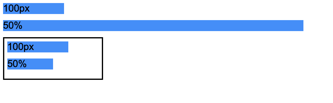
Example 1: The following example shows the comparison between px and percentage. The example clearly shows the difference between px and percentage. px is an absolute unit whereas percentage is a relative unit. px will not change its size regardless of the size of the container whereas % will change its size dynamically based on the width of the container.
HTML
<!DOCTYPE html>
<html>
<body>
<div class="box pixel-units">
100px
</div>
<div class="box percentage-units">
50%
</div>
<div class="parent">
<div class="box pixel-units">
100px
</div>
<div class="box percentage-units">
50%
</div>
</div>
</body>
</html>
|
CSS
body {
font-family: Arial;
}
.box {
background-color: dodgerblue;
margin-bottom: 10px;
}
.pixel-units {
width: 100px;
}
.percentage-units {
width: 50%;
}
.parent {
width: 150px;
border: 2px solid black;
padding: 5px;
}
|
Output:
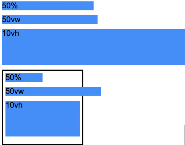
Example 2: The following example shows the comparison between vw, vh , and percentages. Another type of relative unit is vw and vh. While percentages are relative to the size of the parent container, vw, and vh are relative to the size of the screen. 1vw is the width of 1% of the screen size whereas 1vh is the height of 1% of the screen size. The below example will illustrate the difference between vw, vh, and percentages.
HTML
<!DOCTYPE html>
<html>
<body>
<div class="box percentage-units">
50%
</div>
<div class="box vw-unit">
50vw
</div>
<div class="box vh-unit">
10vh
</div>
<div class="parent">
<div class=" box percentage-units">
50%
</div>
<div class="box vw-unit">
50vw
</div>
<div class="box vh-unit">
10vh
</div>
</div>
</body>
</html>
|
CSS
body {
font-family: Arial;
}
.box {
background-color: dodgerblue;
margin-bottom: 10px;
}
.percentage-units {
width: 50%;
}
.vw-unit {
width: 50vw;
}
.vh-unit {
height: 10vh;
}
.parent {
width: 150px;
border: 2px solid black;
padding: 5px;
}
|
Output:
Example 3: The following example shows the comparison between em and rem.
em and rem are relative units applied to font sizes. These units are defined by the font sizes specified by us. The main difference between em and rem is, em is relative to the root element (<html>) whereas em is relative to the font size specified in the parent container. The below example should help you understand the differences between these units.
Note: The default font size of the root element is 16px. It can be overwritten by changing the font-size value in HTML.
HTML
<!DOCTYPE html>
<html>
<body>
<div class="one-rem">1rem</div>
<div class="one-em">1em</div>
<hr>
<div class="parent">
<div class="one-rem">1rem</div>
<div class="one-em">1em</div>
</div>
</body>
</html>
|
CSS
html {
font-size: 20px;
}
.one-rem {
font-size: 1rem;
}
.one-em {
font-size: 1em;
}
.parent {
font-size: 30px;
border: 2px solid black;
}
|
Output:
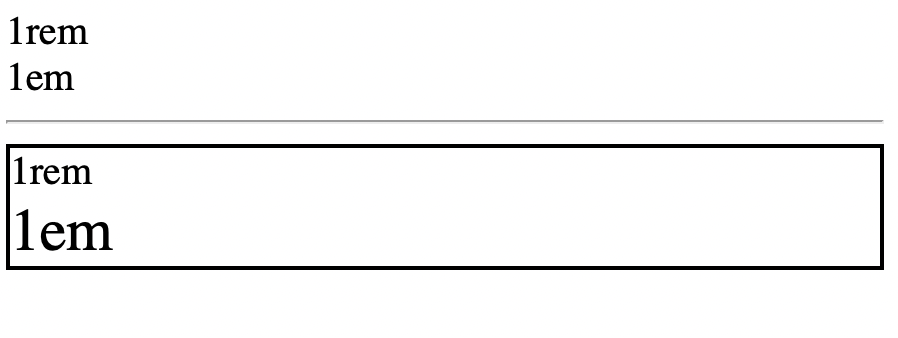
In the first case, em and rem have the same font size because they are children of the same element (root element). However, in the second case, the font-size in the parent container is defined as 30px which explains the difference in font-size between em and rem.
Like Article
Suggest improvement
Share your thoughts in the comments
Please Login to comment...