Error Bars using ggplot2 in R
Last Updated :
28 Jul, 2021
Error bars are bars that show the mean score. The error bars stick out from the bar like a whisker. The error bars show how precise the measurement is. It shows how much variation is expected by how much value we got. Error bars can be plated both horizontally and vertically. The horizontal error bar plot shows error bars for group differences as well as bars for groups.
The error bar displays the precision of the mean in one of 3 ways:
- The confidence interval
- The standard error of the mean
- Standard Deviation
geom_errorbar()
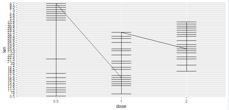
Various ways of representing a vertical interval are defined by x, ymin, and ymax. Each case draws a single graphical object. Here geom draws the error bar, which can be defined by the lower and upper values. Remember that you have to provide the value of y_min and y_max ourselves because the error bar geom doesn’t compute the confidence level automatically.
Syntax :
geom_errorbar(mapping = NULL,data = NULL,stat = “identity”,position = “identity”,na.rm = FALSE, orientation = NA,show.legend = NA,inherit.aes = TRUE)
Example :
R
library("ggplot2")
df <- ToothGrowth
df$dose <- as.factor(df$dose)
df$len <- as.factor(df$len)
p<-ggplot(df,aes(dose,len))
p +
geom_line(aes(group = len/2))+geom_errorbar(
aes(ymin =len , ymax = dose),width=0.3)
|
Output :
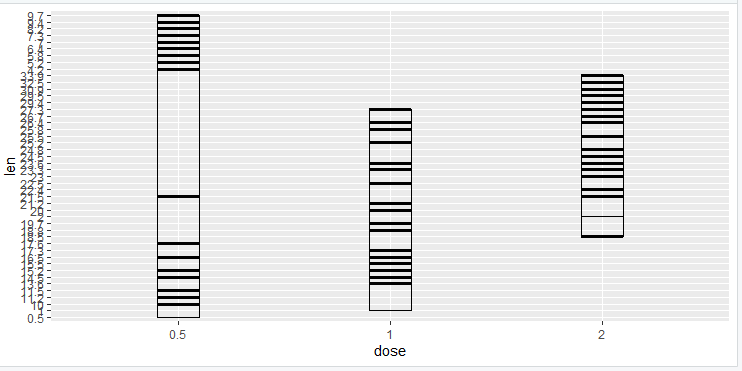
geom_linerange()
Here geom draws the error bar, which can be defined by the lower and upper values. The linerange function is a bit similar to the error bar. In the line range function, you have to provide the value of y_min and y_max ourselves because the linerange geom doesn’t compute the confidence level automatically. In geom_linerange there are some parameters that are by default present (size, line range, color, width).
Syntax :
geom_linerange(mapping = NULL,data = NULL,stat = “identity”,position = “identity”,na.rm = FALSE orientation = NA,show.legend = NA,inherit.aes = TRUE)
Example :
R
library("ggplot2")
df <- ToothGrowth
df$dose <- as.factor(df$dose)
df$len <- as.factor(df$len)
p<-ggplot(df,aes(dose,len))
p +
geom_line()+
stat_summary(func.y= mean, geom= "bar" ,fill="white",color="black") +
geom_linerange(aes(ymin =len , ymax = dose)
)
|
Output :
geom_pointrange()
Here geom draws the error bar, which can be defined by the lower and upper values. The point range function is quite similar to the error bar and line range. In the point range function, you have to provide the value of y_min and y_max ourselves because the pointrange geom doesn’t compute confidence level automatically. In geom_pointrange there are some parameters that are by default present (size, line range, color, fill, width). The pointrange function is useful to draw confidence intervals.
Syntax :
geom_linerange(mapping = NULL,data = NULL,stat = “identity”,position = “identity”,fatten = 4,na.rm = FALSE orientation = NA,show.legend = NA,inherit.aes = TRUE)
Example :
R
library("ggplot2")
df <- ToothGrowth
df$dose <- as.factor(df$dose)
df$len <- as.factor(df$len)
p<-ggplot(df,aes(dose,len))
p +
geom_line()+
stat_summary(func.y= mean, geom= "bar" ,fill="white",color="black") +
geom_pointrange(aes(ymin =len , ymax = dose)
)
|
Output :
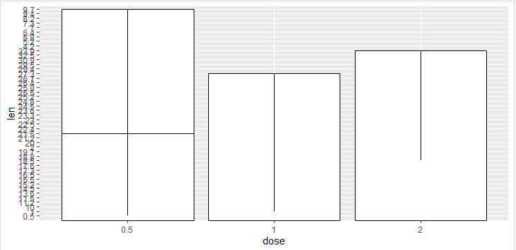
geom_crossbar()
Here geom draws the error bar, which can be defined by the lower and upper values. The crossbar function is quite similar to error bar and line range. The crossbar is the hollow bar with the horizontal lines in the middle.
Syntax:
geom_crossbar(mapping = NULL,data = NULL,stat = “identity”,position = “identity”,fatten = 2.5,na.rm = FALSE,orientation = NA,show.legend = NA,inherit.aes = TRUE)
Example :
R
library("ggplot2")
df <- ToothGrowth
df$dose <- as.factor(df$dose)
df$len <- as.factor(df$len)
p<-ggplot(df,aes(dose,len))
p +geom_crossbar(aes(ymin = len , ymax = dose),width = 0.2)
|
Output :
geom_errorbarh()
Here geom draws the error bar, which can be defined by the lower and upper values. The geombar function is a bit similar to the error bar but here we are changing the position and axis. In the errorbar range function, you have to provide the value of x_min and x_max ourselves because the error bar geom doesn’t compute the confidence level automatically. In geom_errorbar there are some parameters that are by default present (size, line range, color, width).
Syntax:
geom_errorbarh(mapping = NULL,data = NULL,stat = “identity”,position = “identity”,na.rm = FALSE,orientation = NA,show.legend = NA,inherit.aes = TRUE)
Example :
R
library("ggplot2")
df <- ToothGrowth
df$dose <- as.factor(df$dose)
df$len <- as.factor(df$len)
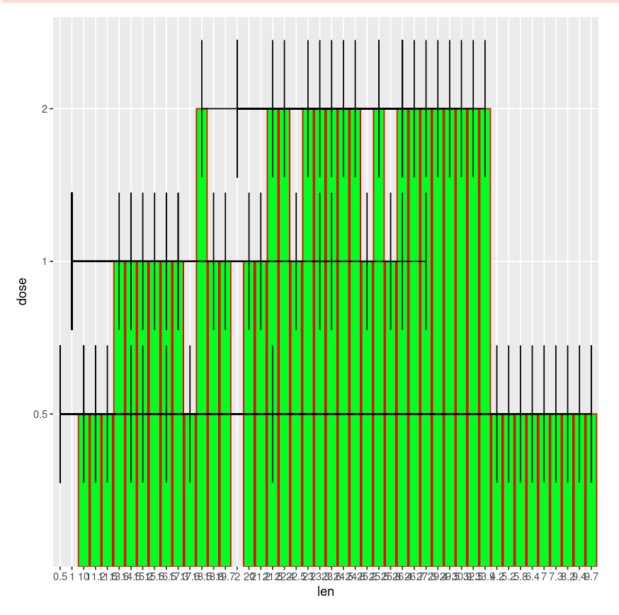
p<-ggplot(df,aes(len,dose))
p +
geom_line()+
stat_summary(func.y= mean, geom= "bar" ,
fill="green",color="red") +
geom_errorbarh(aes(xmin =dose , xmax = len)
)
|
Output :
Let us implement these on one variable system.
Data : example.csv
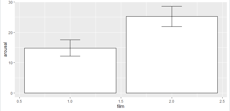
Load your data in a variable. Check if data is proper or not, if it’s proper keep the same otherwise change according to your need. To plot the mean arousal score (y-axis) for the film (x-axis) first create the plot object.
Syntax :
factor(x = character(), levels, labels = levels,exclude = NA, ordered = is.ordered(x), nmax = NA)
If there is a need to change, the data conversion is done by setting them to actual factors. Then plot the data.
Example 1:
R
library("ggplot2")
rawdata <- read.csv("example1.csv", header = TRUE)
rawdata$gender = factor(rawdata$gender,levels = c(1,2),
labels = c("Men","Women"))
rawdata$film = factor(rawdata$film, levels = c(1,2), l
abels = c("Bridget Jones","Memento"))
rawdata_bar = ggplot(rawdata,aes(film,arousal))
rawdata_bar + stat_summary(func.y= mean, geom= "bar" ,
fill="white",color="black") +
stat_summary(fun.data = mean_cl_normal ,
geom = "errorbar",width = 0.2)
rawdata$gender = factor(rawdata$gender,levels = c(1,2),
labels = c("Men","Women"))
rawdata$film = factor(rawdata$film, levels = c(1,2),
labels = c("Bridget Jones","Memento"))
rawdata_bar + stat_summary(func.y= mean, geom= "bar" ,
fill="white",color="black")
rawdata_bar + stat_summary(func.y= mean, geom= "bar" ,
fill="white",color="black") +
stat_summary(fun.data = mean_cl_normal ,
geom = "errorbar",width = 0.2)
|
Output:
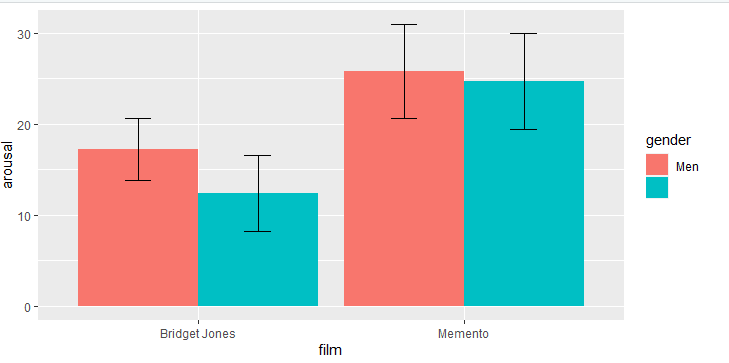
Example 2: The same can be done for two independent variables.
R
library("ggplot2")
rawdata <- read.csv("example1.csv", header = TRUE)
rawdata$gender = factor(rawdata$gender,levels = c(1,2),
labels = c("Men","Women"))
rawdata$film = factor(rawdata$film, levels = c(1,2),
labels = c("Bridget Jones","Memento"))
rawdata2 = ggplot(rawdata,aes(film, arousal, fill = gender))
rawdata2 +
stat_summary(fun.y = mean, geom = "bar",position = "dodge")+
stat_summary(fun.data = mean_cl_normal, geom = "errorbar",
position = position_dodge(width = 0.90),width=.2)
|
Output:
Like Article
Suggest improvement
Share your thoughts in the comments
Please Login to comment...