Dual Lines Chart in Tableau
Last Updated :
24 Oct, 2020
In this article, we will learn how to draw dual lines chart in a tableau worksheet to do further operations. For this first look into two terms :
- Tableau: Tableau is a very powerful data visualization tool that can be used by data analysts, scientists, statisticians, etc. to visualize the data and get a clear opinion based on the data analysis. Tableau is very famous as it can take in data and produce the required data visualization output in a very short time.
- Dual Lines Chart: Line charts connect individual data points in a view. They provide a simple way to visualize a sequence of values and are useful when you want to see trends over time, or to forecast future values.
Dataset used in the given examples is Dataset.
For this we have to follow some steps :
Open the Tableau tool and connect a dataset to it. Drag and drop the one sheet of the connected dataset. Click on sheet1 to open the tableau worksheet. On clicking Sheet1 you will get whole dataset attributes on the left side and a worksheet for work.
To draw a dual lines chart you have to select minimum of three attributes by drag and drop into a row then apply the other parameter for better visualization.
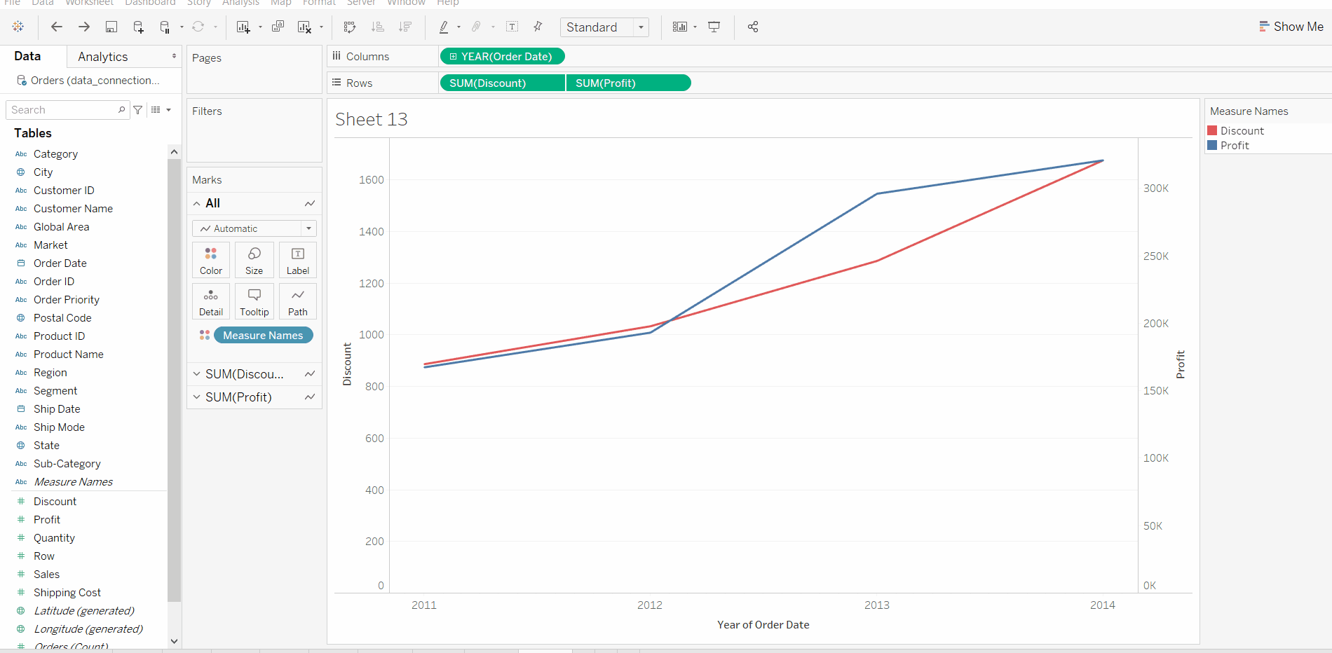
Example 1: In this example, we simply draw a dual lines chart by using the show me option.
Example 2: This example uses above example 1 with some extra marks (apply the label and color marks) and which are shown easily below :

Example 3: This example uses above example 1 with some extra marks (apply the label and color marks) then apply forecast analytics and which are shown easily below :
Like Article
Suggest improvement
Share your thoughts in the comments
Please Login to comment...