Display the Pandas DataFrame in Heatmap style
Last Updated :
17 Aug, 2020
Pandas library in the Python programming language is widely used for its ability to create various kinds of data structures and it also offers many operations to be performed on numeric and time-series data. By displaying a panda dataframe in Heatmap style, the user gets a visualisation of the numeric data. It gives an overview of the complete dataframe which makes it very much easy to understand the key points in the dataframe.
A heatmap is a matrix kind of 2-dimensional figure which gives a visualisation of numerical data in the form of cells. Each cell of the heatmap is coloured and the shades of colour represent some kind of relationship of the value with the dataframe. Following are some ways to display a Panda dataframe in Heatmap style.
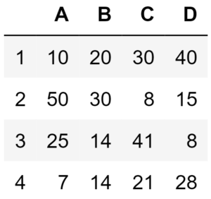
Consider this dataframe as an example:
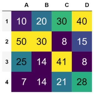
Method 1 : By using Pandas library
In this method, the Pandas library will be used to generate a dataframe and the heatmap for it. The cells of the heatmap will display values corresponding to the dataframe. Below is the implementation.
import pandas as pd
idx = ['1', '2', '3', '4']
cols = list('ABCD')
df = pd.DataFrame([[10, 20, 30, 40], [50, 30, 8, 15],
[25, 14, 41, 8], [7, 14, 21, 28]],
columns = cols, index = idx)
df.style.background_gradient(cmap ='viridis')\
.set_properties(**{'font-size': '20px'})
|
Output :
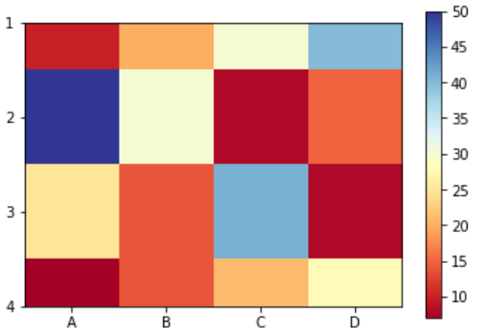
Method 2 : By using matplotlib library
In this method, the Panda dataframe will be displayed as a heatmap where the cells of the heatmap will be colour-coded according to the values in the dataframe. A colour bar will be present besides the heatmap which acts as a legend for the figure. Below is the implementation.
import matplotlib.pyplot as plt
import pandas as pd
idx = ['1', '2', '3', '4']
cols = list('ABCD')
df = pd.DataFrame([[10, 20, 30, 40], [50, 30, 8, 15],
[25, 14, 41, 8], [7, 14, 21, 28]],
columns = cols, index = idx)
plt.imshow(df, cmap ="RdYlBu")
plt.colorbar()
plt.xticks(range(len(df)), df.columns)
plt.yticks(range(len(df)), df.index)
plt.show()
|
Output :
Method 3 : By using Seaborn library
In this method, a heatmap will be generated out of a Panda dataframe in which cells of the heatmap will contain values corresponding to the dataframe and will be color-coded. A color bar will also present besides the heatmap which acts as a legend for the figure. Below is the implementation.
import pandas as pd
import seaborn as sns % matplotlib inline
fig, ax = plt.subplots(figsize = (12, 7))
idx = ['1', '2', '3', '4']
cols = list('ABCD')
df = pd.DataFrame([[10, 20, 30, 40], [50, 30, 8, 15],
[25, 14, 41, 8], [7, 14, 21, 28]],
columns = cols, index = idx)
sns.heatmap(df, cmap ='RdYlGn', linewidths = 0.30, annot = True)
|
Output :
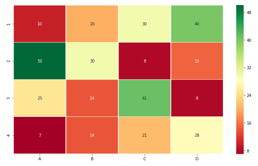
If the uppermost and the lowermost row of output figure does not appear with proper height then add below two lines after the last line of the above code.
bottom, top = ax.get_ylim()
ax.set_ylim(bottom + 0.5, top - 0.5)
|
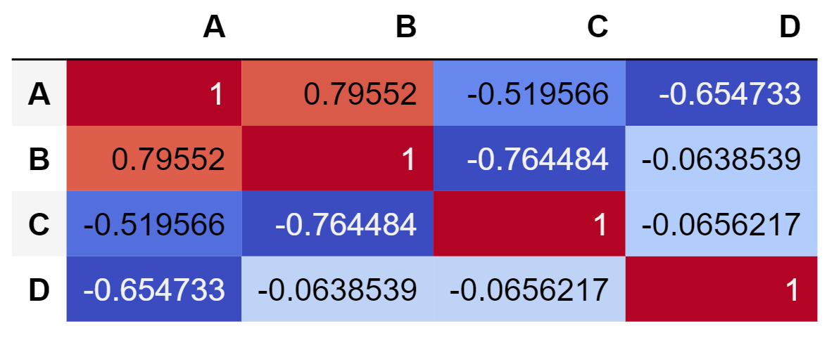
Method 4 : Generating correlation matrix using Panda library
A correlation matrix is a special kind of heatmap which display some insights of the dataframe. The cells of this heatmap display the correlation coefficients which is the linear historical relationship between the variables of the dataframe. In this method only Pandas library is used to generate the correlation matrix. Below is the implementation.
import pandas as pd
idx = ['1', '2', '3', '4']
cols = list('ABCD')
df = pd.DataFrame([[10, 20, 30, 40], [50, 30, 8, 15],
[25, 14, 41, 8], [7, 14, 21, 28]],
columns = cols, index = idx)
corr = df.corr()
corr.style.background_gradient(cmap ='coolwarm')
|
Output :
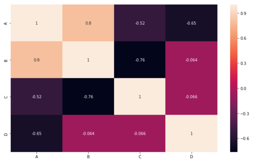
Method 5 : Generating correlation matrix using Seaborn library
The correlation matrix can also be generated using Seaborn library. The cells of the generated heatmap will contain the correlation coefficients but the values are round off unlike heatmap generated by Pandas library. Below is the implementation.
import pandas as pd
import seaborn as sn
fig, ax = plt.subplots(figsize = (12, 7))
idx = ['1', '2', '3', '4']
cols = list('ABCD')
df = pd.DataFrame([[10, 20, 30, 40], [50, 30, 8, 15],
[25, 14, 41, 8], [7, 14, 21, 28]],
columns = cols, index = idx)
df = pd.DataFrame(df, columns =['A', 'B', 'C', 'D'])
corr = df.corr()
sn.heatmap(corr, annot = True)
|
Output :
If the uppermost and the lowermost row of output figure does not appear with proper height then add below two lines after the last line of the above code.
bottom, top = ax.get_ylim()
ax.set_ylim(bottom + 0.5, top - 0.5)
|
Like Article
Suggest improvement
Share your thoughts in the comments
Please Login to comment...