Difference Between ggvis VS ggplot in R
Last Updated :
26 Mar, 2024
R programming language provides many tools and packages to visualize the data points using interactive plots. ggpvis vs ggplot2 plots can be annotated or customized with different headings, titles, and color schemes to improve the readability of the data plotted.
ggvis
The ggvis package in R is used for data visualization. It is also used to create interactive web graphics. It is also used to create interactive graphs and plots. It is an addition to the ggplot package. It provides the framework to build HTML graphs in the working space. The package can be downloaded and installed into the working space using the following command :
install.packages("ggvis")
R
# installing the reqd library
library("ggvis")
# creating a data frame
data_frame <- data.frame(
col2 = 1:8,
col3 = LETTERS[1:8]
)
print ("Data Frame")
print(data_frame)
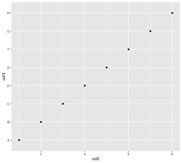
# plotting the col2 and col3 of data frame
layer_points(ggvis(data_frame, x = ~col2, y = ~col3))
Output
[1] "Data Frame"
col2 col3
1    1    A
2    2    B
3    3    C
4    4    D
5    5    E
6    6    F
7    7    G
8    8    H

ggvis VS ggplot in R
ggplot
The ggplot2 package is a powerful and widely used package for graphic visualization. It can be used to provide a lot of aesthetic mappings to the plotted graphs. This package is widely available in R. The package can be downloaded and installed into the working space using the following command :
install.packages("ggplot2")
The ggplot method can be used to create a ggplot object. The graphical object is used to create plots by providing the data and its respective points. The data can be plotted using both points as well as lines.
ggplot(data, aes = )
Arguments :
- data – The data to be plotted
- aes – The aesthetic mappings
R
# installing the reqd library

library("ggplot2")

# creating a data frame
data_frame <- data.frame(
  col2 = 1:8,
  col3 = LETTERS[1:8]
)
print ("Data Frame")
print(data_frame)

# plotting the col2 and col3 of
# data frame
ggplot(data_frame,aes(col2,col3))+
  geom_point()
Output
[1] "Data Frame"
 col2 col3
1    1    A
2    2    B
3    3    C
4    4    D
5    5    E
6    6    F
7    7    G
8    8    H
ggvis VS ggplot in R
Now we perform some visualization on both the packages using Iris dataset.
ggvis Scatter Plot
R
# Load necessary libraries
library(ggvis)

# Interactive Scatter Plot using ggvis
scatter_plot <- iris %>%
  ggvis(~Sepal.Length, ~Sepal.Width, fill = ~Species) %>%
  layer_points(size := 100) %>%
  add_tooltip(function(df) df$Species) %>%
  hide_legend("fill") %>%
  layer_text(x = ~mean(range(Sepal.Length)), y = ~max(Sepal.Width) + 0.5,
             text := "Scatter Plot - ggvis", fontSize := 15, baseline := "bottom") %>%
  set_options(width = 400, height = 300)

# Display the plot
print(scatter_plot)
Output:

ggvis Scatter Plot
Scatter Plot using ggplot2
R
# Load necessary libraries
library(ggplot2)

# Scatter plot using ggplot2
ggplot(iris, aes(x = Sepal.Length, y = Sepal.Width, color = Species)) +
  geom_point(size = 3) +
  labs(title = "Scatter Plot - ggplot2", x = "Sepal Length", y = "Sepal Width") +
  theme_minimal()
Output:
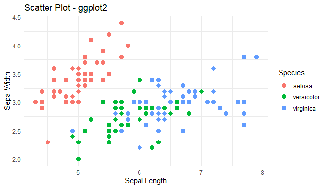
Scatter Plot using ggplot2
Interactive Bar Chart using ggvis
R
# Load necessary libraries
library(ggvis)

# Interactive Bar Chart using ggvis
bar_chart <- iris %>%
  ggvis(x = ~Species, y = ~Sepal.Length, fill = ~Species) %>%
  layer_bars() %>%
  add_tooltip(function(df) df$Species) %>%
  scale_nominal("fill", range = c("blue", "red", "green"))

# Display the plot
print(bar_chart)
Output:
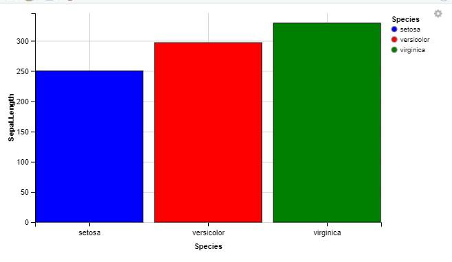
Interactive Bar Chart using ggvis
Interactive Bar Chart using ggplot
R
# Load necessary libraries
library(ggplot2)

# Bar Plot using ggplot2 on iris dataset
bar_plot <- ggplot(iris, aes(x = Species, y = Sepal.Length, fill = Species)) +
  geom_bar(stat = "identity") +
  labs(title = "Bar Plot of Sepal Length by Species",
       x = "Species",
       y = "Sepal Length") +
  theme_minimal()

# Display the plot
print(bar_plot)
Output:
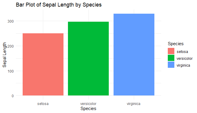
Interactive Bar Chart using ggplot
Box Plot using ggvis
R
# Load necessary libraries
library(ggvis)

# Define custom colors for species
colors <- c("darkblue", "darkred", "darkgreen")

# Box Plot using ggvis on iris dataset with color scales
box_plot_ggvis <- iris %>%
  ggvis(x = ~Species, y = ~Sepal.Length, fill = ~Species) %>%
  layer_boxplots(fillOpacity := 0.7, strokeWidth := 0.5, stroke := "black") %>%
  scale_nominal("fill", range = colors) %>%
  add_tooltip(function(df) df$Species)

# Display the plot
print(box_plot_ggvis)
Output:

Box Plot using ggvis
Box Plot using ggplot2
R
# Load necessary libraries
library(ggplot2)

# Box Plot using ggplot2 on iris dataset
box_plot_ggplot <- ggplot(iris, aes(x = Species, y = Sepal.Length, fill = Species)) +
  geom_boxplot() +
  labs(title = "Box Plot of Sepal Length by Species",
       x = "Species",
       y = "Sepal Length") +
  theme_minimal()

# Display the plot
print(box_plot_ggplot)
Output:
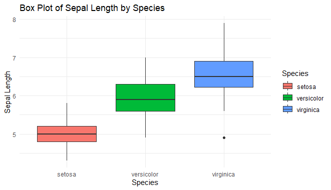
Box Plot using ggplot2
Table of difference between ggvis and ggplot
The following table is used to illustrate the differences between both the packages :
| ggvis | ggplot |
|---|
| Can be used for constructing both static and interactive plots. | Can be used for constructing only static plots. |
| ggvis package is required | ggplot2 package is required |
| Faster | Slower |
| Simpler plots are constructed | Complex but elegant plots are constructed |
| It doesn’t support a good annotation framework | It supports a good annotation framework |
| Doesn’t easily output ordinary image files. | Quickly outputs ordinary image files. |
Like Article
Suggest improvement
Share your thoughts in the comments
Please Login to comment...