Dex Mean Plot
Last Updated :
22 Jan, 2021
Dex mean plot is used to analyzing the data from the respective set of factors that contains two or more than two levels. The plot represents the mean values of two or more levels of factors each plotted by factors. This means the values of a factor are connected by the straight line. Dex mean plot is a complement to traditional Analysis of Variance (ANOVA) of design experiments.
Dex mean plot can be used to answer the following questions:
- Which factors are most important for the response variable?: The dex means plot does not provide the definite answer to the question, but it does help categorize the factors according to their importance such as ‘clearly important’, ‘not important’, and of ‘borderline importance’.
- Ranking list of factors in accordance with their importance.
Dex mean plot consists of the following axes:
- Vertical Axis: Mean of the response variable for each level of factors.
- Horizontal Axis: Factor variable.
Let’s consider the dex mean plot of BOXBIKE2.data dataset:
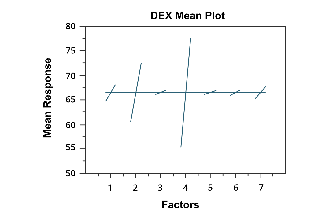
Dex Mean Plot
We can draw the following conclusions from the above plot:
- Factor 4 is the most important factor in the above graph.
- This is followed by factor 2 which is the second most important and factor 1 is the third most important. These factors can be considered as ‘clearly important’
- This is followed by factors 7 and 6, which can be considered as ‘borderline important’.
- Factor 3 and 5 can be considered as ‘relatively not important’.
The ranking list of factors
( 4, 2, 1, 7, 6, 3, 5)
Extension of Dex mean plot:
We can use the scatter plot matrix in the dex mean plot to display first-order interactions. For the k factors, we need k rows and k columns. On the diagonal of the matrix plot, the plot is simply a dex mean plot with a single factor. For the non-diagonal plot, measurements at each level, where the level is Xi * Xj and Xi is the code for the ith main effect level and Xj is the code for the jth main effect. After that, we generate the dex mean plot for the interaction variable. Below is an example of Dex Mean plot matrix:
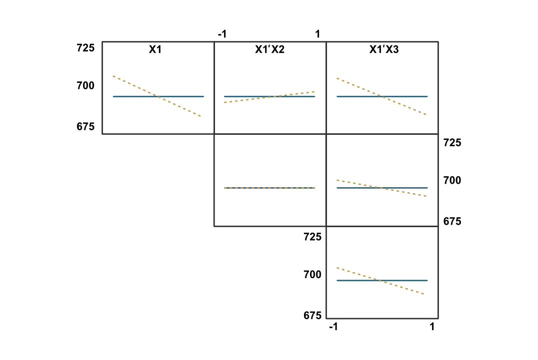
Dex Mean plot matrix
References:
Like Article
Suggest improvement
Share your thoughts in the comments
Please Login to comment...