Design an Animated Toggle Switch Button using framer-motion & React
Last Updated :
09 Nov, 2023
Animated Toggle Switch Button using framer-motion & React is a button that shows some animation/transitions and switches the states when clicked.
Prerequisites:
Approach:
To design an animated toggle switch button using framer motion in react we will be using the animated and motion components for showing transitions and useState hook to store, useEffect to render the components after state changes.
Steps to create React Application And Installing Module :
Step 1: Create a React application using the following command:
npx create-react-application demo
Step 2: After creating your project folder i.e. demo, move to it using the following command:
cd demo
Step 3: Install framer-motion from npm.
npm i framer-motion
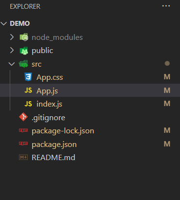
Project Structure:
The updated list of dependencies after installing required modules:
"dependencies": {
        "@testing-library/jest-dom": "^5.17.0",
        "@testing-library/react": "^13.4.0",
        "@testing-library/user-event": "^13.5.0",
        "framer-motion": "^10.16.4",
        "react": "^18.2.0",
        "react-dom": "^18.2.0",
        "react-scripts": "5.0.1",
        "web-vitals": "^2.1.4"
}
Example: This example implemets animated toggle switch button using motion and animate components of framer-motion.
Javascript
import React from "react";
import { useState, useEffect } from "react";
import { motion } from "framer-motion";
import "./App.css";
const Switch = ({ isOn, ...rest }) => {
const customClassName = `toggleSwitch ${
isOn ? "on" : "off"
}`;
const src = isOn
? "Toggle 1st Image link"
: "Toggle 2nd Image link";
return (
<motion.div
animate
className={customClassName}
{...rest}
>
<motion.div animate>
<img src={src} />
</motion.div>
</motion.div>
);
};
const App = () => {
const [isOn, setIsOn] = useState(false);
useEffect(() => {
document.body.style.backgroundColor = isOn
? "#1c1c1c"
: "#ffffff";
}, [isOn]);
return (
<Switch
isOn={isOn}
onClick={() => setIsOn(!isOn)}
/>
);
};
export default App;
|
CSS
body {
margin: 0;
display: flex;
justify-content: center;
align-items: center;
min-height: 100vh;
transition: 0.5s ease-in-out;
}
* {
box-sizing: border-box;
}
.toggleSwitch {
width: 170px;
height: 100px;
border-radius: 100px;
padding: 10px;
display: flex;
cursor: pointer;
z-index: 2;
}
.toggleSwitch.on {
background-color: #1aad66;
justify-content: flex-end;
transition: 0.5s ease-in-out;
}
.toggleSwitch.off {
background-color: #dddddd;
justify-content: flex-start;
}
.toggleSwitch div {
width: 80px;
height: 80px;
border-radius: 100%;
}
img {
width: 80px;
height: 80px;
border-radius: 100%;
}
|
Step to Run Application: Run the application using the following command from the root directory of the project.
npm start
Output: Now open your browser and go to http://localhost:3000/, you will see the following output.

Like Article
Suggest improvement
Share your thoughts in the comments
Please Login to comment...